


![]()
Pinnacle Pet UK has launched a new visual identity designed by K A Creative. The identity highlights the brand’s focus on care, reliability, and close connection with pets and their owners. As part of the larger Pinnacle Pet Group, the refreshed look aims to build trust and showcase expertise while staying visually connected to the parent company.
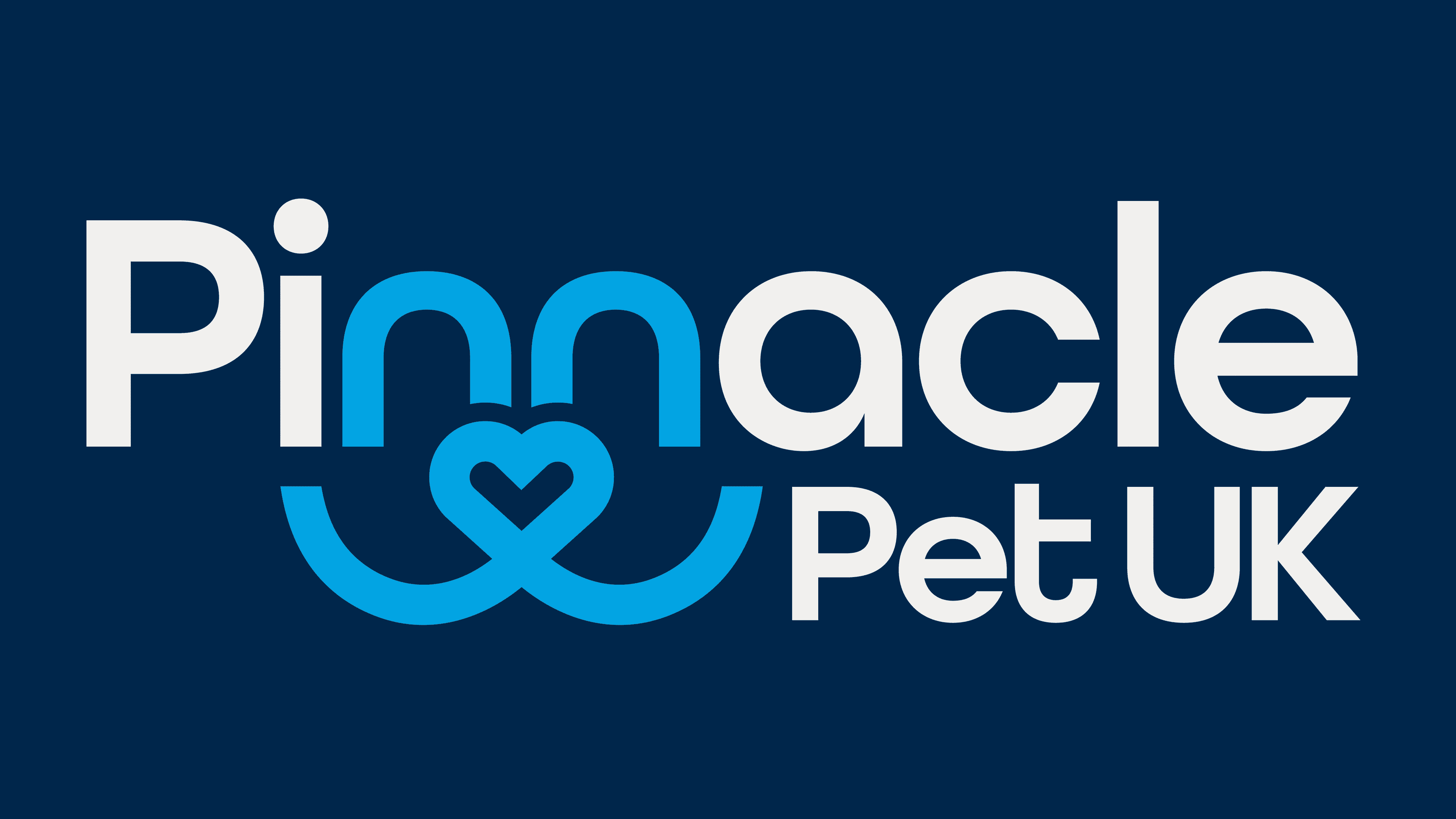
The updated logo features a distinctive graphic element woven seamlessly into the word “Pinnacle.” The design cleverly uses the arches of the lowercase “n” letters, which flow into intertwining lines, forming a heart-like shape. This symbolizes the bond between pets and their caregivers. The lines hint at an abstract dog’s face, subtly outlined with dark blue to create depth and reinforce the brand’s connection to pet care.

The modern, geometric sans-serif typeface has soft, rounded edges, giving it a friendly, approachable feel. The rounded letters convey warmth, reflecting the brand’s commitment to compassion and care. “Pinnacle” appears in a bold, larger font to highlight the company name, while “Pet UK” is displayed in a smaller, complementary size, creating a visually balanced look.
The color palette has been thoughtfully chosen to strengthen the brand’s identity. Two shades of blue dominate: a deep navy for the abstract symbol and key text elements and a lighter, brighter blue for accents. Combination conveys professionalism and reliability while adding a fresh, vibrant touch. A subtle pop of red, inspired by the UK Union flag, appears in supporting materials, giving a nod to the brand’s British roots without overpowering the design.
The logo’s clean, minimal composition emphasizes simplicity and clarity. Integrating the abstract pet face within the wordmark adds a playful yet refined feel, striking a balance between professionalism and emotional connection. The design avoids unnecessary details, focusing on bold, simple lines that work well across various formats, from digital platforms to print materials.
One of the unique features of the new identity is the playful use of facial expressions in internal materials. By adjusting the curves and angles of the abstract pet face; the brand can create different expressions, adding personality to office signage, stationery, and presentations.
Combining geometric shapes, friendly typography, and a balanced color palette creates a visual system that feels professional and heartfelt. As Pinnacle Pet UK continues to grow in the competitive pet care market, this refreshed identity will help strengthen its dedication to quality care and the well-being of pets across the UK.