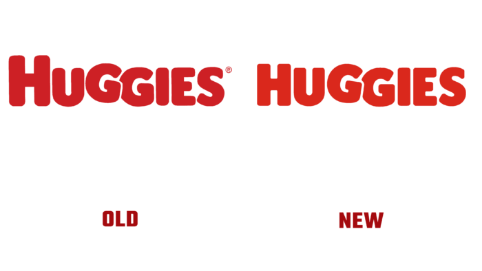
For over 50 years, the largest brand of baby diapers, Huggies, has been helping generations of parents take care of their babies. Even though now this brand is incredibly promoted and loved worldwide, in 1977, it endured competition from Kleenex Super Dry diapers. However, innovation in baby hygiene technology and patience has taken its toll. The competitor only lasted a year after that. The market introduced an updated diaper formula, which received a patent – diapers in the shape of an hourglass, making a splash among moms. Thus, having gained attention, the brand has become a leading manufacturer of hygiene products for children.
This year, the brand unveiled a new logo to the public, harnessing the creative potential of its advertising campaign: Huggies filmed an ad in which, highlighting the merits of their products, they showed children born on the first day of the Super Bowl. The video was broadcast before the live broadcast so that most viewers could appreciate the changes in the company’s visual identity.
The initiators of the updates emphasize that there is a need to adapt their appearance to the process of digital globalization, especially since the brand has always tried to be close to the target audience to satisfy their needs in taking care of children as much as possible, and to cover a wide range of hygiene issues.
With the new logo, the authors salute the past. The brand began its development with him; now, it is a different dimension, but the tradition is respected, so it was slightly changed. The playfulness, softness, and smoothness of the lines, the letters of the word Huggies, which are out of tune, the absence of shadow accents, and the repeated Gs generally create the illusion of twins, one of which seems to touch the other in the game.
Nothing revolutionary, contradictory, stunning. Effectively underscore the brand’s uniqueness and invincibility in the market. The same shade of red as in the previous version. Added to identity and fonts – Moranga (Sofia Mor, Sofia Mohr) and Baton Turbo (A. Kuvit and J. Baggar, Anton Koovit and Yassin Baggar). The first is softer and more childish, the second is more strict and formal.


