Plan: Brand overview
In 1937, amidst the Spanish Civil War, Plan International emerged through the initiative of British journalist John Langdon-Davies and humanitarian Eric Muggeridge. The organization’s original name, Plan Foster Parents, was intended to help children affected by the ravages of war by providing food, shelter, and education.
After the devastation of World War II, the organization adapted its sponsorship model to meet the needs of children orphaned by conflict and expanded its work throughout Europe. In the 1950s and 1960s, Plan International saw opportunities for greater change and began working in Asia, Africa, and Latin America, with a particular focus on developing countries.
By the 1970s, a rebranding was necessary. The organization shortened its name to Plan International to reflect its changed mission, which now included sponsorship and a broader range of community improvement initiatives.
In the following years, Plan shifted its focus to more complex global issues. The organization began to focus more on gender parity, children’s rights, health, sanitation, and clean water initiatives. Notably, Plan International was one of the first organizations to emphasize the importance of girls’ rights and the importance of empowering young leaders in development contexts.
Today, with offices in over 70 countries, Plan International is at the forefront of the fight for children’s rights around the world. Through numerous programs, they work tirelessly to strengthen gender equality and ensure a fair legal framework for the protection of children. Their extensive network includes more than 10 million philanthropists and donors from around the world who support projects that improve at-risk children, their families, and communities.
Meaning and History
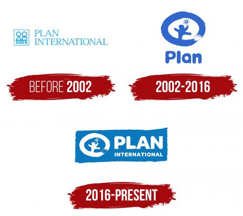
before 2002
2002 – 2016
2016 – today
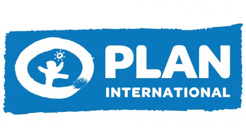
The logo for the humanitarian aid organization features its full name, “Plan International,” neatly divided into two lines. Despite the difference in letter size, the words share a consistent style: both are in an ultra-bold font that masterfully blends straight and rounded ends. This balance is so well-executed that the variance in letter size is hardly noticeable, creating a seamless and cohesive appearance.
To the left of the text is a child-like drawing, adding a touch of whimsy and hope to the logo. This illustration is set within an irregular circle, containing an image of the sun and a figure in mid-stride. The person depicted is taking a wide step forward with hands raised high, symbolizing progress, optimism, and the proactive nature of the organization’s mission.
This logo’s design encapsulates the essence of “Plan International” – its commitment to forwarding movement and positively impacting the lives of children worldwide. The bold, balanced typography and simplistic yet meaningful illustration conveys strength, hope, and unity. It’s a visual representation of the organization’s dedication to supporting and empowering communities, ensuring every child has the opportunity to reach their full potential.
