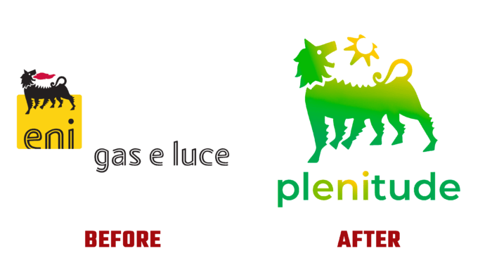
Today, the world’s largest oil company, Eni SpA, has found a new face with a complete rebranding that has affected its name. With the characteristics of a transnational brand, the company has boldly declared its determination to follow modern trends and the desire to move forward, abandoning everything that can slow down along the way. Now the Italian brand has acquired a new, more sonorous name – Plenitude, which more fully and accurately reflects the features and changes that have taken place in the company’s strategy and policy. Occupying 7th place globally, the company conducts its business in 66 countries of the world. At the time of its creation in 1950, the brand was focused on working with hydrocarbons, which was reflected in its previous name. Today, the company has significantly expanded its scope of activities, covering nuclear and electrical energy, mining and chemical production, developing and manufacturing advanced plastics, equipment for the mining and processing industries, textile production, and news agencies. Everything led to the need to create a completely new identity.
Starting with the name, the brand immediately lifted the restrictions set earlier. A growing enterprise should not be limited by anything in its desire to develop. The new visualization effectively coped with the solution of such a problem. Starting with the name – becoming Plenitude, the brand has managed to pay tribute to its rich and successful history while demonstrating the fullness of the brand’s new global vision and the energy with which the company continues to move forward and develop. The new ideas that pushed the brand to change are also reflected in the new brand visualization, confirming their importance in shaping a better future. Aligning the importance of such positions as business goals and the desire for sustainable development, the brand has become a Benefit Company, offering only advanced solutions for home and business.
The brand confirmed its commitment to history by keeping the image of its main element of the emblem almost unchanged. Except for the color palette, the mythical fire-breathing creature has not changed its forms. The gradient green fading to yellow on the tail and the performance of the stylized sun emanating from the mouth are becoming the brand’s main colors. The chosen shades symbolize the natural origin of the company’s products for energy production and symbolically indicate that the proposals go beyond the “energy” framework. This also explains the rejection of the red flame language used in the old identity. The gradient transitions used to create the text sign and on the image of the beast convey the effect of rising rays, the coming victory of light over darkness, which is inherent in the very essence of brand creation.


