


 PNC Logo PNG
The PNC logo, shaped like a Möbius strip, represents the circulation of money in society. It reflects the continuity of banking and financial processes, driven by the enduring demand for funds. Thin letters emphasize its elegant operations, reflecting a professional company ready to help anyone who asks.
PNC Financial Services began on April 10, 1845, as the Pittsburgh Trust and Savings Company. The bank became fully active on January 28, 1852, after the city recovered from the Great Fire. Its founders, James Laughlin and B.F. Jones, came from the steel industry and built the bank for a region shaped by railroads, steel, and heavy industry. In eastern Pennsylvania, Tradesman National Bank of Philadelphia, later Provident National Bank, was founded in 1847.
In 1959, Pittsburgh Trust and several banks merged to form Pittsburgh National Bank, giving it the scale to serve corporate clients and support regional growth. The decisive change came in 1982, when Pennsylvania allowed statewide banking. In 1983, Pittsburgh National Corporation and Provident National Corporation merged to form PNC Financial Corporation, with $10.3 billion in assets.
PNC then expanded beyond Pennsylvania. In 1986, it merged with Louisville’s Citizens Fidelity Corporation, then with Cincinnati’s Central Bancorporation and Delaware’s Bank of Delaware Corporation. From 1991 to 1996, PNC bought more than ten financial institutions, including Midlantic Bank in New Jersey, Sears Mortgage Company, and The Massachusetts Company, the oldest US trust company.
By 1987, PNC was the 12th-largest US bank holding company. Its 2008 acquisition of National City Corporation doubled assets to $291 billion. The acquisition pushed PNC into the top tier of US regional banks. In 2020, PNC sold its 22.4% stake in BlackRock for about $14.2 billion. Later that year, it agreed to buy BBVA USA, completing the deal on June 1, 2021, and expanding into Texas, Alabama, Arizona, and the Sun Belt.
Meaning and History
PNC Financial Services Group has many subsidiaries, including PNC Bank. The brand is represented in 21 states and uses the same logo as the parent company: an orange circle with a triangular symbol inside, complemented by blue ‘PNC’ lettering. The three-letter abbreviation derives from the initials Provident National Corporation and Pittsburgh National Corporation, the modern holding predecessors.
By the way, United Bank got its name and triangular symbol from Pittsburgh National. But the Provident National emblem didn’t survive. It was based on the image of a sower. The agricultural worker symbolized productive work, and the seeds symbolized small investments that could sprout in the future.
What is PNC?
PNC stands for PNC Financial Services Group, a banking corporation operating in 27 US states and the District of Columbia. It has almost 3,000 branches. The company was founded in 1983 and grew out of two predecessor banks. It got its name from the Pittsburgh National Corporation and Provident National Corporation.
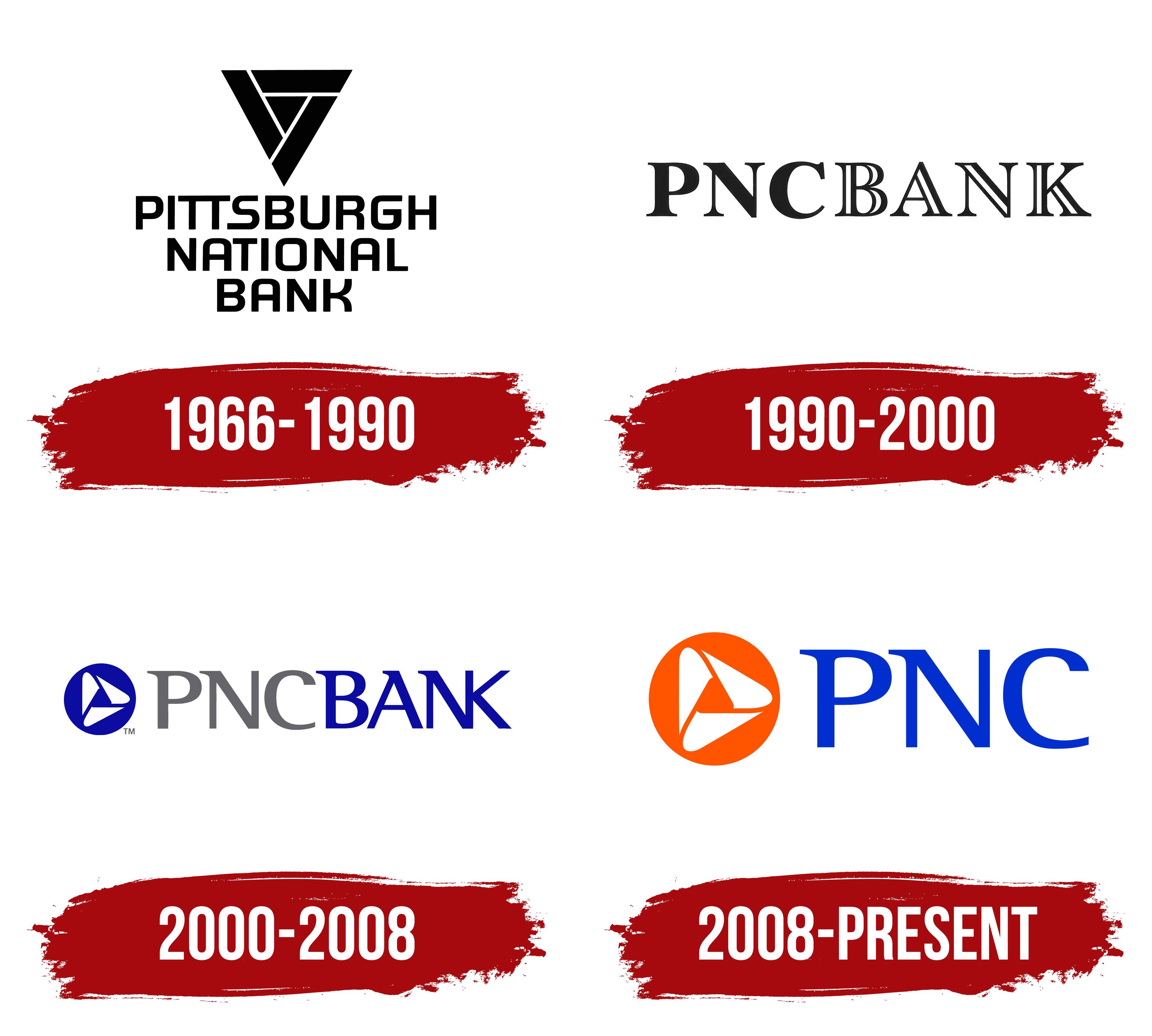
1966 – 1990
The letters PNC came from two banks in different Pennsylvania cities. Pittsburgh National Corporation represented Pittsburgh, while Provident National Corporation was based in Philadelphia. Both shared the same initials, so after their 1983 merger, the abbreviation became part of the name PNC Financial Corp. It maintained a connection to both institutions and suited a bank representing both cities. The Pittsburgh National name reflected its Pittsburgh roots, while “Provident” conveyed foresight and care for the future.
Before the merger, the banks used different emblems. Philadelphia’s Provident Trust adopted the sower image in 1922. The figure scattering seeds linked present work to future results and a small investment to eventual growth. The Pittsburgh emblem drew on the city itself. In 1959, the merger of Fidelity Trust Company and Peoples First created Pittsburgh National Bank. Its triangle referenced the Golden Triangle, Pittsburgh’s downtown business district, and represented the city’s industrial and commercial strength.
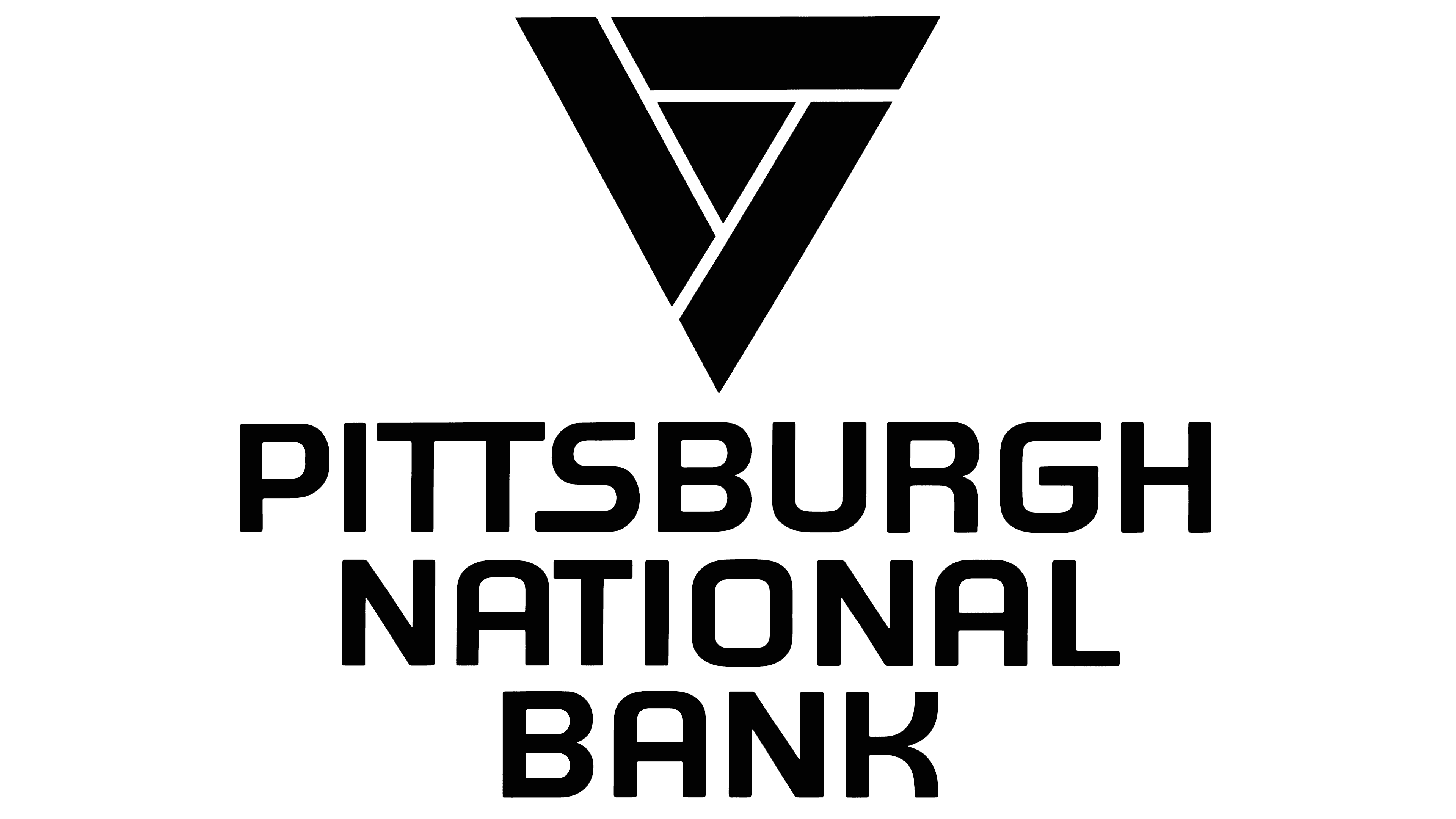
In the early version, the triangle pointed downward. Three thick bands surrounded a small triangle in the center, with narrow, light-colored gaps dividing them into separate sections. The outer edges met at sharp angles. The full name PITTSBURGH NATIONAL BANK appeared beneath the emblem, with each word on a separate line. The lines became progressively shorter from PITTSBURGH at the top to BANK at the bottom. Heavy sans-serif capitals combined straight strokes with rounded interior corners.
The bank’s connection to the city’s sports culture appeared on a small plastic coin bank shaped like a baseball. It featured the Pittsburgh National Bank name alongside the inverted triangle and the phrase “Nearby and Neighborly.” Reproductions of Pittsburgh Pirates players’ signatures decorated the surface, bringing the bank’s branding together with the local team’s identity.
1990 – 2000
The shared PNC Bank name was intended to present the group’s banks as a unified organization. The renaming program was announced in September 1992, and the transition began in February 1993. Pittsburgh National, Provident National, and other banks gradually adopted the common name. Research among banking customers also informed the change. Participants associated the PNC abbreviation with the group’s financial resources and customer service.
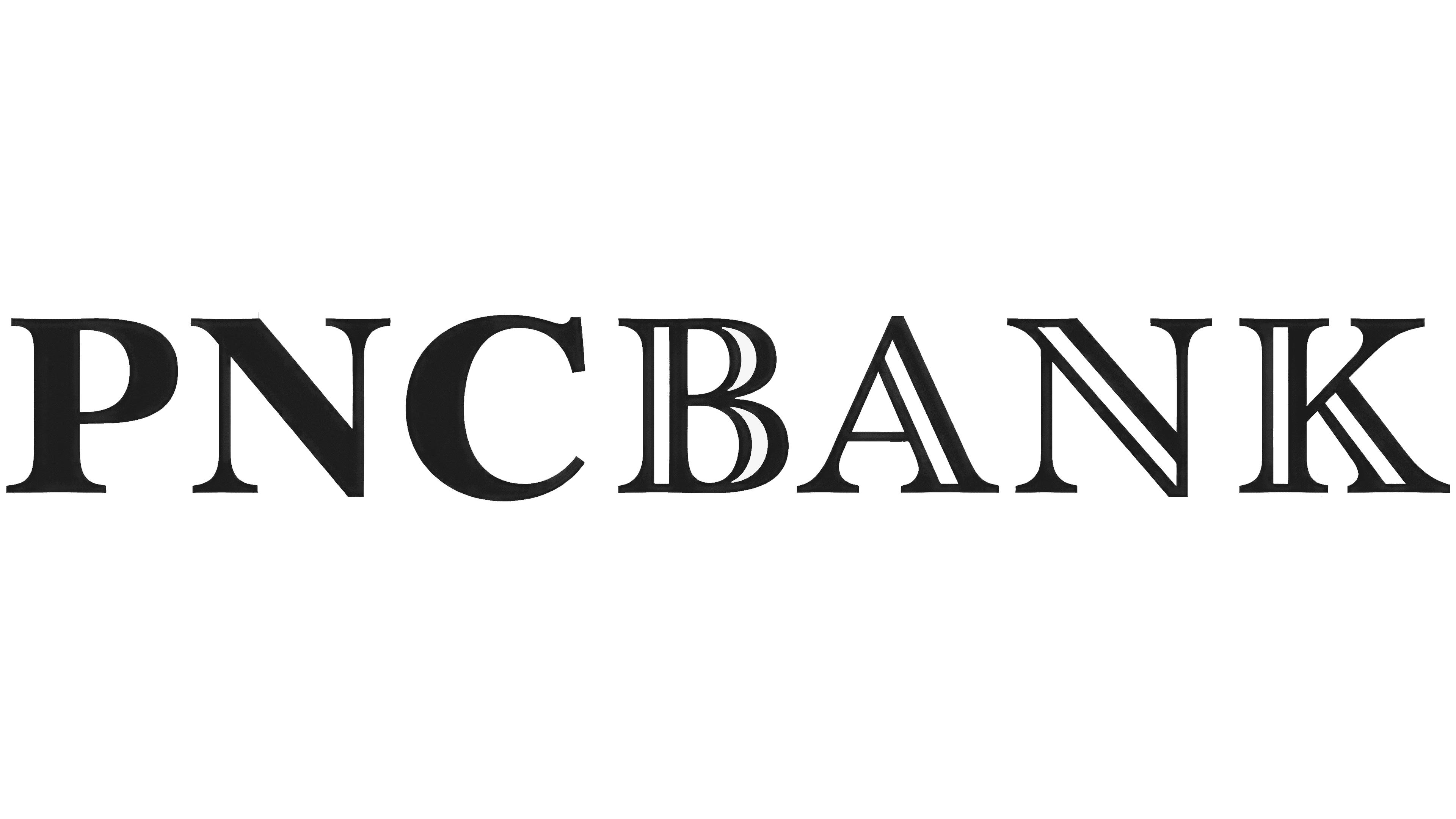
The standalone triangle was replaced by a PNC BANK wordmark. Different letter treatments distinguished the two parts of the name. PNC appeared in a solid dark color, while BANK used outlined letters with light interiors. The logo consisted entirely of lettering. Large, rounded forms in the “P,” “C,” and “B” were paired with thin connecting strokes and long serifs.
Joe Finocchiaro worked on the PNC Bank lettering in 1993 as part of a Siegel+Gale project. Fry’s Baskerville served as the starting point. The capitals’ proportions, stroke-thickness variations, and smooth transitions into the serifs retained a connection to the historical typeface. The shared name and consistent typography unified the branding of the group’s banks.
2000 – 2008
The parent company adopted the name The PNC Financial Services Group in 2000 to reflect its expansion beyond banking. The addition of “Financial Services” accompanied an identity update. The new branding was intended to help customers see the group’s different businesses as a single organization. PNC regional executive Bill Turner explained that they needed to be presented as one team. Some customers still remembered the former names of acquired banks.
The new PNC BANK logo paired the bank’s name with a redesigned triangular emblem. A blue circle sat on the left, with a horizontal wordmark extending to the right. The PNC initials were gray, while BANK was blue to match the circle. All the letters used solid fills. The contrast between thick and thin strokes was reduced compared with the previous serif lettering. Small projections remained at the tops of certain strokes, while the lower edges were mostly flat.
Inside the circle, three curved white shapes surrounded a small triangular opening. Rounded outer edges and pointed ends replaced the earlier angular bands. The triangle was rotated so that one point faced right. Alternating wide and narrow sections suggested a folded ribbon, while the solid fill kept the design flat.
2008 – today
By the mid-2000s, BANK had been removed from the abbreviated PNC logo, leaving the group’s shared name. Blue PNC lettering appeared to the right of the emblem, and the circle became orange. The color difference separated the symbol from the wordmark.
The white design inside the circle retained its three repeating sections with rounded edges and a triangular opening in the center. In the lettering, small projections at the tops of the “P” and “N” were paired with flat bases. The upper and lower terminals of the “C” differed in shape.
Font and Colors

The emblem’s main element symbolizes Downtown Pittsburgh’s commercial and industrial potential. This part of the city received the unofficial name “Pittsburgh Golden Triangle” because the Monongahela and Allegheny rivers surround it on three sides. It is home to the 33-story Tower at PNC Plaza, owned by PNC Financial Services Group and its subsidiary, PNC Bank.
The financial corporation uses the Rotis Semi Serif font for its logo. Monotype Imaging Inc. owns the rights. German typographer Otl Aicher created the Rotis family in 1988, and Monotype Originals later republished it. If we focus on the inscription “PNC,” it is set in thin capital letters. Long serifs in the upper-right corner of the “P” and “N” make the word feel dynamic. The “C” also draws attention because its lower part stretches forward, while the upper part curves slightly and shortens.
The blue lettering and orange circle represent the official PNC colors. Their shades are close to Absolute Zero (Crayola) (#002FCD) and Mystic Red (#FF5400). Against such a bright background, the white triangular symbol stands out, the emblem’s only light element.

PNC’s clients have repeatedly criticized it for a lack of unified visual identity. For example, Virginia Montanez, a blogging platform user, noted inconsistent logo colors. A 2006 note indicated that the bank used its old purple wordmark in some places. The bank also used a blue-and-gray emblem and a standard color version, but with a different font.
FAQ
Why bank with PNC?
Choosing PNC offers many benefits for a range of financial needs. The brand offers comprehensive services that are ideal for managing your daily finances. The High Yield Savings Account offers a competitive 4.65% APY, which is attractive in the current market.
An extensive network of branches and ATMs makes in-person banking convenient. Customers can easily find the nearest branch or ATM, improving service quality. The brand’s online and mobile banking platforms make it easy to manage your finances from anywhere in the world.
What is PNC Bank’s company profile?
The bank is a major player in the US financial industry. It offers a wide range of services and emphasizes customer relationships and local service.
The brand offers retail and business banking services, including personal loans, mortgages, credit cards, and business loans. Beyond traditional banking, the company offers wealth management and institutional banking.
The brand supports customers with powerful online and mobile banking platforms that make account management and financial transactions easier. It has a wide network of branches and ATMs throughout the United States, providing easy access to in-person banking services.
What does the PNC symbol mean?
The symbol is a small triangle of three connected elements forming a loop similar to a Möbius strip. This design symbolizes downtown Pittsburgh’s commercial, financial, and industrial strength, known as the Golden Triangle.
The name “Golden Triangle” comes from the territory’s layout. The city’s commercial and financial district is concentrated here, with the PNC Plaza building at its center. Rivers surround the area, forming a natural triangle. This symbol shows the brand’s strong connection to Pittsburgh and its economic roots.
What font is the PNC logo?
The logo uses the Rotis Semi Serif font, created by German designer Otl Aicher and later re-released by Monotype Originals.
Rotis Semi Serif combines serif and sans serif elements. The logo’s “P” and “N” have an elongated serif at the top left, and the letter “C” is distinguished by an elongated lower element. These details give the logo a professional, modern look while keeping a classic feel. This font makes the brand’s visual identity clear and recognizable.
What does the PNC logo mean?
The logo represents the brand name and its connection to Pittsburgh, symbolized by the Golden Triangle. The logo is an orange circle with three white triangles, reminiscent of a Möbius strip.
The Golden Triangle highlights the brand’s roots in downtown Pittsburgh, a commercial and financial hub. The orange circle and white triangles create a dynamic and modern look. Orange symbolizes energy and enthusiasm, while white triangles convey clarity and precision. The blue inscription adds trust and stability. The design blends tradition with forward-thinking, making it a recognizable icon in the financial industry.