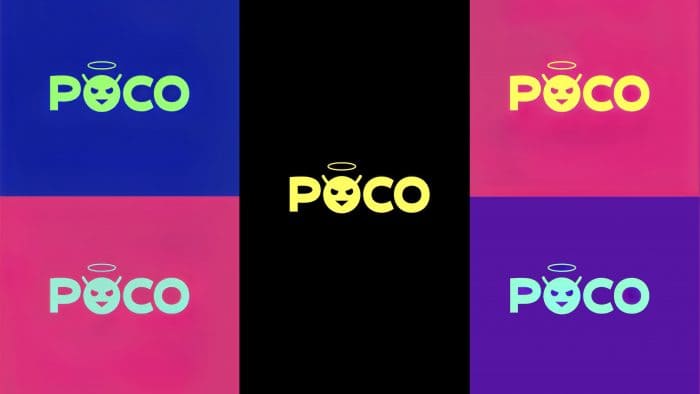
In an attempt to separate itself from Xiaomi as much as possible, the Chinese company has introduced its logo and mascot, targeting a young audience. The brand has expanded the standard color palette, which consisted of black and yellow, and now also uses bright shades: turquoise, lilac, fuchsia, green and blue.
POCO will probably reach out to every consumer and expand its audience because the new logo evokes vague emotions. The intertwining of good and evil and the very name Made Of Mad show the brand from a different angle. The talisman is used instead of the letter O in the name of POCO. The logo was created only for India, while in other countries, the old style will be relevant.
The mascot of a company consists of four elements that are responsible for a particular emotion. The halo over the head of the smiley is a direct association with angels and goodness. The horns follow, but POCO calls them antennas, which symbolize the negative side of madness. A slightly angry look contradicts the halo above his head. The last element is the triangular mouth, which is responsible for wit.
As a reminder, a year ago, the POCO brand separated from Xiaomi with the intention of autonomous operation with its marketing strategy. After that, the company introduced a new device POCO X2, and in November 2020 – POCO M3. Regional brand director Anuj Sharma said consumers should expect the new POCO F2, which he says will be unique to the Indian market. Maybe the rebranding will help the company to attract even more consumer attention and release exclusive devices?


