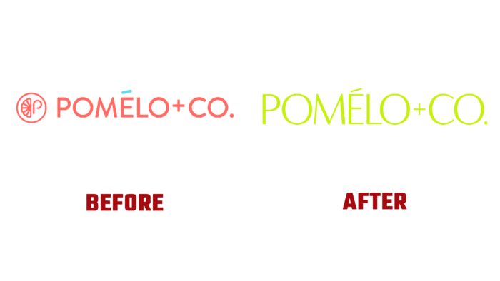
The world-famous cosmetic brand Pomelo + Co, whose hair care products are popular all over the world today, has changed its corporate identity. The wide range of products offered by the company perfectly copes with its tasks to ensure a healthy appearance of hair. Over the years, the brand has earned users’ appreciation, built its impeccable image, and created all new products based on the wishes and needs of users. During all this time, the company has become only closer to its customers, providing their hair with “absolute radiance,” which has become one of the main mottos of the brand today. After all, it is the appearance of the hair that forms an opinion about its owners. And their condition directly depends on the quality of care and the effectiveness of the means used. Pomelo + Co products are characterized by constant improvements and the emergence of new innovative developments. Today, the brand unveils its visually enhanced version, which aims to build trust without compromise and validate the creation of only sustainable results.
The formation of a new style included the development of a corporate color palette. The brand’s main color was chosen, a light green shade – lime. The softness and warmth characteristic of it favorably resonates with the feeling of freshness, lightness, and dynamism that it brings to the surrounding atmosphere. Despite its softness, this shade has a high charge of positive energy, which it transmits to all its surroundings. It plays an important role in forming visual identity, giving hope and confidence in the effectiveness of the application of the product that it reflects. Through the use of this shade, the brand acquires a benevolent tone that gives users of the product peace, creating a relaxed atmosphere in the community created by the brand. At the same time, the color symbolizes the naturalness of everything that the brand offers, guaranteeing the possibility of endowing the hair with strength and vitality.
At the same time, a thin, almost delicate font chosen to create a text logo plays a special role. Large large letters in their single combination stand out against any background in the space used to place the logo. Both typographically and digitally. It is recognizable easy to read in any size, both on the information surface and the elements of packaging and containers. The minimalism of the execution makes it possible to emphasize the strength, strength, and flexibility that the product gives to the hair when applied correctly.


