 Portland Trail Blazers Logo PNG
Basketball players from the Portland Trail Blazers use a dynamic logo reminiscent of two colliding waves. The cycle in the center is the starting point for victories that athletes strive for. Continuous motion, power, and indomitable strength are the key factors that underpin their emblem. They are clearly reflected in it, as in a mirror.
Portland Trail Blazers: Brand overview
| Founded: | 1970 |
| Founder: | Paul G. Allen Trus |
| Headquarters: | Portland, Oregon, U.S. |
| Website: | nba.com |
The Portland Trail Blazers club was established in 1970 in Portland, Oregon, USA. The idea of creating an NBA franchise in Portland emerged as early as 1955. It belongs to sports promoter Harry Glickman. He proposed expanding the NBA to two teams: one in Portland and another in Los Angeles. However, for various reasons, the National Basketball Association only granted the right to create a franchise in Portland fifteen years later.
In 1970, a contest for the best team name was announced. Among the ten thousand name options, “Pioneers” was the most popular. However, this option was excluded as it was already used by the collegiate teams of Lewis and Clark College located in Portland. As a result, the name Trail Blazers, which received 172 votes, was chosen.
The team’s colors are red, white, black, and silver. The latter was added in 2002. The team’s logo was designed by Harry Glickman, the team leader’s cousin. The name Trail Blazers refers to the railroad builders in Oregon who passed through forests and mountains. The team’s name is often shortened to Portland Blazers. Blaze, the Blazers’ cat, is the mascot of the “Portland Trail Blazers.” He has been the team’s official mascot since 2002.
Meaning and History
The basketball team Portland Trail Blazers has a unique logo that distinguishes it from other NBA participants. The original version was designed by Boston graphic designer Frank Glickman, the cousin of the club’s first general manager.
It all started when sports promoter Harry Glickman decided to introduce professional basketball to his hometown. For this, he needed players, a team name, and its emblem. To resolve this issue, he called his cousin. Less than a week later, he already had a finished sketch in his hands, which is still used in a modified form.
The Blazers will never fall out of the top ten as long as they use this logo, a masterpiece of abstract art in American sports. Five red-blue stripes symbolize the five best competing teams on the court, which interact on the one hand and converge in confrontation on the other. Of all the NBA team symbols, only Portland’s emblem reflects the poetic nature of this sport.
What is Portland Trail Blazers?
As of 2021, this is the only National Basketball Association team located in the Pacific Northwest. It has managed to win the league championship once and reach the NBA finals twice. Portland Trail Blazers have not changed their name since their foundation in 1970.
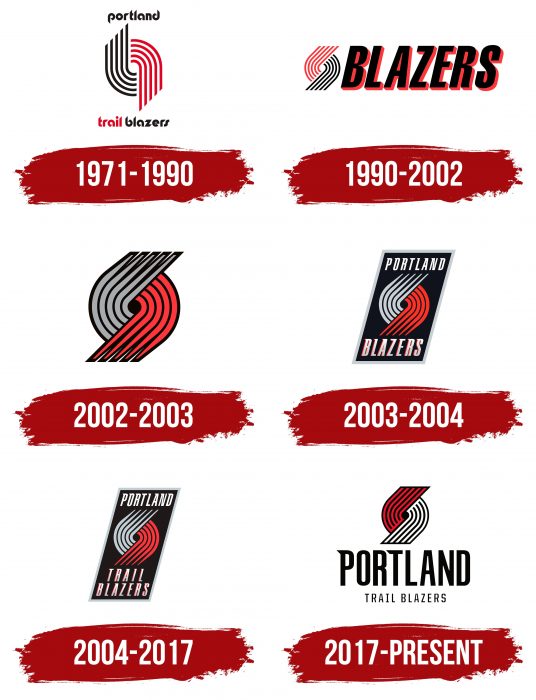
1971 – 1990
Almost 50 years ago, Portland, Oregon, became the hometown for a new basketball franchise with the quite catchy name “Portland Trail Blazers.” Frank Glickman drew a spinner consisting of ten curved lines. Five black stripes on the left denote the offense, and five red stripes on the right represent the defense. The empty hole in the center symbolizes a basketball game in which the participants of the two teams met. The bends create a sense of speed, as the players don’t stand on the court but are in constant motion. The word “Portland” is written in lowercase. Below is the phrase “Trail Blazers.”
1991 – 2002
After 19 years, the team’s emblem was changed, but slightly. From the 1991 season, the spinner became slanted. Designers rotated it 45 degrees and reflected the colors so that the left side was red and the right side was black. They also reduced the scale and placed a red-black italic inscription “BLAZERS” next to it.
2002 – 2003
The team’s third logo change brought volume and a three-dimensional look. In 2002-2003, a modernized logo appeared without text elements. Artists again changed the colors, but this time, they made five gray stripes, while the black highlighted the outlines and central hole. At the same time, they narrowed the ends of the lines, giving them a pointed shape.
2003 – 2004
In the new version of the emblem, the whirlwind is placed inside a black parallelogram with a thin silver frame. The same geometric figure represents the basketball club’s name, divided into two parts: “Portland” in the upper part and “Blazers” in the lower. The font is italic with small sharp serifs.
2004 – 2017
In 2004, updates were made aimed at improving graphics, not a complete design change. The inscription was supplemented with the word “Trail,” placed directly above “Blazers.” Also, the developers reduced the letter size, allowing the parallelogram to be narrowed vertically.
2017 – present
In 2017, the team’s owners again contemplated changing the logo. Moreover, they considered a global change to create a new concept from scratch. They organized a focus group involving fans and found out that everyone sees the spinner as the main symbol of the “Portland Trail Blazers” and wants to keep it. It was decided to retain the iconic sign but slightly change its shape and color. This mission was entrusted to designer Rodney Richardson, who owns his studio in Mississippi.
The main changes were made to the drawing, where the red lines were directed upward and the white ones – downward. In addition, the designers united them under one black contour line, both above and below. They also spelled out the word “Portland” in large black letters. The letters “P” and “T” were made with serifs – small lines at a 45-degree angle. As explained by one of the “Blazers” players, this refers to the 45th parallel, going north and passing through Salem, Oregon. The inscription “Trail Blazers” is located below the city name.
Portland Trail Blazers: Interesting Facts
The Portland Trail Blazers, or just the Blazers, are a basketball team from Portland, Oregon. They play in the NBA and have a lot of fans in the Pacific Northwest.
- Beginning: The Blazers started 1970 as a new team in the NBA. This was exciting for people in Portland because they had their professional basketball team.
- 1977 Championship: The Blazers won their first NBA Championship only seven years after they began. Players like Bill Walton and Maurice Lucas helped them beat the Philadelphia 76ers and take home the trophy.
- “Rip City”: This nickname came from an announcer during a game. He got excited about a long shot and yelled, “Rip City!” It stuck, and now people call the Blazers “Rip City.”
- Bad Luck with Tall Players: The Blazers had some tough times with their tall players getting hurt. Bill Walton got injured after helping them win the championship, and they picked Sam Bowie in the draft instead of Michael Jordan, which didn’t work out so well because Bowie got hurt a lot.
- Playoffs Streak: From 1983 to 2003, the Blazers made it to the playoffs 21 times. That’s impressive and shows they were a strong team for a long time.
- Their Mascot: Blaze the Trail Cat is the Blazers’ mascot. He started in 2002 and is loved by fans for his funny moves and community service.
- Helping Others: The Trail Blazers Foundation helps kids and families who need it in Oregon and Southwest Washington. They focus on education, helping the environment, and supporting local groups.
- Cool Court: The Blazers’ court at the Moda Center has a special pinwheel design. It shows five players from each team coming together, which is also part of the Blazers’ logo.
- Amazing Fans: The Blazers are known for having dedicated fans. They had sold out games for 18 years straight, from 1977 to 1995, which was a record.
- Famous Players: Some great Blazers have been Bill Walton, Clyde Drexler, Terry Porter, and Damian Lillard. They’ve all helped make the team what it is today.
These facts show how special the Portland Trail Blazers are on the basketball court and their community.
Font and Colors
The modern logo of the club contains the familiar spinner. But it looks unusual: the left side consists of alternating red and black lines, and the right side is black and white. The stripes have the same thickness throughout the length and are cut off at the ends, as they were in 1991-2002.
The meaning of the drawing has not changed: it denotes players of two teams that have met in one arena. Below is the inscription in two lines, “PORTLAND TRAILBLAZERS,” with the first word significantly larger than the second and third. This technique allowed us to emphasize the name of the city.
The 2017 emblem uses an updated font. In the word “PORTLAND,” only the letters “P” and “T” have serifs. They are located in the upper left part and look like small triangles at a 45-degree angle. This value was chosen deliberately: the angle represents the 45th parallel of northern latitude.
All logos of the basketball team Portland Trail Blazers contain its official colors: white, black, and red. Only the shades have changed over the decades, although sometimes silver-gray was added to the primary colors.
Portland Trail Blazers color codes
| Red | Hex color: | #e03a3e |
|---|---|---|
| RGB: | 224 58 62 | |
| CMYK: | 0 91 76 6 | |
| Pantone: | PMS 186 C |
| Black | Hex color: | #000000 |
|---|---|---|
| RGB: | 6 25 34 | |
| CMYK: | 30 0 0 100 | |
| Pantone: | PMS Black C |
FAQ
What should the Portland Trail Blazers logo look like?
The full version of the Portland Trail Blazers logo should consist of an abstract drawing and a wordmark. The upper element is a spinner formed from two blocks of curved lines on a black background. One half contains five red stripes, and the other contains five white. The team’s name should be placed under the abstract image: PORTLAND in the first line and TRAIL BLAZERS in the second.
Why is the team called “Rip City”?
This nickname was coined by announcer William W. Schonely when, during one of the most tense moments of the match, he exclaimed: “Rip City Baby!”. As the sports commentator later admitted, he himself does not know how this phrase came to his mind.
Why the “Trail Blazers” logo?
The two sides of the “spinner” in the Portland Trail Blazers logo represent two teams competing against each other. The red and white lines represent players – five on each side.
What does the Portland logo represent?
The upper part of the Portland Trail Blazers logo is shaped like a paragraph sign. This element consists of white and red lines on a black background. Below is the name of the franchise, divided into two lines. A separate black font is used for the inscription. The first letter, “P,” has a triangular notch.
