


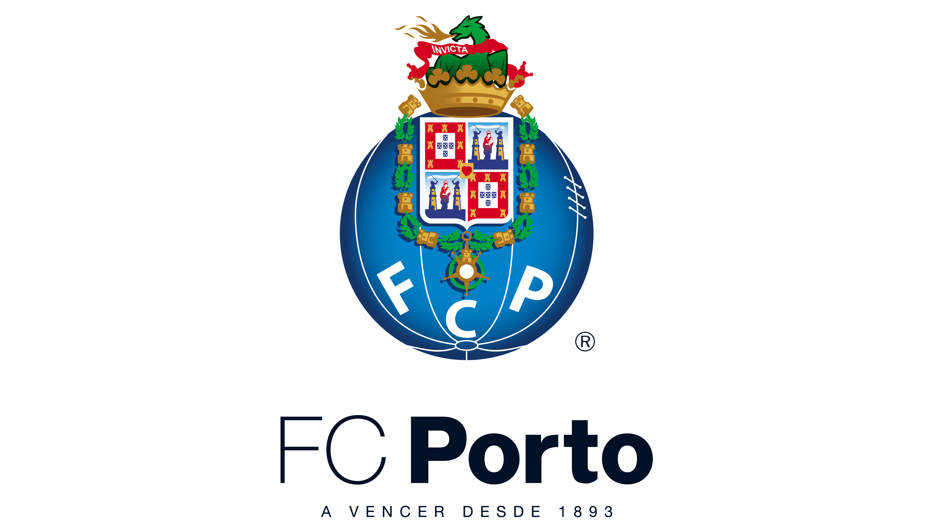
![]() Porto Logo PNG
Porto Logo PNG
The logo Porto combines symbols of history and strength. The emblem features a tower, a dragon, and the Virgin Mary. These elements are tied to the country’s culture and traditions. The main colors trace back to royal heraldry, emphasizing national pride.
Futebol Clube do Porto was founded on September 28, 1893, by António Nicolau de Almeida, a wine merchant who introduced football to Portugal. The date matched the birthday of King Carlos I and Queen Amélia. The first match took place on March 2, 1894, against Lisbonense, attended by the royal couple.
After Almeida stepped away, the club declined until August 2, 1906, when José Monteiro da Costa revived it and became president. In 1909, he fixed the blue and white colors, aligning them with the national flag, and invited coach Adolphe Casseigne.
Porto won its first trophy, the Campeonato de Portugal, against Sporting CP in 1922. In 1934–35, the club became the first champion of the Primeira Liga, though Benfica and Sporting CP remained dominant rivals.
A new era began in 1982 when Jorge Nuno Pinto da Costa became president. In 1984, Porto reached the Cup Winners’ Cup final but lost to Juventus. In 1987, under Artur Jorge, the team beat Bayern Munich 2–1 in the European Cup final, then added the UEFA Super Cup against Ajax and the Intercontinental Cup against Peñarol.
Between 1995 and 1999, Porto won five consecutive league titles. In 2002, José Mourinho took charge, winning the league and UEFA Cup in 2003 against Celtic, then the Champions League in 2004 against AS Monaco.
In 2011, under André Villas-Boas, Porto won the UEFA Europa League, defeating Braga 1–0 on a goal by Radamel Falcao.
Meaning and History
![]()
What is Porto?
It is the abbreviation for the Portuguese professional football club FC Porto. Located in the eponymous city, the club was founded in 1893 by Antonio Nicolau de Almeida. Over time, the team advanced to the top division (Primeira Liga) and became the country’s second-most trophy-winning club, having won 83 trophies. The team’s home stadium is the Estádio do Dragão.
1908 – 1913
![]()
No one can say for certain when Porto first adopted a logo. When the team was founded in 1893, there was no emblem yet. Most researchers agree that it was introduced in 1908. Even then, the monogram with interwoven letters became the team’s calling card.
Three capital letters, F, C, and P, together form a solid composition. The elements overlap and intersect, creating a unified image. The strokes are rounded.
The monogram is placed inside a dark blue circle. Against this background, the white lines stand out strongly.
1913 – 1921
![]()
When Porto simplified its emblem in 1913, the football club opened a new chapter in its brand history. The complex monogram was replaced with the simple abbreviation FCP, and the familiar circle was stylized as an old football.
The logo is rendered in blue with white details. Inside the circle, the outline of an early 20th-century leather football with lacing is drawn. From the central point where the segments meet, soft, smoothly curved lines extend, imitating the seams and design of balls from that era. The ball’s lacing is indicated by neat hatching on the right side.
The FCP abbreviation centered is set in a simple sans-serif typeface, similar to Franklin Gothic or a Grotesk style. The ball elements and the lettering do not intersect and complement each other organically.
This emblem emphasized the club’s connection to football, marked its initials, and distinguished it during the early years of development.
1921 – 1983
![]()
In 1921, the Porto emblem received a new design. It was created by team player Augusto Baptista Ferreira, known at the club as a talented artist. After a board meeting, he used the previous symbol, with the ball as the base, and added signs for the city and the state. The ball was rotated, and the FCP abbreviation was moved downward, freeing space for a complex heraldic composition.
In the upper half of the logo, a multicolored coat of arms appeared, combining symbols of Porto and of Portugal. The shield is divided into four sections with Portuguese imagery, including depictions of towers, castles, figures resembling the Virgin Mary with the Child, and a royal shield with dots.
Above the shield is a golden mural crown, inside which sits a green dragon with a red ribbon. The ribbon bears the Latin inscription INVICTA, meaning undefeated. The side parts of the coat of arms are decorated with towers, wreaths, and swords linked by a chain. At the bottom are crossed flagpoles, round badges, and a medal with a ribbon.
The background of the logo remains the earlier stylized blue football. From its lower point, extend white lines that imitate the seams of an old leather ball. On the right, a vertical stripe with cross-hatching remains, depicting the lacing. The three letters F, C, and P are placed at the bottom in a semicircle.
The new complex club symbol reflected a close connection between football and Portugal’s history and culture, becoming the team’s visual identity for decades.
1983 – 1995
![]()
In 1983, FC Porto introduced an updated logo that retained the previous foundation while gaining brighter colors and new details. The ball background remained unchanged, still stylized as an old leather model, but took on a purple tone. The white club abbreviation F, C, and P is placed in a semicircle at the bottom.
The shield placed over the ball became brighter. The four sections of the coat of arms received more precise detailing. The towers and castles appear clearer, and the figure of Mary with the Child gained more defined outlines.
Below the coat of arms, in the lower part of the logo, the medallion was retained with its interior changed. It is now white, with the inscription VALOR • LEALDADE • MERITO around the edge, meaning Courage, Loyalty, Merit. Inside is an image of an open book with clean
1995 – 2005
![]()
By the mid-1990s, the FC Porto emblem had become so familiar and popular that it was decided to refresh it without overdoing the changes. In 1995, designers carefully refreshed the coat of arms’ colors. They replaced the image of the Virgin Mary, giving her a more realistic appearance rather than the static look of the previous version. The dragon on the crown became uniform in color.
The basis of the coat of arms remains a shield divided into four sections. In two red fields arranged diagonally, there are seven gold castles and five blue shields with white dots forming a cross. The other two fields are light blue. In them, between golden towers, stands a woman with a child, her clothing rendered in red and blue. Above her head stretches a white ribbon with the Latin inscription CIVITAS VIRIBVS VNITA. At the center is a small gold shield with a red heart.
A wreath of dark laurel branches with yellow castle-shaped knots frames the shield. Beneath it is a bright yellow medallion surrounded by a green laurel wreath. In its upper part is a castle, and around the edge is the inscription VALOR • LEALDADE • MERITO. At the center is an open book with black lines resembling text, symbolizing knowledge and loyalty to tradition.
The purple ball with white arched lines continues to form the logo’s base. At the bottom are three letters: F, C, and P. The typeface used is strict and geometric, similar to well-known families such as Eurostile or Gill Sans Bold Italic.
2005 – 2010
![]()
In 2005, the Porto logo was updated again. The changes affected the shades of the coat of arms. The towers and the crown, which had long been bright yellow, turned a calmer orange. The image looks more restrained, without the former brightness.
The dragon figure remained part of the design, even though it is no longer present in the official city coat of arms of Porto. From the open mouth of the green creature, a small orange flame is now shown. Otherwise, the dragon kept its previous pose and shape, continuing to hold the ribbon with the Latin motto INVICTA.
The shield is still divided into four fields, each bearing historical symbols. All details of the coat of arms, including inscriptions and decorative elements, remained unchanged.
The stylized blue circle continues to serve as the background. The blue color took on a noble, muted hue. The three letters of the club’s abbreviation, FCP, are set in a strict sans-serif typeface. The ball image retains recognizable white lines reminiscent of the seams of old sports equipment.
2010 – 2017
![]()
In 2010, the club decided to refresh the logo, for the first time using gradients and shadow effects. The crest’s appearance deepened and grew brighter. For example, the old football is now colored with a smooth transition from dark blue to a lighter tone, creating a sense of volume.
The crown at the top took on orange tones, transitioning from rich to lighter, adding a subtle shine. The dragon is rendered in several shades of green rather than a single solid color as before. The flame from its mouth remained small and orange.
The five-pointed star above the letter C is now colored exclusively orange and no longer depicts an open book. The bright yellow tone was removed. Light blue shadows were also added, emphasizing the towers’ shapes and the wreaths on the shield’s sides.
The main design elements stayed in their previous positions but appear more refined due to the new approach to color and shading.
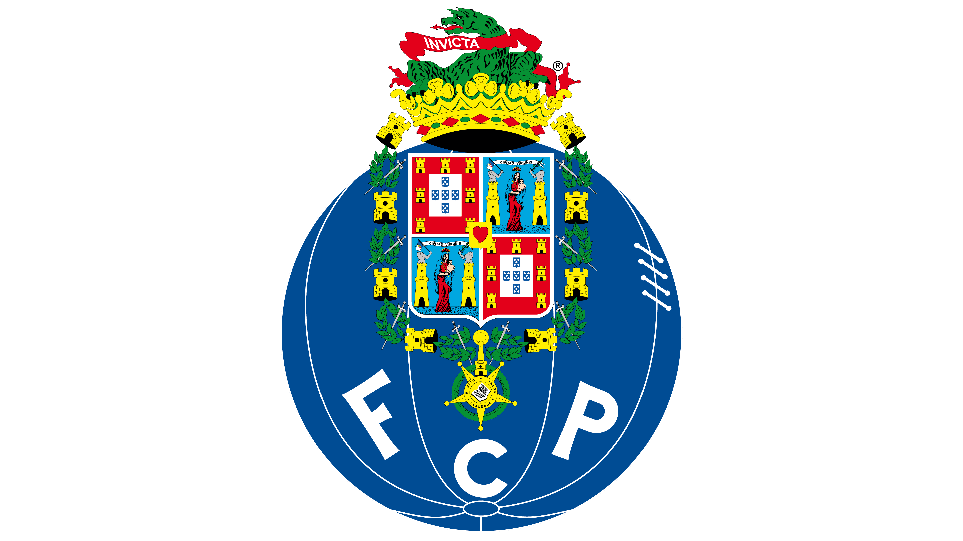
2017 – today
![]()
In 2017, Porto slightly updated the emblem once again, deepening the color of the stylized football. The dark blue circle became even richer, and the sense of volume shifted as the light source shifted slightly to the right. As a result, shading appeared on the left, with a soft highlight on the right.
The towers, crown, and heraldic figures remained in place, keeping the orange tones and the green dragon above. The main coat of arms with the image of Mary and the child, the shields with dots, and the red heart also remained unchanged.
Font and Colors
The FC Porto emblem, interestingly, plays with the country’s and the city’s primary symbols. They are combined with the old team graphic sign, which, until 1922, depicted a ball with the inscription “FCP.” Almost a hundred years have passed since the original emblem appeared. During this time, the “Porto” coat of arms changed: the dragon was removed in 1940. But the club decided to leave this historical image in its usual place.
As a result, the dragon, as many years ago, languidly lies within the crown and holds a ribbon inscribed with the word “INVICTA.” Perhaps such conservatism is related to the fact that the footballers’ home stadium is called Estádio do Dragão, and they are nicknamed Dragões.
The abbreviation “FCP” is unremarkable: it is set in a sans-serif font. Designers focused not on the lettering but on the graphic part, so they chose a combination of five primary colors: blue (#00428C), white (#FFFFFF), red (#D60019), green (#009634), and gold (#E9B245). Each of them, except white, has several shades of gradient.