As part of COMTEMP – Companhia dos Temperos, Ltd., Portuguese vinegar producer – Cristal has announced its rebranding. Vinegar and vinegar products of only natural origin characterize this production. Born from a dream since 1939, the production of white wine vinegar has expanded not only to new tastes of vinegar but also to a wide range of proposals based on lemon juice, pickled vegetables, olive oil, sauces. Cristal provides a worthy place for its entire assortment on the dining table and contributes to the health and quality of human nutrition.
Modern technologies, the psychology of today’s consumer – everything requires keeping up with the times, not only changing trademarks and their attractiveness. To keep, and even more so to attract new potential buyers, it is necessary to change the overall strategy, not stopping at half-measures radically. The company turned to the professional agency Judas Rocks (Lisbon, Portugal), which stands out for its creativity and originality of solutions, especially in grocery products.
A particularly important moment in this direction was the “indiscriminate” ban on tables by many people and even brands of such food seasonings that positively affect human health and nutrition. And the only reason is the lack of measure, correct application, and usefulness, which proclaims all permissible limits. Devaluation, lack of innovation, and the absolute lack of the ability to correctly approach products “drives” vinegar and seasonings into a sector inaccessible to the buyer. An outdated strategy, lack of potential, even a high-quality product can no longer change anything. Only radical changes that can break the wrong stereotypes can make Cristal a leader, making it a product worthy of its well-deserved recognition.
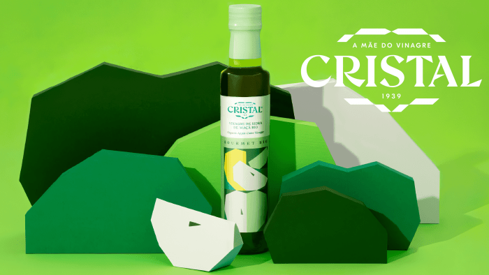
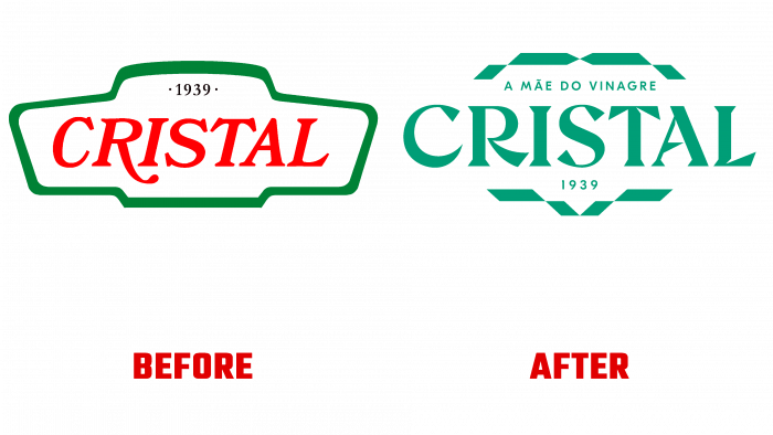
A new logo facilitated this with faceted notes and elegant graphics. The new, more sophisticated line refers the customer to crystalline purity. The common basis has retained its continuity in the same form. But the frame has been transformed into a more active and conceptual subtext signature. The ingredients have become the main starting points of the visual and graphic new universe created in the packaging and logo. The brand has become an independent element, freed from the very environment, outdated and unattractively familiar. The new identity is a completely new reinterpreted self-built on the glorious history of the brand.


