![]() Primerica Logo PNG
Primerica Logo PNG
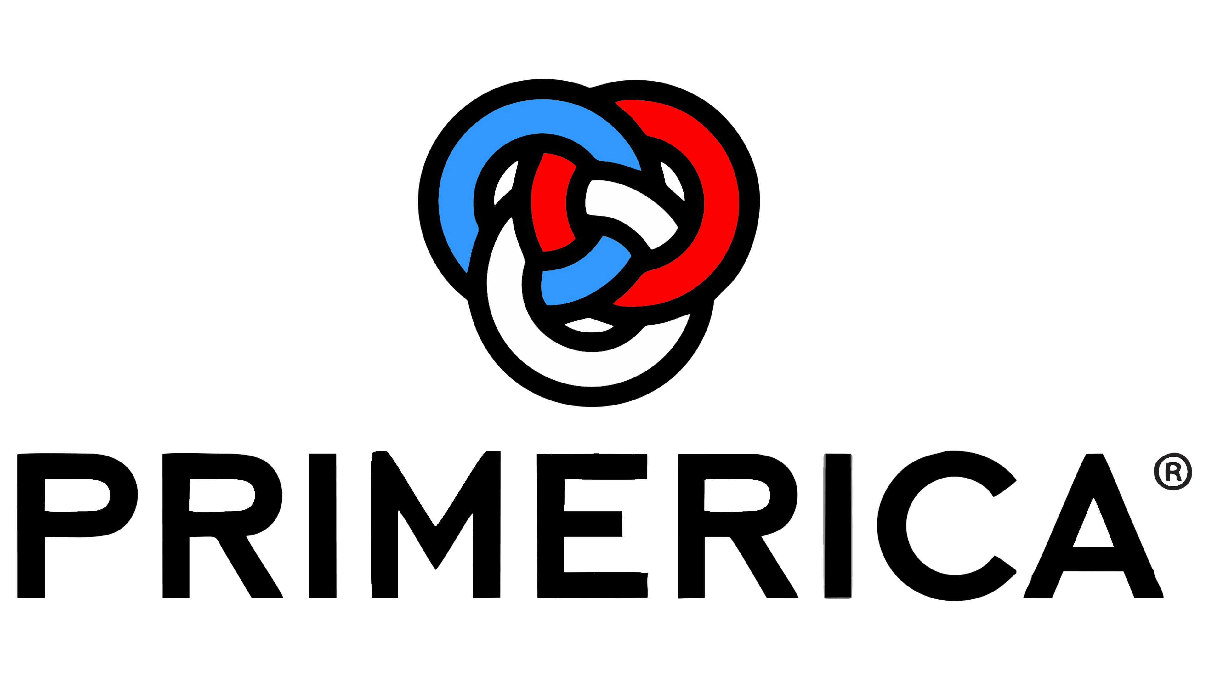
The Primerica logo symbolizes the close interconnection of different groups that together strive for financial well-being. This reflects the business model built on pyramid sales. Additionally, the emblem is associated with determination, care, and professionalism.
Primerica began on February 10, 1977, when Arthur “Art” Williams Jr., a former high school football coach from Columbus, Georgia, founded A.L. Williams & Associates in Atlanta. He started with seven founding partners and 85 agents, arguing against expensive cash-value life policies sold by the traditional insurance industry. His core message was “Buy Term and Invest the Difference.”
The company sold lower-cost term life insurance through a multi-level network of independent representatives, who sold policies and recruited new agents. In 1980, A.L. Williams partnered with Massachusetts Indemnity and Life Insurance Company, or MILICO, as the underwriter for its policies. By 1984, it had begun building headquarters in Duluth, Georgia. It sold $38.3 billion in life insurance, challenging companies such as MetLife and Prudential Financial.
In the late 1980s, financier Sanford “Sandy” Weill brought A.L. Williams under the umbrella of Primerica Corporation. This financial services group grew out of American Can Company. A.L. Williams became Primerica Financial Services, MILICO became Primerica Life Insurance Company, and the business added investment services. In 1993, Primerica acquired Travelers Insurance Corporation and, in 1994, became Travelers Group, with Smith Barney as one of its major assets.
Travelers Group merged with Citicorp in 1998 to create Citigroup, then the world’s largest financial company. Primerica stayed inside the group as a separate unit focused on middle-income families. That same year, the SEC fined PFS Investments over supervision failures in Michigan. In April 2010, Citigroup took Primerica public in a $320 million IPO, returning the company to independent public ownership.
Meaning and History
![]()
The Primerica logo with three multi-colored rings appeared in 2010. Before that, the brand had a long and convoluted history, which officially began in 1977 with the founding of A.L. Williams. However, Primerica’s true predecessor is American Can, a canning company established in 1901. In 1986, it divested its packaging division to focus on financial services. Under the agreement, the American Can name also went to the new owner, prompting an urgent rebranding of the enterprise.
The CEO, Gerald Tsai, wanted to handle the naming himself, but after initial attempts, he realized how challenging it was. Eventually, the company leaders sought help from Lippincott & Margulies, paying $200,000. The experts developed over 400 names, from which 13 were chosen. Among them, “Primerica,” a blend of “prime” and “America” (a nod to American Can), won. Lippincott’s staff also created a logo in which the company name was set in two different fonts: Antiqua and Grotesque, with the name presented in red. They highlighted the part “MERICA” to clarify the pronunciation. The rebranding was completed in 1987.
In 1993, Primerica acquired the corporation Travelers and took its famous name and red umbrella emblem. A few years later, Travelers Group merged with Citicorp, giving rise to the investment bank Citigroup. In 2010, Citi spun off its Primerica division into a separate business and sold its shares. It was then that the logo with three interconnected rings began to be used.
What is Primerica?
Primerica is an American company that provides financial services, manages investments, monitors credit, and sells insurance. Its business model is built on multi-level marketing, meaning anyone can join the system and sell financial products. The main office is located in Georgia, and the firm’s clients are residents of North America, predominantly the USA and Canada.
before 2010
![]()
The company’s name is displayed in large capital letters in two colors: red and black. The red color is used for the first three letters, “PRI,” while the rest of the name, “MERICA,” is presented in black.
The logo’s font is a sans-serif typeface, giving it a modern and professional appearance. The letters are bold, making the name easily readable and noticeable. Below the company name, the phrase “Membre de/A member of Citigroup” is set in a smaller, thinner font. This indicates an affiliation with Citigroup, underscoring the importance of partnership and reliability in the business.
A unique element in the design is a red umbrella positioned above the letter “J” in “PRIMERICA.” The umbrella is a recognized symbol of protection and shelter, reflecting the company’s promise to safeguard its clients’ financial interests. The color palette of red and black is chosen to convey energy and stability, respectively.
This logo conveys a message of strength and confidence, as well as the fact that the company is part of a large and respected group.
2010 – today
![]()
John Addison introduced the current emblem in February 2010. Its main element is the so-called Borromean rings. At first glance, this figure seems natural. However, from a geometric perspective, it cannot consist of three interconnected circles; in three-dimensional space, such a connection can only be made with ellipses. In the Primerica logo, one ring is blue, the second is red, and the third is white. They can be interpreted as the connection among indivisible entities: for example, the company, the sales department, and the clients.
The brand name is positioned on the right side and is written in black letters, which in color and thickness echo the bold outlines of the rings. The use of uppercase letters emphasizes the firm’s solidity and conservatism as a financial service provider. The absence of serifs gives the emblem an industrial look.
Font and Colors
One of Primerica’s official fonts is Interstate, designed by Tobias Frere-Jones. In the company’s logo, a modified version is used with a raised middle in the letter “M.”
In addition to the traditional white-and-black combination, the emblem also features blue (Pantone 279) and red (Pantone 485). They add variety, turning a simple geometric figure into a connection of opposites.