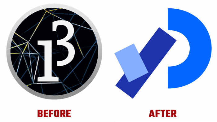
Launched in 2001 by Casey Reas and Ben Fry, the revolutionary open-source Java programming language has undergone a dramatic style change over the past 20 years. Design Systems International carried out the development of the new visualization, a company distinguished by an innovative approach to the design and integration of products, including software and various types of applications. When developing a new design, the essence of the product was taken into account – that it is a program. Moreover, it is exactly the one that is designed to work with images, animation, and interactive components based on the Java language, including for creating logos. For this reason, its logo ceased to be static but was made in a “program” style.
The new visualization was laid down in the very formation of the language. But only now has it manifested itself in its entirety – it is an “explosive” mixture of art and new technologies, games, and programming. The new logo demonstrates that the old does not mean “outdated,” and it can be updated, becoming accessible and useful for beginners while continuing to provide comfort and convenience for venerable programmers while having a wide range of functionality that covers any needs in their profile.
Its universal availability is the main principle, which is primarily reflected in the new brand name. The original performance of the sign, consisting of several scattered elements that visually make up the tilted letter “P” – the first of the name of the product itself, immediately attracts the eye and creates the impression of a started but not completed movement. The thick lines complementing the element are not connected to the hemisphere that forms the head of the letter. The simplicity of the element, as it were, speaks of the ease and speed of creating multimedia applications for various platforms using this program. The sign is made in three soft and close shade colors, which does not form visual disharmony, but immediately draws attention. The hemisphere is made in blue degrees, the oblique stroke is in sky blue, and the rectangle superimposed on the stroke and directed to the left is in a heavenly shade.
Under the sign, there is a text – the name of the program – Processing. It uses a gradient transition in various shades of blue – from lighter to indigo and purple-blue Crayola. The logo has acquired an original “sound” in comparison with the previous version. It has become laconic and not overloaded with elements, like itself, although a small but very effective and convenient program.


