The French search engine Qwant, developed in 2013 by QWANT S.A.S., announced the acquisition of a new visual identity, more accurately revealing the features and functionality of the brand. The system is positioned as providing guaranteed confidentiality, unlike existing popular analogs. Starting work in 2011, the creators immediately focused on the existing shortcomings of Google, trying to avoid them in their search engine, making it more comfortable and secure. An important difference was the lack of advertising revenue, making collecting user data unnecessary. For ease of use, the search engine has three types of interface, one of which is as close as possible to the existing options familiar to many. One of the promising areas of its development is children. The Qwant Junior system is intended for children aged 3 to 12 and provides for the formation of e-mail in the future. Today Qwant is available all over the world, except for Russia. The wide variety of features and offerings, as well as the expansion of the user contingent, was one of the reasons for the revision of the visualization system and the creation of a more relevant modern identity.
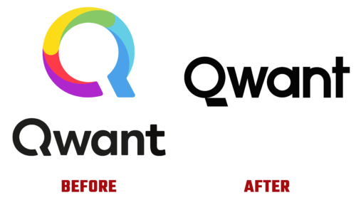
The new logo accurately and fully reflected the main mission of the search engine, aimed at protecting and respecting the digital personal data of users. The created corporate identity confirms the company’s ambitions, reflecting its purposefulness, positivity, and accessibility. The identity has become a reflection of the desire of the resource to provide users with the key to maintaining free will and privacy and receiving simple and affordable services. The created graphic universe is distinguished by its showiness and joyful atmosphere, which can be easily deployed both on a desktop computer and in mobile applications.
All this supports the conciseness of the visualization, focusing on the title, made in the original font in black monochrome. The first letter of the name has an attractive tail that adds stability to the whole composition, symbolizing confidence and stability, a high level of organization, and efficiency. The letter becomes a typography-friendly icon that unites all elements of the identity.
The simplified identity provided:
- A better reflection of important brand messages.
- Demonstrating its modernity and the desire to move forward constantly.
- Strictly complying with its obligations to users.
The update created the conditions for the ability to easily and quickly make changes when further changes appear.


