The release of a new branding identity for a large Birmingham-based company, Protective Life Corp, will occur very soon. The new logos are expected to be seen both at the company’s offices and the corporate stadium.
The new identity is a logical continuation of a fruitful collaboration with Lippincott’s large global creative consulting firm after favorable and loyal feedback from employees, customers, and partners. Like other vibrant brands, it is recommended that they refresh their visual image periodically, as expressed by President and CEO Rich Bielen, insisting that the brand’s strengths and current market position will be key to the brand’s future success and development. How the brand has established itself fully reflects its mission and values. This is life insurance, protection of citizens, safety in all respects – health, business, property.
In addition, the fact that the speaking name of the company expresses commitment to the client’s side and dedication to its work once again confirms that the brand clearly understands what it wants to say to the target audience, where it is directed, what it wants to promote further.
Over the past three years, the company is estimated to have increased profits by 41%, and revenues increased by 48%. In connection with the coronavirus pandemic, the “defenders” quickly transferred their activities to the framework of virtual personnel, optimizing business processes.
The brand’s management emphasizes that the company has recently strengthened its position. Demonstrated to clients the spirit of “endurance and safety” through adaptation mechanisms to changing business circumstances, showed resilience and innovation. She also revealed the cohesion of the team of partners and proximity to the audience, simplifying complex procedures, instructing, and helping to adapt to the new time.
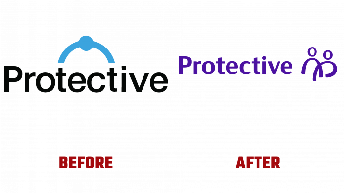
These semantic aspects are conveyed by the new logo, which is made in a dark blue shade. Interestingly, the logos of such large companies usually leave the graphic element on the left side of the logo itself, but in this case, the creatives decided to put it on the right. The name with a capital letter, a simple font, quite soft and rounded, without square accents, and an emblem – two people. The figures are marked with arcs and circles of the letter “O.” An elegant and stylish logo as part of a new identity will undoubtedly bring more success to the brand over time. After all, this is a real conversation with the target audience, attention to its needs, and response to circumstances.


