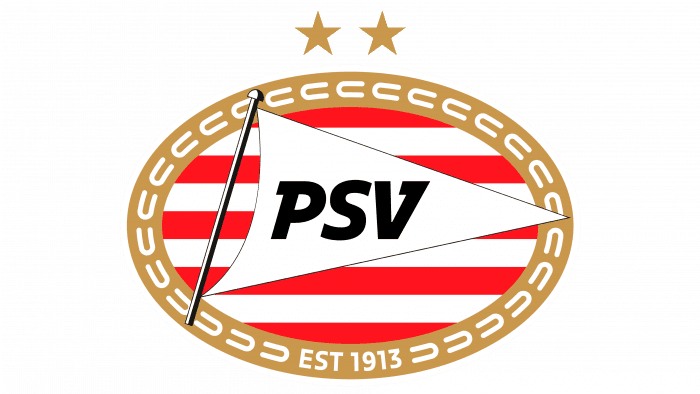
The PSV logo indicates a flagship football team capable of representing the Netherlands in front of the global community. There is pride in our roots and a desire to perform well on the field, creating a legendary future in the emblem.
PSV: Brand overview
| Founded: | 31 August 1913 |
| Headquarters: | Eindhoven, Netherlands |
| Website: | psv.nl |
Meaning and History
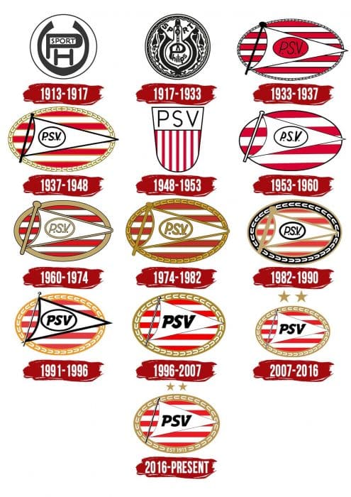
The first Philips Sport Vereniging emblems reflected the club’s close relationship with the electronics giant. A little later, an oval logo appeared, which featured a triangular pennant and the abbreviation “PSV.” Designers changed it at least nine times, experimenting with colors, fonts, and decoration. The modern version differs from the earlier incarnations only by the presence of two gold stars at the top and the inscription “EST 1913” at the bottom.
What is PSV?
PSV is the abbreviation for Philips Sport Vereniging, a football club from the Netherlands, better known as PSV Eindhoven (based on its location). It was founded in 1913 by Philips employees. The team has two brilliant eras associated with winning the UEFA Cup (1978) and European Cup (1987-1988 season). As of 2021, they ranked 56th in the UEFA ranking.
1913 – 1917
The first coat of arms of the PSV was simple in form and content. It consisted of a circle surrounded by a black line. On a white background were the letters “PH” and “V,” representing the club’s initials. On the inside of the “P” was the word “SPORT.” All letters were monogrammed, with the “V” looking like the bulb of an electric light bulb.
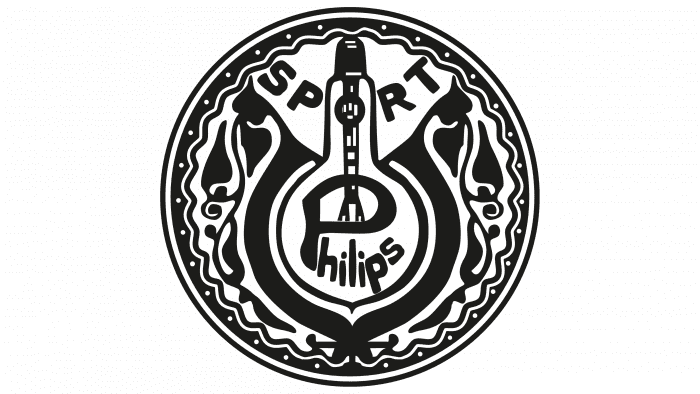
1917 – 1933
In 1917, the designers developed a new logo, keeping the classic round shape. This time, they depicted a real light bulb with the inscription “PHILIPS” to highlight the origins of the PSV. The monogram has disappeared, and the word “SPORT” has moved up. The remaining space was decorated with a black and white floral ornament. This version was used until 1933 but returned briefly in 2016 when players wore special commemorative jerseys.
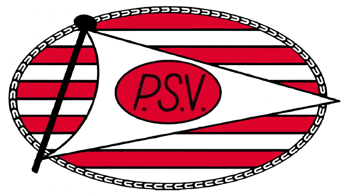
1933 – 1937
In 1933, the iconic emblem appeared with a striped oval, a triangular pennant, and the inscription “PSV” The letters, flagpole, outlines, and borders were black. The horizontal lines were red and white to match the team uniform.
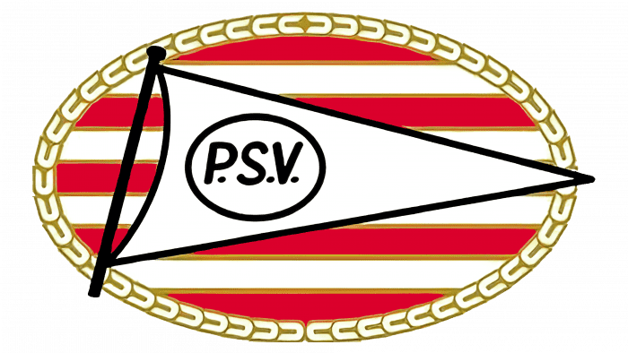
1937 – 1948
The mini oval on the flag is white. The figured ornament around the large oval is golden, as are the red and white stripes’ dividing contours.
1948 – 1953
In the late 1940s, Philips Sport Vereniging has adopted a heraldic shield logo split in two by a thin black line. At the top, in a white rectangle, was the team’s abbreviated name. The bottom was adorned with vertical red and white stripes, which became a hallmark of the PSV’s image.
1953 – 1960
The designers transformed the old emblem with an oval and triangular pennant. To do this, they changed the number of horizontal lines, made all the outlines thin and black, and at the same time repainted the inside of the flagpole white.
1960 – 1974
The large oval, the flag, and the red and white stripes now have a gold border. The small oval, the flagpole, and the inscription are the same gold.
1974 – 1982
The frame around the logo became curly, as in 1937-1948. The ornament consists of a chain of repeating horseshoes.
1982 – 1990
The emblem has returned to black. It painted letters, a small oval, and the inner part of the frame.
1991 – 1996
In the early 1990s, points after “P,” “S,” and “V” have been removed. The golden dividing lines between the white and red stripes have also disappeared. The frame is orange, and the pennant and flagpole are black and white.
1996 – 2007
The designers removed the small oval from the flag, enlarged the abbreviation, and made the frame gold.
2007 – 2016
Added two gold stars to the emblem, which PSV earned for winning twenty championships.
2016 – today
The year the club was founded appears at the bottom of the frame. The inscription “EST 1913” divides the horseshoe ornament into two parts.
PSV: Interesting Facts
PSV Eindhoven, short for Philips Sport Vereniging, is more than just a soccer team. It’s a big part of soccer in the Netherlands and Europe.
- Started by Philips: In 1913, the Philips company made a team for its workers in Eindhoven. This team grew up with the city, making it a big part of what Eindhoven is known for.
- Philips Stadion: They play games at the Philips Stadion in Eindhoven. It’s been their home for a long time and has been updated to stay modern but keep its old charm.
- European Champions: In 1988, PSV won the UEFA Champions League, showing they’re one of the top teams in Europe.
- Winning in the Netherlands: PSV has won many Eredivisie titles, making it one of the best teams in the country. They were especially good in the late 1980s and early 1990s.
- Great Youth Program: They’re known for training young players who do well in the Netherlands and other countries. Training young talent is a big part of their plan.
- Big Rivalry: PSV and Ajax have a huge rivalry called “De Topper.” Their games are very exciting and can change who wins the Eredivisie title.
- A Special Season: The 1987-1988 season was amazing for PSV. They won the Eredivisie, the KNVB Cup, and the European Cup all in one season.
- Smart Management: PSV runs the team using smart management methods, such as scouting, sports science, and data, which helps it stay competitive.
- Loyal Fans: PSV fans are passionate and make games at the Philips Stadion exciting. They are a big part of the team’s success.
- Helping the Community: PSV works well outside soccer with the PSV Foundation. They work on health, education, and social projects to help the community.
PSV Eindhoven’s long history of success, smart planning, and close ties to its community make it a well-loved and respected soccer team in the Netherlands and beyond.
Font and Colors
The Philips football team has a unique image. Moreover, its graphic sign does not overlap with the elements of the parent company’s identity – it is based on individual PSV symbols. These include the red and white stripes that adorn the players’ uniforms and the triangular pennant with the abbreviated club name. The oval shield is considered classic – it has been in use since 1933.
In the early 1990s, designers have developed a new font for the abbreviation “PSV.” Its characteristic feature is rectangular serifs directed in different directions. Simultaneously, the letters and numbers in the inscription “EST 1913” do not have serifs.
The main colors of the logo are red (# f00000) and white (#ffffff). They are also presented on the outfit of football players. The club’s official palette was chosen by Jan-Willem Hofkes, who noticed how well a white notebook and a red raspberry drink work together. Also, some elements are colored black (# 000000) and gold (# a8862d).
PSV color codes
| Red | Hex color: | #f00000 |
|---|---|---|
| RGB: | 240 0 0 | |
| CMYK: | 0 100 100 6 | |
| Pantone: | PMS 172 C |
| Black | Hex color: | #000000 |
|---|---|---|
| RGB: | 0 0 0 | |
| CMYK: | 0 0 0 100 | |
| Pantone: | PMS Process Black C |
| Gold | Hex color: | #a8862d |
|---|---|---|
| RGB: | 168 134 45 | |
| CMYK: | 0 20 73 34 | |
| Pantone: | PMS 7556 C |

