 PwC (PricewaterhouseCoopers) Logo PNG
“The company will help keep business records. It will bring the calculations to a common denominator.” Such a message contains the PwC logo. The organization works with firms in different directions and owns various tools that lead clients to success.
PwC: Brand overview
| Founded: | 1998 |
| Headquarters: | London, England, UK |
| Website: | pwc.com |
Meaning and History
PwC has an incredibly long history and rich experience, dating back to the mid-19th century. It was then that two specialized organizations arose that dealt with accounting issues. Price Waterhouse was founded in 1849, and Coopers & Lybrand was founded in 1854. In the 20th century, they merged to form a single structure that expanded the scope of financial advisory activities. They formed a modern company with a new identity, so the old logos don’t count.
Both firms were originally London-based. Accountant Samuel Lowell Price created Price Waterhouse. He later teamed up with two more partners, which strengthened the position of the service. In 1890, she began to open her own offices in the United States. Coopers & Lybrand opened William Cooper, who then recruited his brothers to work. There have been many mergers in the history of this firm, and it has repeatedly changed the composition of the owners. The service received its generally recognized name in 1957 when it moved to the international level.
The modern PricewaterhouseCoopers chain was named after its founders. To offer something original but connected with roots, the guide merged the names of both companies into one whole. The history of the emblems of the new structure starts from the moment of its appearance.
1998 – 2010
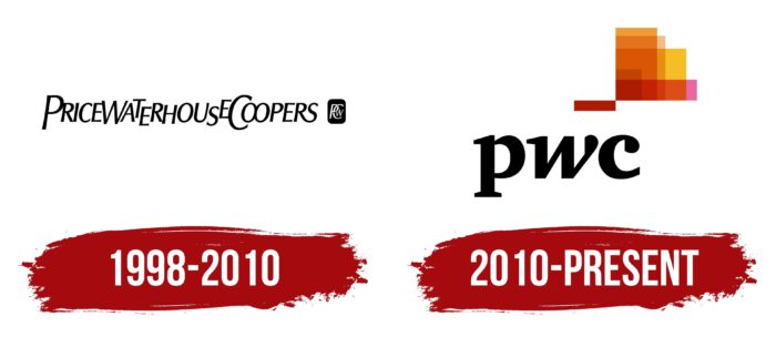
The debut logo consisted of the full name of the company. It merged the names of Price Waterhouse and Coopers & Lybrand. The result is a long and hard-to-read inscription. It was typed in thin type with uppercase letters. Moreover, the characters were located unevenly – not in one line. They were placed at different heights, which gave the impression that they were cramped. P, W, and C were larger than the rest. Alongside (right) was a miniature graphic monogram of intertwined letters. The background was a vertical rectangle with rounded corners.
2010 – today
Designer Wolff Olins created the current logo in collaboration with PwC. He removed all the bulky elements, illegible lettering, and small icons, offering a modern alternative to visual identity. The developer removed the rectangle and placed the letters separately by converting them to lowercase and using serifs. He left the color of the text the same – black. Above the abbreviation is a multi-structured figure consisting of many geometric elements of different shapes. Although they are superimposed on each other, they are still clearly visible since they are made translucent and highlighted in color. It’s the epitome of the services the company handles, from accounting services to consulting.
Font and Colors
The international British chain presented a redesign plan at the beginning of 2010, and in the end, received an updated logo. It is transparent, which emphasizes the transparency of the company’s work. Previously, the emblem was monochrome, but it became a color after modernization.
The current version uses a serif typeface called ITC Charter Black, and the first version uses the serif typeface Helvetica. Six colors were chosen for the logo: Standard Black, China Pink (# E669A2), Orange-Yellow (# F3BE26), Beer (# E88D14), Tenné (Tawny) (# D85604), and Rufous (# AD1B02). Due to transparency and superposition on each other, they get a more intense shade in each new shape.
PwC color codes
| China Pink | Hex color: | #e669a2 |
|---|---|---|
| RGB: | 230 105 162 | |
| CMYK: | 0 54 30 10 | |
| Pantone: | PMS 212 C |
| Orange-Yellow | Hex color: | #f3Be26 |
|---|---|---|
| RGB: | 243 190 38 | |
| CMYK: | 0 22 84 5 | |
| Pantone: | PMS 7408 C |
| Beer | Hex color: | #e88d14 |
|---|---|---|
| RGB: | 232 141 20 | |
| CMYK: | 0 39 91 9 | |
| Pantone: | PMS 1495 C |
| Tawny | Hex color: | #d85604 |
|---|---|---|
| RGB: | 216 86 4 | |
| CMYK: | 0 60 98 15 | |
| Pantone: | PMS 1655 C |
| Rufous | Hex color: | #ad1b02 |
|---|---|---|
| RGB: | 173 27 2 | |
| CMYK: | 0 84 99 32 | |
| Pantone: | PMS 485 C |
| Black | Hex color: | #000000 |
|---|---|---|
| RGB: | 0 0 0 | |
| CMYK: | 0 0 0 100 | |
| Pantone: | PMS Process Black C |


