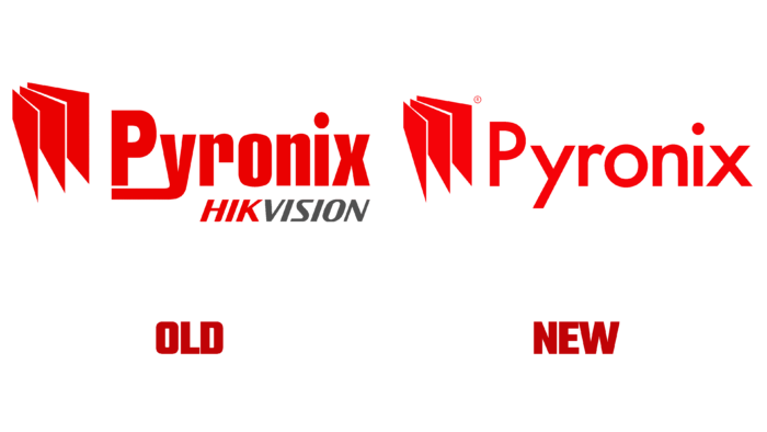
In 2021, the company turns 35, and in honor of its long presence in the market, Pyronix decided to present a new update. The brand is focused on the UK and Irish markets. Changes in visual identity are aesthetics for a company and a broadcast of experience, heritage, and history.
The company logo is made in red and consists of a graphic part and a name. An animated version of the picture can be seen on the Pyronix website. The font chosen for the logo fits perfectly into the concept of all changes, conveying the company’s status as a market leader.
The brand updates reflect the market position and reveal the brand as a forward-looking, fresh, and reliable organization, the company says. Pyronix’s main mission is to help its customers improve their installation business by creating quality products and services. Updates will even affect packaging and other materials in the coming months.
The company also claims that such changes are evolution, but not revolution. The company wants to emphasize that it is the guarantor of quality in the UK and Irish markets and creates the best solutions for its customers. Additionally, the updates convey the essence of the firm: customer orientation, specific markets, and local production. In May 2016, the Hikvision group of companies acquired Pyronix, and the brand still operates as part of a larger organization. Shortly, the company will present new products and solutions.


