The rebranding of one of the fastest-growing US brands made the company’s visual identity interesting and friendly.
Pyure Organic is headquartered in Naples, Florida. The brand is renowned for producing and manufacturing quality, low-calorie sugar substitutes, bakeware, and milk modifiers. The company’s products do not contain GMOs and consist of organic components.
The updated design was developed by the marketing and media agency Ideabar. The team presented a marketing strategy aimed at growing the business and increasing capital for Pyure Organic. Ideabar’s work is based on consumer research and surveys, which ultimately became a key factor in creating the design and strategy for 25 Pyure Organic products. The main goal of the rebranding is to challenge sugar and take the lead among sweeteners in America.
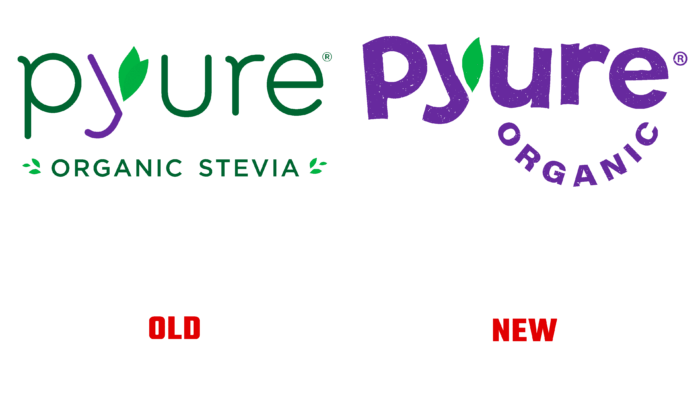
A friendly, fun font with a grainy texture was used for the logo. The vibrant purple color combined with the chaotic lettering significantly refreshes the brand and grabs attention. Small emphasis was placed on the letter “y,” replacing one piece with a piece of paper. The packaging is complemented by colorful photographs of sweets on a light background. Additionally, the company presented its new slogan, “Love is pure. Pyure is love.”.
The representatives of Pyure Organic and Ideabar agency were pleased with the work done. CEO Benjamin Fleischer shared that making plant-based sugar substitutes is his passion. The idea of love is conveyed not only through a slogan but also through a quality product. According to the CEO, the rebranding reflects the dynamics of the product line and provides an opportunity to showcase a new look.
In turn, the Ideabar agency said that they were pleased to cooperate with a brand that cares about customers’ well-being. Pyure Organic provides consumers with choices to live a better life that aligns with the agency’s values.


