The Qatar National Tourism Board decided to rebrand the iconic design and national brand identity to increase awareness and prestige. This task was entrusted to the company Tarek Atrissi Design (Barcelona, Spain). Thus, it was intended to show that cultural authenticity is closely intertwined with the breath of modernity in the country. This will allow foreign citizens to become closer to the peculiarities of the country’s sports, cultural, historical, family, business, and spiritual profile.
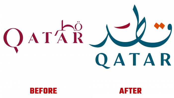
During the logo development, the basis of the historical concept was preserved, and the former design was recreated. Due to the development of digital technologies, it became possible to improve the quality of lines, clarity, and compliance with the original color shades of the palette, which was impossible to bring to life in its first performance.
The new Qatar logo incorporates an interweaving of elegance and innovation, expressed in the Arabic letters used. With its simplicity, he attracted much more attention to himself while not focusing on specifics. Abstraction of forms leaves a lot of room for imagination, due to which the viewer himself complements the general visual perception of the picture. Inspired by the beautiful nature of Qatar, Tarek Atrissi Design has chosen four colors for the logo, which hide a specific meaning behind them. Dark blue – as the main one, implies the water expanses of the country, and in the orange color, you can see the sunrise from behind the dunes. The other two colors are national, which can be seen on the country’s flag.
The logo was worked out to the smallest detail, and two variations were made for different needs. One is initially used exclusively on a white background; the other, on the contrary, is used upside down against a background of any other color. The second option includes lighter letters compared to the background so that in both cases, they have the same meaning. The Latin text has also been added to contrast with Arabic characters. For a greater emphasis, the Arabic version of the country’s name that the Latin characters are made in lighter colors.
The work done by Tarek Atrissi Design to update the logo took a long time. The process involved designing design, for which it was necessary to delve deeper into research in other directions. It all ended with creating a new calligraphic font that can organically combine the Arabic and Latin variations of “Qatar.” In addition, early developments were used, which were incorporated into the final version of the logo, presented to the general public today.


