In a bold move to reinvent its digital presence, QoQa, the Swiss e-commerce platform known for its flash sales, has unveiled a vibrant new brand identity. The innovative QoQa logo, crafted by Base Design, represents a significant transformation from its earlier version, underscoring the platform’s commitment to dynamic online retail and active community engagement.
Since its inception in 2005, QoQa has carved a niche in the e-commerce sector, amassing over 950,000 members, affectionately termed ‘QoQasians.’ These members relish exclusive access to a variety of daily deals, ranging from cutting-edge tech and sports gear to luxurious wines and unique lifestyle experiences. More than just a shopping site, QoQa fosters a sense of community, actively participating in philanthropic efforts, supporting group purchases, and aiding local startups through its distinctive sales model.
A standout aspect of QoQa’s culture is its vibrant and offbeat company spirit. With a team of more than 200 ‘otters’ and a leader known as the ‘Head Otter,’ QoQa’s workplace environment mirrors its innovative and lighthearted approach to business.
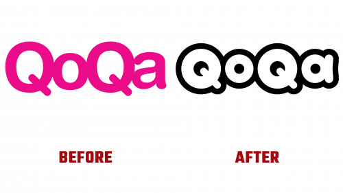
The launch of the new QoQa logo marks a significant shift from the previous Helvetica Rounded design, which faced criticism for its mundane aesthetic. The latest logo is a refreshing change, featuring a bold and energetic interpretation of the brand’s name. It highlights the four ‘O’s in ‘QoQa’ with circular dynamics, infusing the design with vivacity and buoyancy that aligns with the brand’s energetic and playful character. The substantial stroke surrounding the letters lends a whimsical yet sophisticated aura to the logo.
The design’s eccentricities, such as the slightly off-kilter stem of the lowercase “a,” add a unique and engaging quirk to the logo. This creative touch is seen as a welcome departure from the earlier design’s conventional structure.
Complementing the logo is a custom typeface that maintains the boldness of the logo but opts for a more condensed and contrasting format. This typeface, with its distinct character designs, further accentuates QoQa’s unique and whimsical brand identity.
With its reimagined logo and custom typeface, QoQa’s new brand identity encapsulates the platform’s dedication to providing an enjoyable, engaging, and community-centric online shopping experience.


