Quicken, America’s leading personal financial management software, recently unveiled its new logo, marking a turning point in the company’s 40-year legacy. The rebranding reflects Quicken’s commitment to remain at the forefront of financial management for its 20 million user base.
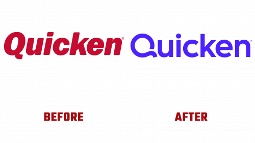
Quicken’s updated logo is significantly different from the previous design, which featured italicized and red elements. The new logo has taken on a modern and elegant look, characterized by a geometric sans serif font presented in a vibrant shade of blue. This change reflects the success of the Quicken Simplifi product and signals a shift to a more modern approach to personal finance.
A standout element of the new design is the stylized letter “Q” at the beginning of the logo. Breaking away from the traditional round shape, the “Q” has a unique single-stroke design with a dynamic curve and precise spacing. While some may notice a slight lack of grace in the upper right corner of the letter, overall, the logo strikes a harmonious balance between simplicity and elegance.
For now, the wider application of Quicken’s new branding is in its early stages. It remains to be seen how the stroke version of the monogram will be combined with other elements, such as photography. Early indications point to a desire to attract a younger and more diverse clientele. However, the choice of big band-style music for the brand’s commercial seems to contrast with this visual strategy, hinting at a mix of traditional and modern appeal.
The updated logo follows the trend of using a “safe” sans serif typeface, a common theme for branding strategies in the early 2020s. This approach is consistent with Quicken’s historical pattern, where brand aesthetics evolved to match the dominant design style of each era. The new Quicken logo symbolizes a brand that is ready to meet today’s digital financial management challenges while maintaining its core identity.


