


 Raiffeisen Bank International Logo PNG
Mutual aid is at the heart of the Raiffeisen Bank International logo. It recalls the cooperatives whose members pooled their resources to finance their farms and livelihoods. The logo’s theme of protection carries on the idea of shared responsibility that gave rise to the Raiffeisen banking network.
Raiffeisen Bank International traces its roots to Friedrich Wilhelm Raiffeisen, who founded a cooperative credit union in Anhausen in 1862 to give farmers, craftsmen, and workers an alternative to moneylenders. The first Austrian bank based on his model appeared in 1886. In 1927, Genossenschaftliche Zentralbank was created as the central clearing bank for Austria’s Raiffeisen network, starting with nine employees.
After the 1938 Anschluss, the German system absorbed Austrian cooperatives, and the Austrian cooperatives were rebuilt in 1946 after World War II. In 1989, the central institution became Raiffeisen Zentralbank Österreich AG, or RZB. Its regional expansion began earlier: in 1986, RZB opened a subsidiary in Hungary before the fall of the Berlin Wall.
That early move gave RZB a base in Central and Eastern Europe before rivals such as Erste Bank and Vienna Group expanded there. In the 1990s, it built banks in Poland, the Czech Republic, Slovakia, Bulgaria, Romania, Croatia, Ukraine, and Russia, usually through banking licenses and retail networks created from the ground up.
In 2005, Raiffeisen International Bank-Holding AG placed the Central and Eastern European banks into a holding company and listed it on the Vienna Stock Exchange, with demand exceeding supply 20 times. On 8 October 2010, Raiffeisen International merged with RZB’s corporate and investment banking unit to form Raiffeisen Bank International AG in Vienna. In 2017, RBI absorbed RZB. After February 2022, its Russian business became controversial: the ECB urged a faster exit, Ukraine listed the bank as an “international sponsor of war,” and, in 2022, it paid €559 million into Russia’s budget while the group’s profit exceeded €3 billion.
Meaning and History
What is Raiffeisen Bank International?
This is a well-known banking organization in Central and Eastern Europe. It serves retail and corporate clients across several countries in the region. Its network includes leasing companies, subsidiary banks, and other financial service providers. The bank operates in many markets, including the Czech Republic, Russia, Austria, and the Balkans. It offers services such as personal banking, commercial loans, investment products, and international trade financing to millions of customers through its branch network and digital platforms.
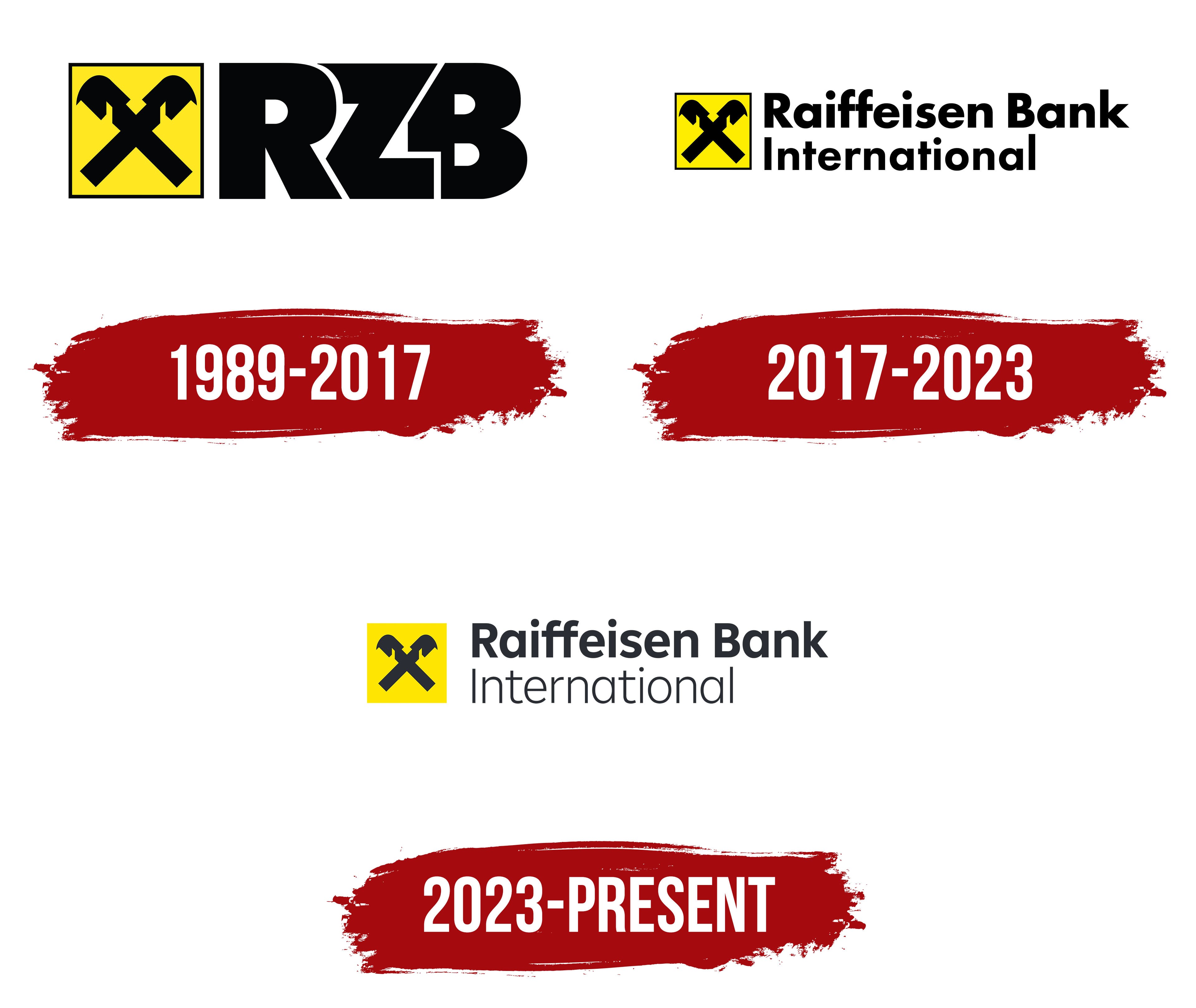
1989 – 2017

The name Raiffeisen Zentralbank traces back to Friedrich Wilhelm Raiffeisen, a German social reformer and organizer of credit cooperatives. His model allowed members to pool their savings and provide affordable loans within their community. Austria’s first bank based on the Raiffeisen model opened in 1886 in Mühldorf, near Spitz on the Danube. The reformer’s surname maintained the banks’ connection to the cooperative tradition. It also appears in Raiffeisen Bank International, where “International” signals the group’s global reach.
The idea of mutual support was reflected in the emblem of two crossed horse heads. It was based on the Giebelkreuz, a gable cross found in rural European architecture. Placed at the roof’s peak, the ornament was believed to protect the home and its inhabitants. In Raiffeisen’s symbolism, that protection became associated with cooperative members helping one another. The emblem entered use in 1877, during Raiffeisen’s lifetime. The horses face in opposite directions, with their elongated bases crossing to form an “X.”
A consistent yellow-and-black identity emerged as the Austrian brand’s varied designs were brought into alignment. Leodegar Pruschak, the longtime head of Zentrale Raiffeisenwerbung, joined Raiffeisen in the early 1980s. At the time, individual organizations used different versions of the gable cross. Pruschak described the development of a shared design as a response to the need for consistency across the banking network. The yellow background united its divisions, while the black silhouette provided contrast. Pruschak oversaw brand management and coordinated the shared identity.
The abbreviation RZB was added after the central cooperative bank was renamed Raiffeisen Zentralbank Österreich AG in 1989. The bank had been founded in 1927 as Genossenschaftliche Zentralbank. Three large black letters appeared to the right of a yellow square containing crossed horse heads, bordered by a thin black frame. The heavy “R,” “Z,” and “B” sat close together, separated by narrow white gaps. The diagonal boundaries between the letters echoed the slant of the emblem’s crossed bars.
2017 – 2023

The October 2010 merger of Raiffeisen International with RZB’s principal business operations created Raiffeisen Bank International. The RBI logo spelled out the name in full, with “Raiffeisen Bank” on the upper line and “International” beneath it.
Both lines used heavy sans-serif lettering. The yellow square with its black border and existing emblem remained on the left. The full name replaced the three-letter abbreviation, while the square connected RBI’s identity to the earlier brand.
RZB continued to operate as a separate organization until March 2017, when it merged into RBI. Before the merger, the RZB and Raiffeisen Bank International logos were used side by side to identify the two organizations.
2023 – today
Preparations for Raiffeisen’s update began in 2018 with a review of its digital typography. Printed materials used Futura, while digital channels used Open Sans. Inconsistencies across divisions and licensing concerns prompted the need for a shared typeface family. Monotype developed Amalia with contributions from designer Emilios Theofanous, creative director Tom Foley, and RBI’s head of digital brand, Martin Kofler. By 2021, it had been introduced as Raiffeisen’s first custom typeface. The family supported multiple writing systems and was designed for international use on screens and in print.
An internal team and the London agency FutureBrand worked on the next stage of the update. The launch took place on April 19, 2023, and RBI presented the group’s new identity on May 8. Previously, the gable cross and yellow were the main connections among the banks across markets. The next task was to align the divisions’ identities and adapt the shared brand for digital channels. Common guidelines covered typography, supporting colors, shapes, illustrations, and sound. The phased rollout began in mid-May.
The square version of the logo retained its yellow background but dropped the black border. The crossed horse heads and lettering became a dark, almost black shade. The upper line, “Raiffeisen Bank,” remained semibold, while “International” below it became light. The stroke-weight difference distinguished the bank’s name from its international designation. The Amalia typeface combined a geometric foundation, soft contours, and a high x-height.
The guidelines allowed several logo arrangements. The cross and lettering could appear on a square background or stand alone. A standalone emblem was intended for small formats. Every version maintained the emblem’s connection to yellow. Supporting colors included warm grays, white, and near-black. Green was designated for RBI’s corporate banking business.
The diagonals of the historical cross provided the basis for arrows and angled shapes in FutureBrand’s new identity. The slogan “Make it happen” encouraged people to put their plans into action. The sonic identity included a short audio signature and a shared musical theme.