


![]() Rangers Logo PNG
Rangers Logo PNG
Entering the field, the players take possession of the ball and fight like lions. They are always ready to play. The Rangers logo is the symbol of the winning club. The team’s ability to reach the top ten has made it a central figure in the world of sports.
In March 1872, brothers Moses McNeil and Peter McNeil, with Peter Campbell and William McBeath, founded Rangers FC in Glasgow. The first match in May ended 0:0 against Callander F.C., and blue shirts became the defining color.
In 1890, Rangers joined the founding group of the Scottish League and shared the first title with Dumbarton FC. In 1894, it won the Scottish Cup against Celtic FC, shaping the Old Firm rivalry that defined Glasgow football.
Under Bill Struth from 1920 to 1954, the club secured 18 league titles and 10 cups. Earlier, in 1898–99, Rangers had won all 18 league matches. In 1939, a crowd of 118,567 attended a derby at Ibrox.
On January 2, 1971, a crush at Ibrox caused 66 deaths. In 1972, Rangers won the Cup Winners’ Cup, defeating Dynamo Moscow 3:2 after earlier final defeats to ACF Fiorentina and FC Bayern Munich.
In 1986, Graeme Souness became manager, leading to nine consecutive league titles from 1989 to 1997, with Walter Smith continuing the run.
Financial issues escalated in the 2000s. In 2012, debts over £130 million led to liquidation and entry into the fourth tier. The club returned to the Premiership by 2016–17.
In 2021, under Steven Gerrard, Rangers won their 55th title unbeaten with 102 points, ending Celtic FC’s run. In 2022, it reached the Europa League final, losing to Eintracht Frankfurt on penalties.
Meaning and History
The Rangers are unique because they use two logos at once. The first, corporate, is represented in the media space and appears in official documents and souvenir goods. The second, the main one, decorates the players’ equipment. Both versions exist in parallel and are not interchangeable. They underwent some evolution before adopting a modern look.
What is Rangers?
Rangers is a team of professional Scottish footballers from Glasgow. They participate in the Premiership and have an unusual founding history. The club owes its existence to four teenagers who decided to come together to play football. This idea came to them in 1872 while walking through Kelvingrove Park (West End Park).
Corporate logos
![]()
1959 – 1968
1968 – 1990
![]()
In 1968, the Rangers began using the red lion emblem over a light blue soccer ball within a white circle. This so-called “Rampant Lion” is an important regional symbol featured on the royal arms of Scotland. The designers removed the monogram, leaving only the club’s full name and a short motto.
1990 – 1994
![]()
After the redesign, the familiar Rangers logo has been redesigned. The lion and ring turned to gold. The ball has moved higher to the very edge of the white circle. A font with rounded corners was chosen for the labels.
1994 – 1997
![]()
In 1994, the red lion returned, and the ball returned to its original position. Simultaneously, the designers finally abandoned gold, using white for the background and dark blue for all elements except the lion. The font has also changed: the emblem authors played on the contrast of thin and thick strokes.
1997 – 2003
![]()
In 1997, the Rangers adopted a modernized lion logo, and the ball moved up a few millimeters. As a result of the redesign, the blue color has become lighter.
2003 – 2020
![]()
The current corporate logo is almost identical to the 1994-1997 version, but the shape and color of the heraldic lion differ slightly. The font has also changed: now the letters seem thicker because they are less elongated.
2020 – today
Club crests
![]()
1904 – 1968
![]()
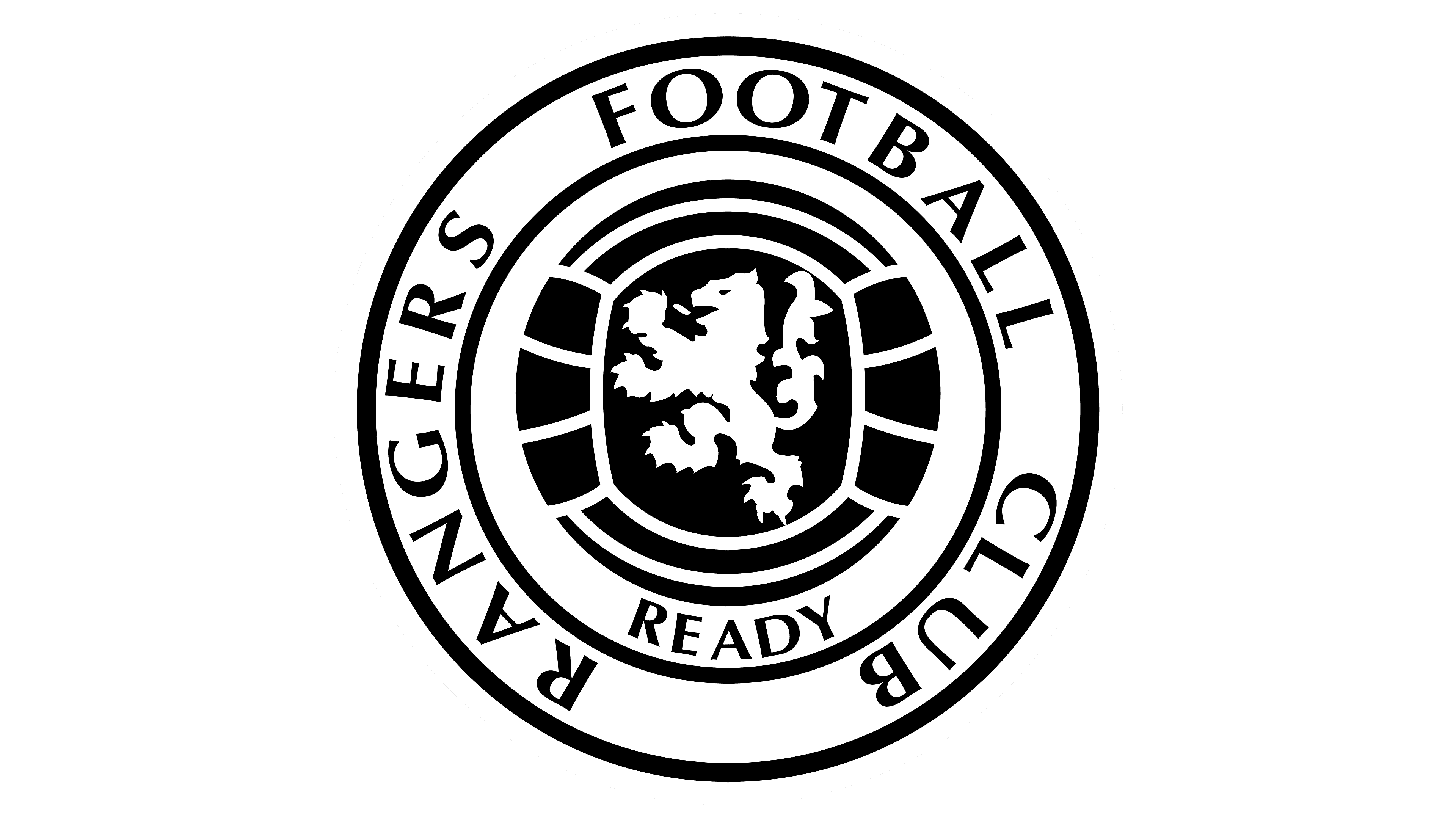
One of the earliest logos featured intertwined “RFC” letters superimposed on one another. The blue monogram was surrounded by a similar blue ribbon with red swirls and white RANGERS FOOTBALL CLUB lettering. At the bottom was the motto “READY” (the full version in Scottish sounds like “Aye Ready” and is equivalent to English “Always Ready”).
It is assumed that a similar logo appeared in 1872, the year the club was founded. The extent to which this corresponds to reality is unknown, as the earliest depiction of him dates to 1881.
1968 – 2003
![]()
Since 1968, players’ equipment has featured the monogram from the old corporate logo: the intertwined letters “RFC.” So the designers played on the full name of Rangers Football Club, linking it to the club’s history. In doing so, they modernized the acronym by closing the top of the “R” and adding gaps at the intersections of the lines.
2003 – today
![]()
In 2003, the Rangers won their fiftieth Scottish League title, so five stars were added to the emblem. When the club went bankrupt, this version was used much less. Now the star monogram is back on the players’ uniforms as a reminder of past victories.
Font and Colors
Rangers is one of the few football clubs with two logos. A round sign featuring a red heraldic lion, a blue ball, and lettering is used for documents and marketing. He connects the team to its location because the same lion appears on Scotland’s coat of arms.
The second emblem is dedicated solely to the Rangers: it features the club’s intertwined initials and reflects the number of Scottish League titles won. The five-star monogram has adorned T-shirts since 2003.
The corporate logo lettering is in bold, short, serif type. The monogrammed letters on the players’ uniforms were created from scratch and stylized.
The corporate logo uses the same colors as the official club palette: red, white, and royal blue. Only blue and white are present in the monogrammed version because there is no heraldic lion, which must be red.