The desire to conquer the world and the possession of great wealth is shown by the RBC logo. The bank looks to the future without losing its royal posture. The emblem reflects the honor, nobility, and dignity that accompany the organization through the centuries.
RBC: Brand overview
| Founded: | 1864 |
| Headquarters: | Montreal, Quebec, Canada |
| Website: | rbc.com |
Meaning and History
The largest financial institution in Canada until 1901 was known as the Merchants Bank of Halifax. His first emblem also looked different. It was used as a seal and therefore consisted of concentric circles. The full name of the company was written around the edges. In the middle was a black and white image of a sailing ship that once belonged to one of the bank’s founders. The rebranding of 1901 changed everything. The owners renamed the financial and credit organization and chose a new concept for its logo.
What is RBC?
RBC is an abbreviation for the full name of the Royal Bank of Canada. This financial institution is the largest in its country by market capitalization.
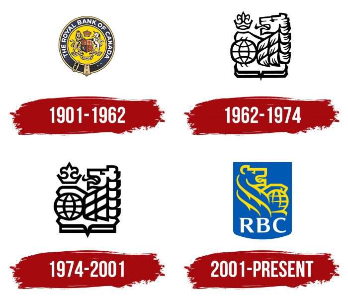
1901 – 1962
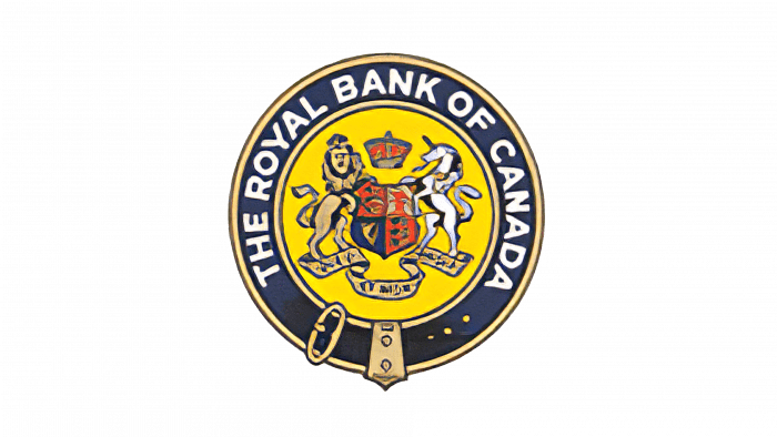
In 1901, a new era began in the history of the Merchants Bank of Halifax. It became known as the Royal Bank of Canada and lost its iconic three-deck ship emblem. The designers decided to emphasize the territorial affiliation of RBC by placing a multi-piece Canadian coat of arms in the center. Its main elements were a lion, a Scottish unicorn, a coat of arms, a crown, and a ribbon with the national motto “AMARI USQUE AD MARE.” They were inside a yellow circle in a blue strap ring. The full name of the financial institution was written along the circle.
1962 – 1974
In 1962, a new RBC emblem appeared. The coat of arms has disappeared, although some classical elements have been retained. The artists left the lion but turned it to the left and enlarged it so that only the head with the mane was in focus. The animal held its front paw on a globe – a symbol of the Royal Bank of Canada’s global presence. A figured crown was above the globe, and a heraldic shield framed the bottom of the drawing. The design has changed a lot compared to the last time: it became simpler, manifested itself even in the minimalistic gray and white palette.
1974 – 2001
The 1974 redesign went unnoticed. The creators of the logo replaced the gray with black to give the image a crisp look. At the same time, they corrected the shape of the lines and removed some details.
2001 – today
The heraldic shield returned to the current logo – though not the same as on Canada’s coat of arms. In this version, it is rectangular and has a rounded base. The shield is also painted blue, so other elements stand out well against its background: a golden lion with a globe at the top and a white inscription “RBC” at the bottom. Moreover, the designers turned the animal to the right and changed the drawing style to have nothing in common with the previous version.
RBC: Interesting Facts
The Royal Bank of Canada (RBC) is a major player in Canada’s banking sector and has a strong international presence.
- Early Days: RBC started in 1864 in Halifax, Nova Scotia, first known as “The Merchants Bank of Halifax.” It was set up to support trade between Europe, North America, and the Caribbean.
- Becoming RBC: In 1901, it changed its name to the Royal Bank of Canada, showing its growth beyond its maritime roots and highlighting its royal connections.
- Going Global: RBC isn’t just in Canada; it operates in over 30 countries. It started expanding internationally early on, especially in the Caribbean, where it’s still a big name.
- Top Bank in Canada: RBC is Canada’s biggest bank in market capitalization and assets, playing a key role in the country’s economy and the wider financial world.
- Wide Range of Services: RBC offers more than just banking. It has personal and commercial banking services, wealth management, insurance, and more, catering to clients worldwide.
- Tech Forward: RBC is known for its focus on digital banking innovation. It has introduced online and mobile banking and top-notch cybersecurity to enhance customer service.
- Eco-friendly and Ethical: RBC is serious about sustainability, with efforts to conserve the environment, support communities, and practice responsible business. It aims for net-zero emissions in its lending by 2050.
- Arts Supporter: RBC supports the arts through sponsorships and donations. It also offers special programs for emerging artists, including the RBC Canadian Painting Competition.
- Backing Sports: RBC sponsors sports at various levels, from local initiatives to the Olympic Games, supporting health, wellness, and sporting excellence.
- Giving Back: Through the RBC Foundation, the bank donates to community initiatives focusing on education, health, arts, and culture, showing its commitment to being a good corporate citizen.
RBC’s evolution from a modest merchant bank to a leading global financial institution showcases its adaptability, innovative spirit, and dedication to serving its clients and communities.
Font and Colors
The emblems’ history reflects the transition from the sailing ship Merchants Bank of Halifax to the Royal Bank of Canada’s modern design. It demonstrates the gradual evolution of the monetary institution. RBC is currently using an image that is registered under the Lion and Globe trademark. In this “duet,” the image of a lion was taken from the country’s coat of arms, and the globe symbolizes the worldwide fame of the company.
The abbreviation at the bottom of the logo is written in letters with short, sharp serifs. The strokes’ thickness is uneven: the transitions from wide lines to narrow ones make the inscription unusual.
The bank’s name is white so that it can be seen on the blue heraldic shield (shade Medium Persian Blue, # 005DAA). The designers chose yellow for the lion’s image and the globe (Cyber Yellow, # FFD200).
FAQ
What is the slogan of RBC?
The slogan is “Let’s Make Someday Happen™.” This slogan shows the bank’s commitment to helping clients reach their financial goals and dreams. Whether saving for a home, planning for retirement, or starting a business, the brand aims to turn clients’ dreams into reality with its financial products and services. The slogan conveys a sense of partnership and encouragement, emphasizing that the company is there to help make those dreams come true.
What is RBC in banking?
RBC stands for Royal Bank of Canada, one of the largest banks in Canada and among the top banks globally by market capitalization. Operating under the master brand name RBC, it offers a wide range of financial services:
- Personal and Commercial Banking: This branch offers savings and checking accounts, credit cards, loans, mortgages, and small business banking solutions.
- Wealth Management: This company offers financial planning, investment advice, estate planning, and asset management to help clients grow and manage their wealth.
- Insurance: Provides life, health, home, auto, and travel insurance, offering comprehensive protection for individuals and businesses.
- Investor Services: Delivers custodial, advisory, and treasury solutions to institutional clients worldwide, helping them manage their investments efficiently.
- Capital Markets: Offers corporate and investment banking services, including mergers and acquisitions, trading, equity and debt financing, and risk management solutions.
It has a significant presence in Canada and internationally, including operations in the United States, the Caribbean, and other global markets.
What does the RBC logo mean?
The logo has important symbols that reflect the bank’s identity and values. The globe represents RBC’s global presence and dedication to serving clients worldwide. This shows the bank’s wide reach and ability to offer financial services in many markets.
The lion in the logo symbolizes power and influence and conveys a sense of confidence and authority, matching RBC’s reputation for excellence.
Overall, the globe and lion in the logo show the bank’s global goals and strong, influential financial position.
Why did RBC change its logo?
The company changed its logo to reflect the bank’s evolution and modernization—the update aimed to align the brand with its growth and transformation.
The new logo keeps key elements like the globe and lion but with a more contemporary design. This change highlights the bank’s dedication to maintaining its heritage while embracing the future. The updated logo signals RBC’s readiness to meet new challenges and provide excellent service to clients worldwide.
What is the name of the RBC mascot?
The Royal Bank of Canada’s mascot is named Arbie. Arbie is designed to be friendly, approachable, and engaging, making it easier for the bank to connect with its customers on a personal level.
Arbie appears in marketing campaigns, advertisements, and community events, helping to humanize the bank and create a positive image. By using Arbie, the bank aims to make its services more relatable and accessible, fostering a sense of trust and loyalty among its customers. This mascot reflects the bank’s dedication to building strong relationships with its customers and enhancing their overall experience with the bank.
Why is RBC a good bank?
RBC is considered a good bank for several reasons. It has a vast network of branches and ATMs across Canada and internationally, making banking convenient and accessible for customers. This wide presence ensures that the bank is always within reach, whether you need to make a transaction, seek financial advice, or use an ATM.
The bank is known for its stability and reliability. Thanks to its strong financial position and prudent management practices, it consistently ranks among the most reliable banks globally. He supports various charitable initiatives and community projects, showing his commitment to positively impacting society.
