The good old National Museum of Liverpool has been the pride of Britain since 1851. Historically, the 13th Earl of Derby became a patron of the World Museum in 1851 to develop a natural science collection. 1986 saw the nationalization of Liverpool’s historical collection, and the institution became the National Museums and Galleries in Merseyside.
Museums survived the times of the pandemic difficult; however, this break was a leap forward towards a new unique brand identity, which London-based creative group SomeOne carried out.
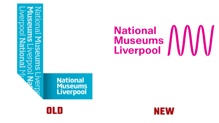
So, typographically, the logo was a previously wrapped ribbon in the corner, as if with a broken edge. Nothing remarkable, only a turquoise, pleasant green-blue hue, leaving in a wave, was pleasing to the eye. Such a logo was applied to all seven museums of the consortium; however, it had different color shades for each – where green is plain, where pink, where mustard. And different fonts were used. The names of the museums were on top; it turned out that visually the impression of an envelope with the signature name of the museum was created, and on the left side of the “ribbon” fastened various graphic elements. Too many letters, too much space used, the size of the fonts is very large, and all this overloads the perception.
Now the creators of the rebranding concept tried to emphasize the simplicity and express gratitude for the innumerable number of historical finds, emphasizing the kinship, connections, and the genetic memory of their native places. In the logo, laconic lines are lifelines that stretch from the past to the future: black color, no bright accents. The font is the same for each museum; only the sizes vary due to the length of the name. You might think, which is too formal. But in this logo, a thread of DNA can be traced, a reference to the fact that we all have the same roots; this is our home, we must continue our historical traditions. The horizontal spiral without visible curves further emphasizes the minimalism and beauty of the new image of the museum brand. On the other hand, you can see a wave that shows the passage of time, various historical ups and downs in the state’s life even if the logo looks homogeneous and practically does not distinguish each museum. But thanks to the Antarctica font from the new glyph, I now, even more, want to visit all the museums and see how their exhibitions differ.


