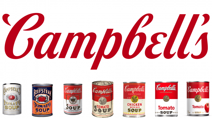
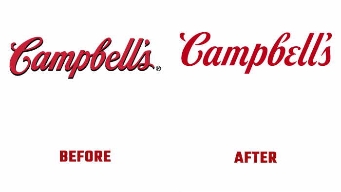
Today the containers in which, for more than 50 years, the beloved “soup” from Campbell Soup Co has been packaged have acquired a new look. The rebranding was the result of long-term work of the marketing department of the company and a decision that was not very easy. The recognized product became recognizable on store shelves due to the unchanging design of the cans, which required adjustments to take into account the peculiarities of modernity and the achievements of modern design technologies.
As a result, a compromise solution was found to preserve the traditional red and white colors in the emblem’s design. But the logo has undergone a modern modernization – the background is removed, which creates a shadow from the images. The font is slightly modified, acquiring a better match with the original signature of the founder of the company – John Campbell. The external perception of the emblem has also been preserved, bearing a sense of comfort, goodness, and American essence. The word “soup” has also undergone some changes, in the writing of which a new font was used, while maintaining the slope of the letter “o” – a tribute to the features of the traditional design adopted back in 1898. The fleur-de-lis pattern is drawn sharper and more detailed. Different types of products – tomato, chicken cream, mushroom, chicken noodles have become the owners of new labels. Today, the consumer will be able to get acquainted with them since fresh products have begun to be supplied to stores in a new design.
The company owners were pushed to the need for such changes by the modern consumer, whose views on food consumption have changed dramatically. The new generation increasingly prefers to cook at home rather than buy a finished product or visit public catering establishments. However, those who love the good taste of Campbell Soup Co’s food and drink products since childhood continue to stick to their preferences.
Campbell Soup Co enlisted the talented street style artist Sophia Chang in its advertising campaign to educate as many fans of its products as possible and reach as many new ones as possible. She has produced a 100-piece series and an exclusive animation show, the proceeds of which will be donated entirely to Feeding America. Activities include participation in the work of Ntwrk, as well as with the climate protection organization Aerial.


