Logo and name changes are part of the brand awareness plan.
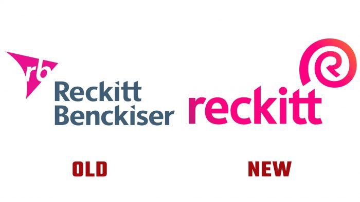
Everyone probably knows the products of Air Wick, Durex, Veet, Strepsils, and others, but few people are familiar with the parent company – Reckitt Benckiser. Now the large corporation has shortened its name to simply Reckitt. The new design was developed by the creative agency Havas.
The company introduced an updated logo – Reckitt with an additional element in the upper right corner. The creators added the letter “R,” the end of which is twisted in a spiral around it. All elements are voluminous and painted in new colors – a palette of pinks and shades of orange refresh Reckitt. Also, the designers used a trendy gradient.
According to Jo Osborn, the company’s vice president of internal affairs, most consumers are familiar with the brands that the company represents but have no idea about the corporation itself. Reckitt shortened the name to increase recognition and better memorization.
During the pandemic, the firm’s sales soared. Thanks to its subsidiaries, the company shared that its products are sold every day for 20 million worldwide. Nurofen, Dettol, Vanish are all Reckitt divisions. With the rebranding, the brand will share its long history and actively spread its goals.


