Reddit, the widely recognized online community platform, has recently introduced a revamped brand identity, headlined by an updated logo crafted by Natasha Jen, a partner at the New York-based design agency Pentagram. This development signifies a pivotal moment for Reddit, which has grown substantially since its launch in 2005, evolving into a sprawling global network of diverse communities.
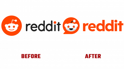
The original Reddit logo, known for featuring the affable alien icon Snoo, had become an emblematic figure for the platform, encapsulating its quirky and inclusive spirit. The simplicity and whimsicality of the previous design resonated well with Reddit’s vast and varied user base. However, a modernized and more sophisticated brand image was deemed necessary in line with Reddit’s expansion and the evolving digital landscape.
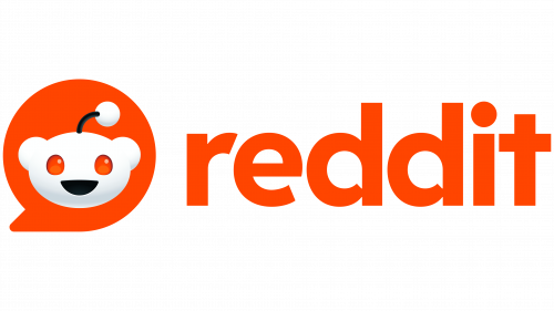
The redesigned Reddit logo maintains the iconic Snoo but elevates it with a polished, three-dimensional rendition. This new iteration of Snoo strikes a fine balance between retaining its characteristic alien-like features, such as the red, pupil-less eyes and the simplistic black mouth and antenna, and infusing a sense of refinement. The incorporation of Snoo within a speech bubble iconographically underscores Reddit’s core focus on fostering rich conversations and community interactions.
In tandem with the icon update, the Reddit wordmark has also been reimagined. It now features a geometric sans serif typeface, lending a more professional aura to the brand while harmoniously coexisting with the playful Snoo icon. However, the decision to integrate speech bubbles into the “d” s of the wordmark has sparked discussions about its impact on the overall legibility and the necessity of such a design choice.
The rebranding effort extends beyond the logo, encompassing an overhaul of Reddit’s visual identity. This includes a refreshed approach to the use of Reddit Sans, the platform’s custom typeface. The revised typeface adopts geometric contours and incorporates speech bubble motifs into select characters, a design choice that has drawn some criticism for potentially affecting readability.
This brand refresh is aimed at resonating with Reddit’s diverse and expanding audience, comprising both long-standing users and newcomers. It underscores the platform’s unwavering dedication to being a hub for various discussions, community building, and content sharing.
The updated Reddit logo and brand identity mirror the ongoing trend in the digital realm, where platforms continually adapt to align with their audiences’ evolving tastes and preferences. With its refreshed appearance, Reddit is set to continue its role as a premier online destination for vibrant communities and dynamic content exchange.


