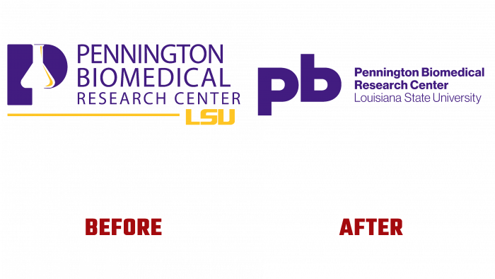
Louisiana Biomedical University Pennington Biomedical has announced the overdue rebranding of the institution. Changing one’s visual identity has become especially necessary in light of the sharp increase in the relevance of the tasks solved by the research organization. Dealing with the problems of eradicating obesity, a disease that is increasingly spreading precisely among the population of the United States, the university covers other areas directly related to the causes of a sharp increase in weight, not only.
To improve the popularization, the quality of perception of the university’s activities, its significance, and the degree of importance of the tasks being solved, Pennington Biomedical turned to the professional design studio, Turner Duckworth. One of the tasks set for the designers was to reduce the complexity of the corporate identity, logo, visual identity, making it less “frightening” as a specific science for the layman.
An original design solution was using a system of graphic elements – simple lines with an increase in the volume of unloaded space. The order of the composition, the ease of perception of the image as a whole, and each element separately is visually ensured. Nevertheless, a radical change with a complete rejection of the previous version means that the respected institution’s history and traditions could not be allowed. To strengthen this connection, special references were used that characterize the connection to scientific activity—for example, the periodic table of the elements.
The logo itself has become a prime example of the analytical and creative approach to building a smart brand. Its main background was the purple, deep color of “reflection” in a unique combination with gold. This symbiosis is created to draw attention to every element of the image. At the same time, the palette links the new Pennington Biomedical rendering to the LSU, which uses the same colors. However, to be self-sustaining, the magenta selected for the background of the new logo has a deeper hue.
The logo monogram represents the image of the symbol consisting of the first two letters of the university name – “p” and “b.” The original solution is to use the same symbol for their visualization in asymmetrically inverted form, which symbolizes the stability of choice characteristic of the university. Next to this sign, the text is typed in three lines – Pennington Biomedical Research Center, in a thicker version. Below, in thin type, it is typed – Louisiana State University. To form the text of the monogram, the font Neue Haas Grotesk was used.


