Launched back in 2016, the Remote Year brand has grown and evolved significantly, creating a community of over 3,000 members and running over 80 programs. The service fulfills its task of assisting in joint coworking and travel with excellent marks. A wide selection of programs covering an entire country or specific places, combining this with remote work, the requirements for which are not so high, and the conditions are favorable and safe, make the brand’s offerings especially in demand. Together with a progressive service team, you can not only make real money, increase your career level, gain invaluable experience in a new direction for yourself, but also relax comfortably and enrich your cultural and educational level.
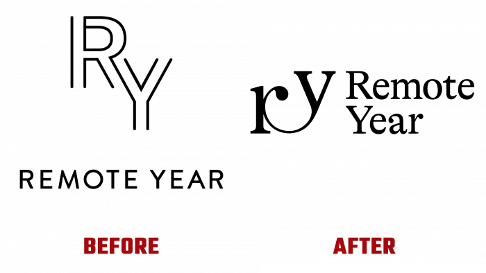
Over the years, the organization has overcome many significant difficulties, resolved unprecedented problems associated with tourism activities, found a new effective partner, Selina, opened new programs in the form of 1 week and one-month trips, improving the traditional 4-month and annual offers. All this became the reason to make dramatic changes in their visual identity, showing all current and future community members their new achievements, preemptive changes, and perspectives.
The main requirement for the visual changes was the obligatory reflection of the main qualities characterizing the brand: foresight and sincerity, the ability to inspire and trust, passion and aspiration. The new corporate identity demonstrates the obligatory presence of deep positivity, constant updating of proposals in their wide variety, fair treatment of each member of the community, the desire to ensure the involvement of as many people as possible in their unique programs.
This became possible because the organizers and developers of the brand’s style put their hearts and a piece of their soul into it. The font used to form the logo and the original graphic design of the monogram effectively reflected the company’s core values - courage, cognitive curiosity, compassion. A dynamic illustration of this is the original combination of the two monogram characters, representing the deep connections within the entire community created by the brand. The freshness and depth of new fonts and vibrant renewed colors create a new voice for the company, honoring the bright and open-minded explorers of a wide range of backgrounds and aspirations, unafraid of novelty, and making Remote Year what it is today.


