Italian is distinguished by its sophistication and love for various types of seasonings. One of its famous representatives is the Italian brand Barilla founded by Pietro Barilla Sr. back in 1877, today a multinational food company. The company has grown from a simple bakery to the world’s largest pasta manufacturer headquartered in Parma, Emilia Romagna, Italy. Over the years of its existence, the brand has expanded the range of offers and opened a chain of restaurants in 2013. Since 2021, the brand has begun to take ownership of the Canadian company Catelli. In the UK, it has acquired a controlling stake in Pasta Evangelists, a company that manufactures a new product for the brand – fresh pasta. All this demonstrated the company’s international growth, which at the forefront set the task of identifying and anticipating the needs of its customers. Such drastic changes required changes in the main strategy of the brand, in its visual identity.
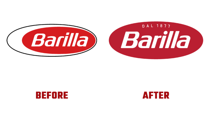
Given the rich practical experience and more than a century of brand service to its consumer, when creating a new image, emphasis was placed on the formation of a visualization that meets modern requirements but retained a link to the company’s historical roots. The new logo retained the traditional oval shape, with the inner space filled with the signature red color. But the latter, when processed, acquired a darker and more saturated shade, which better distinguishes the emblem from the general background with other products when placing the company’s products on the store shelves. In the new design, the oval does not have a space that is not filled with color. Its central part is occupied by the text name of the brand, made in large print, which retains the accepted style of performance. But in the new version, a different type of sans-serif font was chosen, which better conveys the unity and interconnection of each letter of the name, clearly highlighting each element of the letter graphics. The dot above the “i” has acquired a rounded shape. The font provides ease of reading the text in any of its dimensional performance. Above the name in thin letters is the date of the brand’s foundation.
All letters are made in white, which creates the necessary emphasis on the text elements of the logo against the general red background. The new sign has acquired a single “appetizing” ovality and pleasant symmetry of the entire image, making it visually pleasing and easy to remember, ensuring recognition among many similar products.


