Launched in 2013 by San Francisco-based online platform Lemonaid Health, the US has reorganized its own visual identity. The platform is constantly being improved to improve the quality and create additional conveniences for the provision of medical services. Lemonaid Health is focused on delivering a revolutionary service environment and streamlining patient care. The platform is an online doctor’s office at its core, which can be accessed upon request. An important moment in the development of the platform is the increase in the services provided. Shortly, online treatment of asthma and hypertension, two types of diabetes, etc., is expected. The situation with the pandemic has only accelerated the development of healthcare services with the help of modern electronic services – television, the Internet. All this created the conditions for the urgent need to revise many points in this area, which required rebranding.
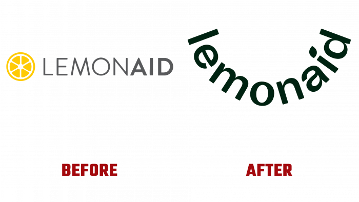
An attractive and accurate reflection of the characteristics, goals, and objectives of a platform such as Lemonaid Health is the most important task facing the platform organizers. The health, and sometimes the life of many people, directly depends on how successfully this was done. The new logo has retained its commitment to the conciseness and simplicity of its form. At the same time, it was decided to remove the lemon slice from the composition, as it was required to create a visualization in a broader context of disclosing the current capabilities of the platform. Having retained its adherence to text graphics, the logo acquired a visual arrangement of the letters of the name in the form of a wide smile, symbolizing not only the friendship and friendliness with which each platform employee is ready to provide effective assistance to patients who have addressed. This smile symbolizes full health, which will be returned to anyone who turns to Lemonaid Health for help. After all, only completely healthy people have such an open and wide smile.
An unobtrusive uppercase font was chosen to reflect the name. To enhance the effect of the impact, a leaf of a tree was applied as a point above the symbol “i.” In this way, the spirit of the company, its mission are reflected. The leaf is the main symbol of life and natural nature, whose gifts are used in healing. Its use ensures the semantic completeness of the entire logo composition, allowing at first glance to grasp the very essence of the professional orientation of the platform.


