There is still tangible gender inequality globally, despite widespread propaganda about the absence of such a problem. The feminist media company Womena’s primary mission is to effectively help and implement effective measures and processes to combat this kind of inequality. The brand creates and implements inspiring and persuasive content aimed at the “weaker sex. The activity of the structure is actively manifested in the creation of an online community that seeks to have a lasting impact on the current situation. All of this is realized through appropriate types of content – documentaries and articles, podcasts and photos, and other types of material presented primarily by women themselves. Womena manifests its activity in the business sphere and in all areas of today’s life and social interactions, where such precedents infringing upon women’s rights are most often created. The very creation of such a brand was a factor that instilled confidence in the possibility to make the changes that everyone wants to see in the world today. It does this in every way possible by voicing stories and situations and opening up funding, education, or support networks. When a brand takes on a challenge, it does so wholeheartedly, with the assurance of a positive outcome.
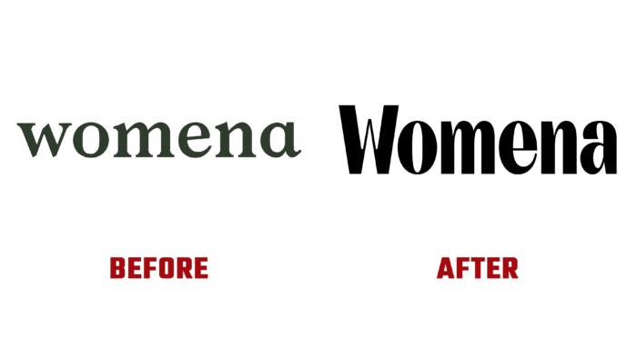
In a constant state of development and improvement, the brand has come to the point where it needs to change its visual identity. The changes taking place in communities and social structures worldwide have also affected the company itself. The external identity was changed by the current trends in the perception of the visual information of the new generation Z. First of all, the brand identity was brought to the requirements of a minimalistic style. The logo became a kind of reflection of the unique “Malevich square.” On a black monochrome background, the name Womena is written in contrasting white in a round sans serif font like Stannum Bold by Eko Bimantara with an individual refinement of the letter W and reduced width of each letter. Each of them is made using modern technologies that ensure their legibility in any size, both in print and in digital media.
The color palette consisting of two contrasting colors – black and white reflects the basic principle of the company – an active and eternal struggle of “good with evil,” creating the necessary atmosphere around the symbols. Thus, the visual mark’s optimal appeal and the best memorability were created. The brand has acquired an individuality, which distinguishes it advantageously in the overall volume of many emblems.


