Founded in 2013, Farmerline is dedicated to making it easier and more convenient to collaborate with farmers worldwide. Today, it is expanding its influence and increasing its presence in the supply market by introducing a new identity that considers the specifics of activities in the African region. The main direction of the enterprise was the development of solutions to expand access to farmers and simplify all types of transactions in the process of creating value for products and services in agriculture. His goal fueled all of the company’s current innovations. Farmerline became the first African organization to provide farm businesses with access to information using voice messaging. The brand’s innovation was the use of all local languages, which makes the application accessible to the entire region population, effectively bridging the gaps in knowledge among smallholder farmers. A farm-type Amazon is being formed, where each user gets access to the services and other resources he needs in a timely manner and at the lowest prices. Gradually, the company expanded to provide services to global organizations that gained access to the tools necessary for a successful vision of the economy. These changes have found their full and understandable reflection in the new strategy and visual identity.
To generate long-term profits and impact the lives of African farmers, technology company Farmerline has developed a comprehensive set of digital services for smallholders. In its implementation, the current branding plays an important role, making it possible to attract talents, partners, and investments more effectively. This is facilitated by the created, instantly recognizable brand, whose reputation precedes all innovations.
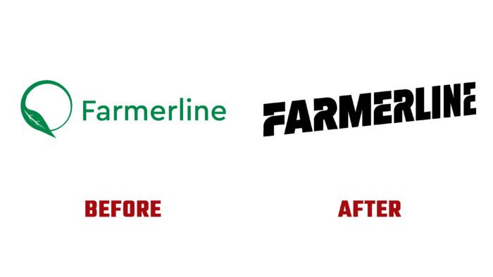
As a social organization, Farmerline was motivated and focused specifically on entrepreneurship. His visual voice is built around this duality – making more impact, making more money. The designers’ creativity in developing the identity and logo was inspired by the company’s large-scale ambitions and its promise to ensure prosperity for all members of its community. All ideas have been interpreted in bold typography. The text module – Farmerline, is made in a progressive design – the letters that make up the word are directed to the right and up. In this way, a bold statement about securing farmland yields, created in a dynamic virtual environment, is supported. Appearance has a pronounced personality in an enterprising, unconventional, and sociable form. The emphasis on this is also provided by the bright color, which has become quite a bold choice in the design of brands from this sector. The graphics of the text formed signs in the letters, allowing them to be interpreted as paths trodden in the field.


