


 Richmond Spiders Logo PNG
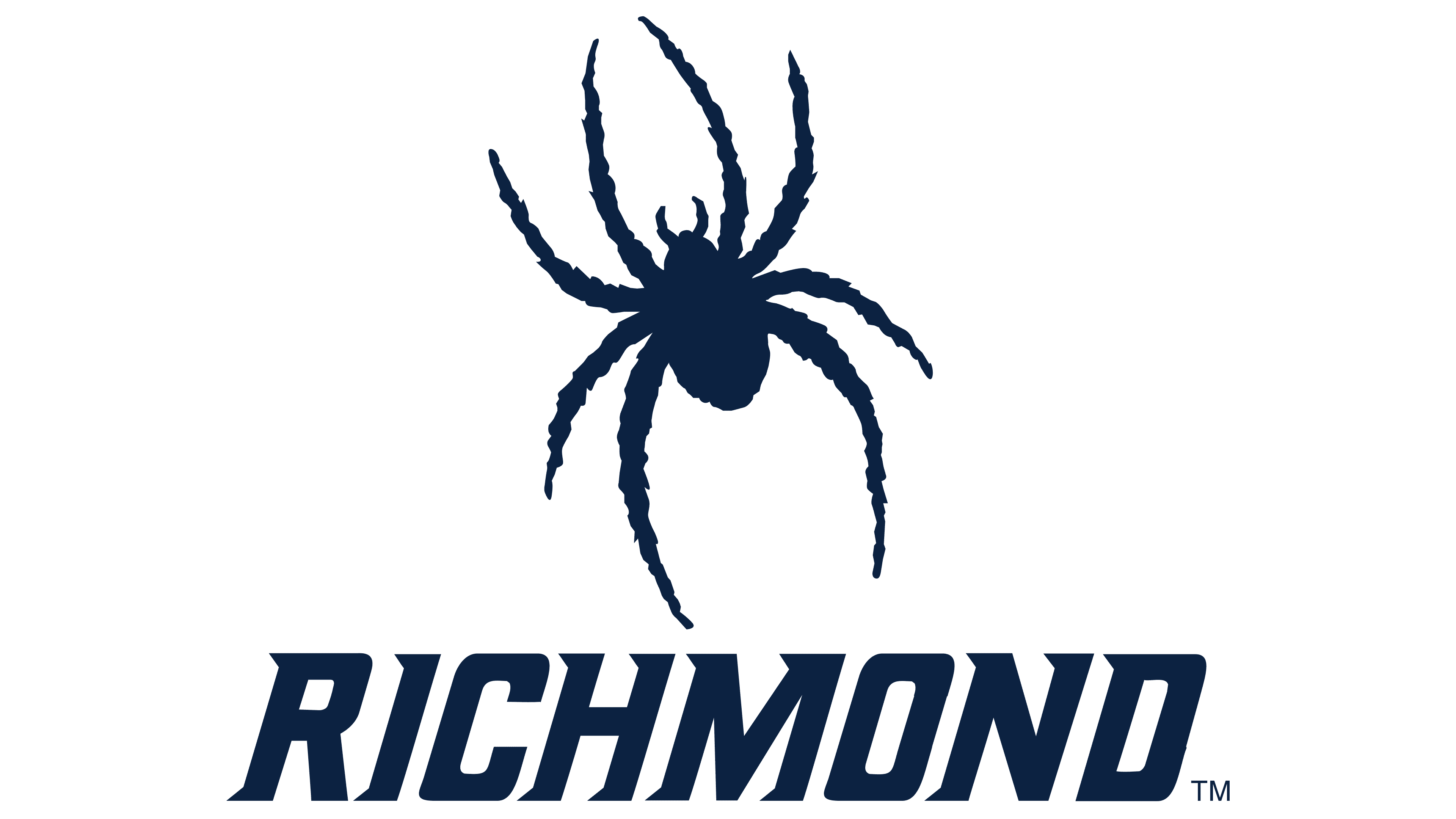
The Richmond Spiders logo features a spider. The image conveys quick reaction, flexibility, and adaptability during the game. The symbol gives the team a distinct identity among programs in the United States.
The Richmond Spiders’ athletic history dates back to the 1870s at the University of Richmond, which was established in 1830. The nickname “Spiders” emerged in 1894 when a reporter described the university’s baseball team as agile and tenacious, likening them to spiders and creating a unique athletic identity.
The early 20th century brought growth, with football officially forming in 1910 and basketball in 1913. Facilities expanded accordingly; in 1924, the university built a new football stadium, and the tennis and track teams also formed. Women’s athletics began in the 1930s.
After World War II, Richmond athletics grew steadily, highlighted by the basketball team’s first national tournament appearance in 1947. The opening of a dedicated basketball gym in 1953 further strengthened the program. Richmond joined the Southern Conference in 1969, increasing competitive exposure.
Facility upgrades continued throughout the 1970s, alongside notable expansion in women’s sports. The 1980s brought national recognition as the basketball team debuted in the NCAA tournament in 1984, and notably upset a second-seed team as a 15-seed in 1988.
Richmond joined the Atlantic 10 Conference in 1997, marking the beginning of a new era. Success peaked when the football team won the NCAA Division I-AA national championship in 2008. Basketball reached the NCAA Sweet Sixteen in 2011, and the Robins Center underwent renovations in 2015, which enhanced the competition and training environments.
By 2023, Richmond fielded 17 NCAA Division I teams, with significant accomplishments including a women’s lacrosse conference championship and men’s basketball competing strongly in the Atlantic 10 Conference.
Meaning and History

What is Richmond Spiders?
The University of Richmond athletic teams compete in the Colonial Athletic Association and Atlantic 10 conferences at the NCAA Division I level. At these venues, ardent fans gather to support the university’s baseball, soccer, basketball, and other sports, creating a lively atmosphere.
2002 – 2017

The Richmond Spiders logo, created by Connecticut agency Silverman Group, became part of the university’s athletic identity renewal. The university officially presented the new emblem on September 5, 2002.
The design features a stylized spider silhouette in dark blue. The figure is positioned at a 15-degree angle, as specified in the usage guidelines, giving the image a sense of inner tension, as if the spider is poised before a confrontation.
The composition is generalized and does not refer to any specific spider species. Eight elongated, curved legs form the creature’s structure, creating a recognizable contour.
The dark blue tone reinforces restraint and focus, reflecting the discipline characteristic of the university’s teams. The spider symbol represents endurance, precision, and readiness for action, aligning with the spirit of athletic competition.
2017 – today
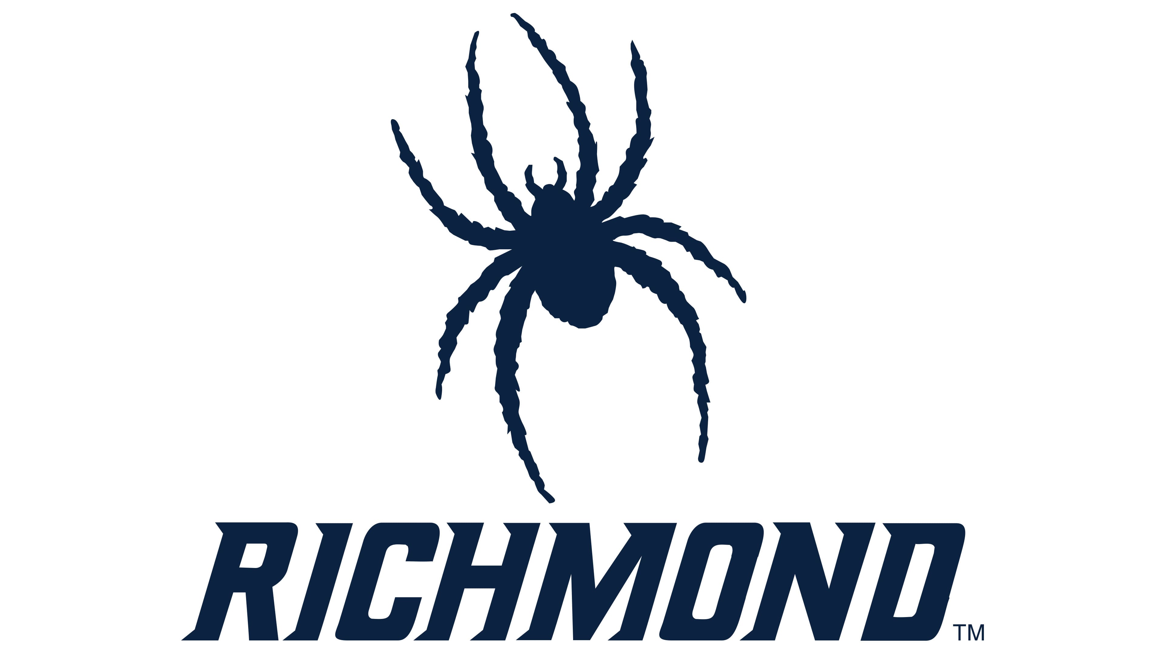
The updated Richmond Spiders logo, used since 2017, builds on the previous version’s visual style, maintaining continuity while strengthening the focus on the university name. The text part now dominates, while the spider figure has become more compact and its proportions refined. This emphasizes “RICHMOND” as the key element in the university’s athletic identity system.
The spider remains unchanged: a dark blue silhouette with eight sharply curved legs. The inscription “RICHMOND” sits beneath the spider in an italic serif font. All letters are uppercase. The main dark blue color unites the symbol and the inscription into a single composition.