


 Boise State Broncos Logo PNG
The Boise State Broncos sports department logo features a horse’s head. The mascot in the brand color palette symbolizes the impossibility of taming, the difficulty of defeating the team, and pride and endurance.
The Boise State program began in 1932, when students chose the bronco as the mascot, reflecting the junior college identity at the time. In 1933, the first football team, led by Dusty Kline, opened with a modest 1–2–1 record.
From 1947 to 1967, Lyle Smith shaped the program. His teams went undefeated in four seasons, including 1947–1950. In 1958, the Broncos won the junior college national title, their first major title.
In 1971, the team joined the Big Sky Conference and moved into higher-competition leagues. A scouting violation led to a playoff ban in 1979, but in 1980 Boise State University won the I-AA national championship, defeating Eastern Kentucky.
A major shift came in 1986 when athletic director Gene Bleymaier installed the blue turf. The first game on September 13 ended 74:0 against Cal Poly Humboldt, and the field became a defining feature.
In 1996, the program entered Division I-A and beat Portland State 33:22 in its first game at that level. By 2001, Boise State had won four straight Western Athletic Conference titles under Dan Hawkins and built a rivalry with Fresno State.
On January 1, 2007, Boise State finished 13–0 with a Fiesta Bowl win over Oklahoma. The team remained a national contender, returning to the bowl in 2009 and 2014.
In 2011, the program joined the Mountain West Conference but faced NCAA sanctions over recruiting violations. In 2024, Boise State announced it would join the Pac-12 starting in 2026, ending a long run in the Mountain West.
Meaning and History

What are the Boise State Broncos?
The Boise State Broncos are an NCAA Division I intercollegiate athletic program affiliated with Boise State University in Boise, Idaho. The team competes in the NCAA’s first division and represents the Mountain West Conference. The team has won the WAC Cup twice: in the 2005-2006 and 2009-2010 seasons. The organization has 16 teams.
1957 – 1965
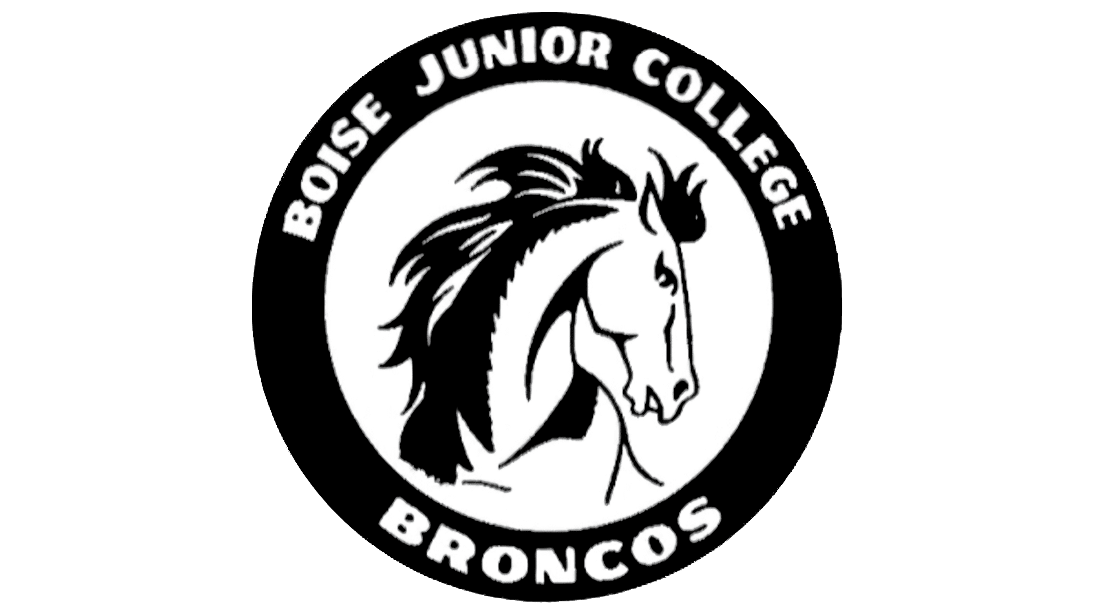
A horse’s head became the centerpiece of the circular Boise State Broncos emblem in 1955, when the institution was still called Boise Junior College. The student organization Pi Sigma Sigma helped bring the design into use. The black-and-white image appeared in athletics and academics, linking the college’s name to its team nickname.
The white head faced right, while long strands of black mane swept left. Fine lines defined the eye, nostrils, mouth, and neck. A thick black ring surrounded the horse, with white uppercase BOISE JUNIOR COLLEGE above and BRONCOS below. Bold letters with rounded terminals filled the upper and lower arcs, leaving open spaces on the sides.
The Broncos name preceded the emblem by two decades. The future university in Boise, Idaho, opened in 1932 as Boise Junior College. During its first academic year, students adopted a nickname inspired by the wild horses of the Owyhee Mountains. In American English, a bronco is a horse that has not yet been fully broken to ride. The regionally rooted horse image remained in subsequent emblems as the institution’s status and athletic identity evolved.
Blue and orange entered the team’s history alongside the Broncos name. Members of the first basketball team proposed the combination. According to student-athlete Preston Hale, they examined the colors of schools in southern Idaho and eastern Oregon to avoid matching their neighbors. They checked the nickname on the same basis. The college was the first among nearby schools to use Broncos. The team colors were established decades before the modern horse-head emblem, although the circular 1955 version used black and white.
The mascot’s history developed separately, beginning with a three-dimensional figure. In 1935, students built a horse nearly 20 feet tall from wood and paper. They named it Elmer after Elmer Fox, one of two cheerleaders involved in the project. The figure was paraded through downtown Boise for Homecoming. In 1936, the procession was followed by a pregame burning of the horse. Live horses later appeared at athletic events. The costumed Buster Bronco debuted in fall 1974. College president John Barnes supported the costume’s creation after seeing Idaho State’s mascot.
1965 – 1969
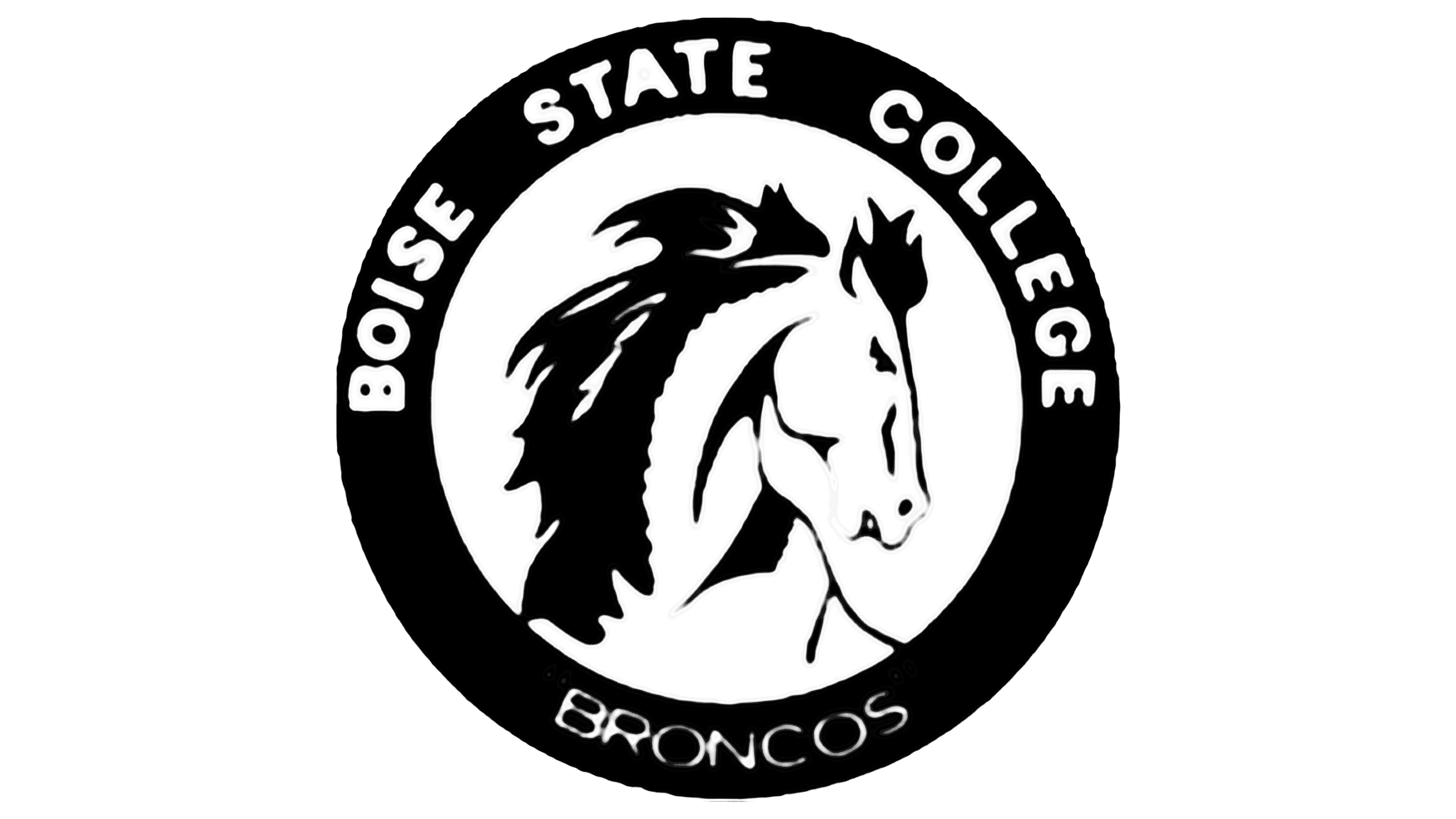
BOISE STATE COLLEGE lettering at the top of the circular Broncos emblem reflected the institution’s name change. BRONCOS appeared below in thin, rounded letters, contrasting with the heavy upper line.
The black-and-white colors, circular format, and head direction remained. The horse’s mane and face were revised. Individual strands were consolidated into larger black areas, and the facial contours were simplified. As in the previous version, the college’s name appeared within the emblem, framing the horse.
1969 – 1974
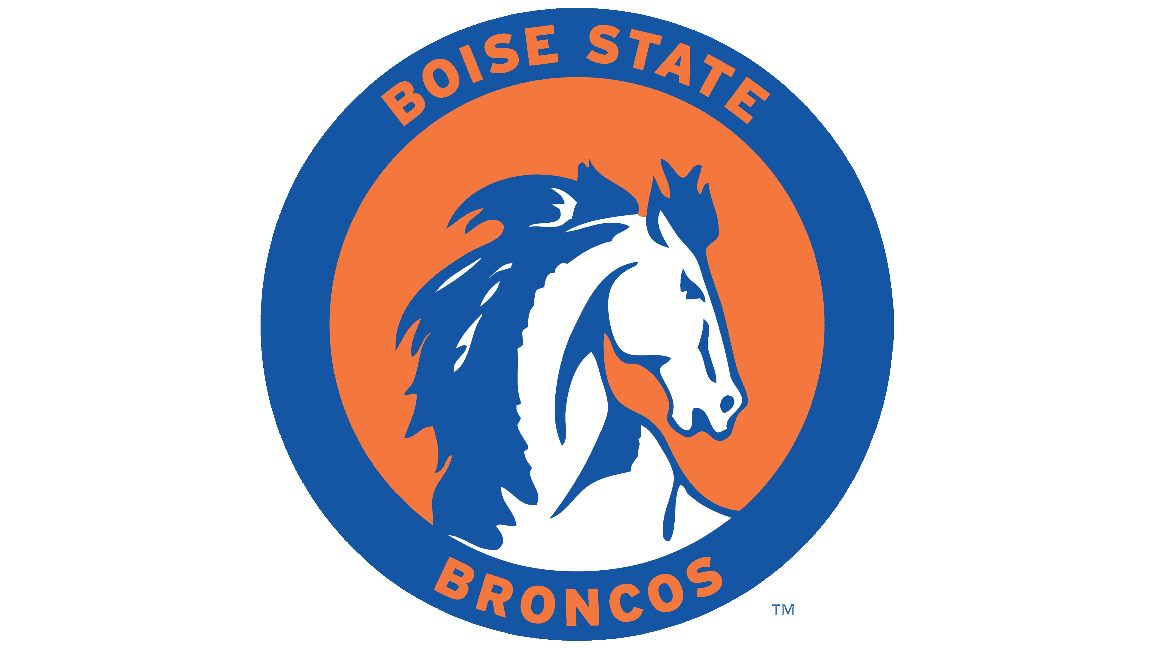
The circular Boise State emblem used from 1969 to 1974 introduced the long-established team colors of blue and orange. It retained the structure of the early student design while changing the colors of the ring, background, and horse’s head.
A blue ring surrounded an orange field containing a white head. Blue replaced the earlier black areas in the mane, neck, and face. The lettering used orange uppercase sans-serif forms, bringing the stroke weights of the two lines closer together. The name above was shortened to BOISE STATE, while BRONCOS remained below.
1974 – 1983
In 1974, the institution became a university and adopted the name Boise State University. A lowercase bsu lettermark appeared that same year. The three letters replaced the horse and circular lettering on academic and athletic merchandise.
An orange “s” sat between a blue “b” and “u.” Thick, right-slanting strokes combined flat cuts with rounded curves. The tall stem of the “b” rose above the neighboring letters, while the lower curve of the “s” extended below the baseline. These height differences gave the compact abbreviation uneven upper and lower edges.
1983 – 2002
A horse, the university abbreviation, and the outline of Idaho came together in an emblem created by Boise artist John Collias. It became the primary emblem in 1982 and remained in that role until 2002. A smaller blue shield occupied the lower-left portion, while the state outline identified the university’s location.
An orange rearing horse stood against the outline of Idaho. Its head faced left, its front legs were raised, and its tail extended right. Blue defined the mane, tail, anatomical details, and shadow beneath the hooves. Blue and orange borders surrounded the white interior of the state outline.
In 1986, the Collias emblem was placed at midfield on Boise State’s first blue football field.
2002 – 2012
In summer 2002, Boise State athletics unveiled an emblem by North Charles Street Design Organization that combined a horse’s head with the university name. A blue background joined the neck to two lines of BOISE STATE lettering, while an orange outline traced the illustration’s and text’s outer edges. STATE was shifted to the right beneath BOISE. Custom lettering featured white, slanted uppercase letters with angular terminals and short serifs.
A large right-facing profile replaced the full-body horse and Idaho map. Dark blue dominated the image. Orange lines continued inside the head, defining the forehead, ear, nostril, and neck. Several long, pointed strands formed the mane. A white eye beneath a lowered brow and a white mouth line gave the horse a stern expression, departing from the calm appearance of the early circular emblems.
Secondary versions accompanied the primary design. They included a standalone head and an orange head facing left. Use of the horse profile on its own was already part of the 2002 logo collection.
2012 – 2013
In 2012, Boise State brought its academic and athletic identities closer together while assigning separate roles to two emblems. The horse’s head remained with the Broncos, while a slanted blue-and-orange “B” was developed for university-wide use. Nike refined the letter from the athletic identity and helped develop a coordinated look for the teams.
The transition to the “B” was announced on November 27, 2012. The previous academic emblem was phased out over the school year. The athletic logo collection was revised as well, with a lighter blue and the retirement of some earlier versions.
The primary version with two lines of lettering, used from 2012 to 2013, retained its established structure. The placement of the head and name, white eye, mouth, and lettering, and orange outlines remained unchanged. The main difference was a slight adjustment to the blue.
2013 – today
In early June 2013, a standalone horse’s head appeared on the 50-yard line at Bronco Stadium. It became Boise State’s primary athletic emblem, replacing the earlier combination of the illustration and BOISE STATE lettering.
The bottom of the neck ended in a rounded curve with elongated orange openings. The outer silhouette approached a circle, with the muzzle projecting to the right and pointed strands of mane extending above. The eye remained white, while the mouth line became orange. The reproduction guidelines specify this distinction. The eye must be white, and the mouth must be a different color. A white outer border surrounds the head on dark backgrounds.
The guidelines require the head to retain its original right-facing orientation and wordmarks to remain separate from the bottom edge of the illustration. The primary colors are Pantone 286 C blue and Pantone 172 C orange. White appears in the full-color version, while shades of gray and black are available for supporting applications.
BOISE STATE and BRONCOS remain available as separate wordmarks. Their custom lettering is reserved for those two approved names. Whenever BRONCOS is used, the horse’s head must appear nearby.
Collias’s historic horse appeared in a 2026 commemorative design marking the blue field’s 40th anniversary. Artist Armando Villarreal hand-painted a football helmet with the old Idaho-outline emblem on the left. The number 40 appeared on the right, with numerals modeled on the yard-line numbers from the original 1986 blue field. Seven marks on top represented the seven turf installations over 40 years. Painted blades of grass connected the helmet’s surface to the field’s texture.