Established in 1973, RIX Riga Airport is the largest airport in the Baltic states. It recently unveiled a new brand identity to modernize its visual appearance. This rebranding initiative highlights the airport’s role as a crucial hub in Northern Europe, designed to offer travelers easy access and efficient service.
The new brand name, “RIX Riga Airport,” simplifies its previous identity while retaining the well-known IATA airport code “RIX.” This change is part of a broader strategy to enhance the airport’s local and international presence by uniting various sub-brands under a single visual system.
The brand’s new tagline, “Closer than expected,” emphasizes RIX’s role in connecting global destinations conveniently, reflecting its strategic significance in Latvia and beyond. This message positions RIX as a gateway that brings the world closer to travelers, underscoring its central role in global connectivity.
The rebranding incorporates elements of Latvian culture, with a color palette of green, blue, and beige that symbolizes Latvia’s natural beauty and aligns with the country’s identity. The design integrates Latvian ethnographic symbols and architectural motifs, presenting the airport as visitors’ first impression of Latvia.
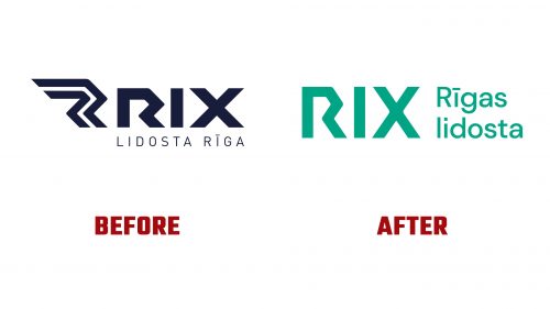
The redesigned logo significantly improves upon the previous version. The old logo included a monogram that redundantly echoed the “R” in Riga without adding meaningful value. The new logo addresses this by refining the “R” into a smoother, more natural form and adjusting the “X” to lessen its visual dominance, enhancing its balance and readability.
The wordmark uses the Haffer typeface from Displaay, applied consistently across the airport’s sub-brands, ensuring clear and unified communication throughout the airport’s signage and promotional materials. The chevron, a key graphical motif drawn from the logo, appears throughout the brand’s applications. These chevrons, whether in solid colors or featuring images, act as dynamic visual elements linking different aspects of the airport’s operations.
This versatile color scheme and graphic design cater to the airport’s operational needs while conveying a strong sense of place and heritage. The extensive use of chevrons and the strategic application of the Haffer typeface contribute to a cohesive and distinctive look, distinguishing RIX in the competitive airport industry.
With this refreshed visual identity, RIX Riga Airport repositions itself as a modern, accessible gateway, reinforcing its status as Latvia’s introduction to the world.


