City, waterfall, shield, state – these are the four key concepts behind the new Rochester New York FC team logo.
The elegance and conciseness of the chosen colors for the new identity are simply a delight for the audience’s eyes.
How often do football and other sports teams suffer from a lack of visual identity and communication with fans? Often enough. Because of the overload of visual perception due to pockmarked lines, imaginary contours that determine the dynamics or flight of balls, bright colors that are not combined with the strict name of the team, the cartoonish character of the logo, etc., do not create an adequate impression for the viewer. It’s one thing when such a colorful logo looks on clothes. It’s like an unfolded book, an open story before our eyes.
But what is the essence of the logo, if not in solving the problem of quick acquaintance with the brand and easy memorization? There is a certainty that if you ask a football fan if he knows any other logo beside his favorite team, he will be able to answer what the main message of the logo is being conveyed. But it will be extremely difficult to describe it because the abundance of styles and graphic elements, along with a long full-fledged name, is already a large banner advertising the team and not a short description of the team’s “what and how.”
Correcting visual bloopers and correcting design mistakes, a brand like Rochester New York FC resorted to simplifying the logo. Naturally, centrally choosing the shield, the designers did not lose because this is a very well-known theme for team design, in which the protection of the field plays an important role.
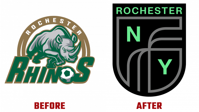
The old logo looks like an old age-old clothing print. The centerpiece rhino is outlined in green, and itself is gray. The name Rhinos is green with golden-orange edging. The letter “O” is stylized as a soccer ball. The geographical name Rochester is in white typographic type with an orange arc. Looks outdated, overwhelmed, and aggressive.
Of course, the image of a powerful rhino intimidates competitors, but now it will be a sign for an aggressive response to the logo. Therefore, it was a great success that a decision was made to rebrand the football team in the new era of football development.
Now the laconic image of a shield with contour lines in the form of pouring water streams of High Falls, green letters with the area’s name, and the city of New York on different sides of the shield looks delicate, discreet, ultra-modern.
In general, the identity has become light and modest. Already gone are the daring and desire to show everyone in a row “how cool and strong we are.” Confidence, fortitude, collegiality, common values, respect for sports and their home region are evident. This is a stunning combination of speaking images placed in a logo too typical for the sport.
But one cannot complain about such a prepared rebranding. If you look at the opposing teams, then many visual problems have not yet been fixed.
Whether the proud Rochester New York FC. Football players dressed like a brand, a well-trained team, an aesthetic logo with the right message.


