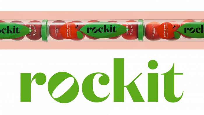
Convenience and comfort in everything – this motto can be considered a characteristic of today. Even in food, taste, quality, and attractiveness, and even size play an important role. New Zealand-based brand Rockit, which recently announced its rebranding from June 1, 2021, cites size as one of the most important influences on fruit buyers. It offers small apples that are “convenient” to store, carry and consume. For example, recently launched a line for the production of tubes, in which five pieces of apples with a size of 58 mm are packed! Given the stagnation this market is experiencing today, the oversaturated search for alternatives to attract buyers explains the originality of Rockit’s approach.
The company proceeds from the premise that small apples are exactly the answer to the convenience of their use. Packaged fruits are ready to eat right away. They do not need to be washed or cut. Time is saved – they can be used immediately at the workplace. Easy to fit in a small and handy package. Rockit organic tubes and boxes do not pollute the environment and preserve apples for a long time. Miniature apples fit comfortably in lunch boxes and are packaged in a small purse. These products create less waste. Even a child can eat them whole without the risk of choking.
All of this required a new marketing move that was supposed to ensure the attractiveness of the ad, make it inspiring to buy, and completely different from anything else. A fresh corporate identity for the company was developed by the leading design company Special Group New Zealand. The rebranding was carried out across the board, encompassing logo, style, packaging, website, blogs, signage, and branding accessories. Taking into account the product’s originality – a miniature apple, the new style was supposed to help stand out, reflect the price characteristic and attract the attention of everyone who cares about their health. The Special Group did a great job.
The new logo, the name of the Rockit brand, was made in a soft olive color, reflecting the naturalness of the product, the conditions in which the miniature apple is grown. At the same time, this is a connection with natural seasonal changes in nature, each of which is characterized by its color. The font is an individual development of the Special Group design group. It allowed moving away from “descriptive” images, providing ample opportunities for its interpretation in a symbolic direction, reflecting the energy and general attitude of the brand towards its product and its consumers.


