Major leaders in mechanical engineering and specialty technological gadgets do not often change the appearance of their brand. This is because technology companies do not have sufficiently developed communication with their target audience, such as a sausage manufacturer. These are specific brands that enter the market, positioning themselves as experts in presenting certain categories of goods designed to facilitate a person’s work. The demand for their services and goods is not as frequent as, for example, the production of food or clothing, but their importance for the development of the entire market is colossal. Such companies help build, repair, produce, clean, etc.
For better recognition, building communication at a new level, increasing demand for its products, Terex Trucks decided to carry out a large-scale rebranding, starting a new stage of development. From now on, the brand that specializes in dump trucks is called Rokbak. The corporate identity was renewed for the first time since 1968, before which it was called the Euclid Road Machinery Company.
Currently, the company’s turnover includes off-road dump trucks, which are necessary for the mining industry’s share. The model range includes two models whose carrying capacity reaches the limits from 28 to 38 tons.
An interesting fact is that seven years ago, the brand became a member of the Volvo Group, which largely helped expand the brand and improve all aspects of the company’s business. Facility modernization, multi-million dollar investments, new equipment, and continuous employee development are not only the main components of a brand’s success in the market but a business card.
The company’s managing director believes that with the new design, the company is entering a new era. And this is so because starting with naming opens up new horizons for realizing its business ambitions.
What is the design, especially the new logo?
This is black lettering made in a simple sharp font, as if visually slightly elongated upward. The letters look like capital letters, but at the same time, if you imagine that they are reduced in size, then it seems as if they are lowercase too. The distance between the letters is small; this is perhaps a reference to the fact that every element in the company is a cog in the customer service system.
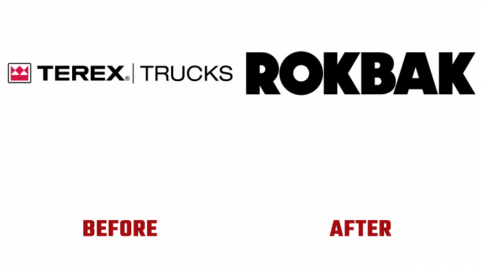
As for the previous logo, it differs significantly from the new one. It was colorful, had a favicon, a bright red crown, and was taken in a square. Moreover, this sign was part of the logo on the left. And already in the center and on the right side, the words TEREX (with the trademark sign) and TRUCKS itself have already been placed. Moreover, both words were separated by a vertical bar.
It cannot be certain that the current logo is a pitiful parody of the logo of a successful company. Far from it, because it is formal, well-built, verified. Yes, laconic and strict, but the field of activity does not imply bright brushstrokes, colorful lines, and play of light.
It’s just that such an idea should be evaluated in the long term when the brand “rocks” and shows real “rock” on the market. In the meantime, the brand does not waste time, wins the target audience’s attention, grows, gains strength in its new role, which should soon be of great importance in building strong and positive relationships with consumers.


