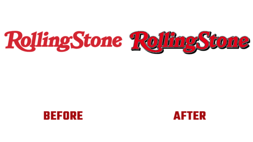
In 2022, the cult music magazine Rolling Stone decided to rejuvenate and appear before the public in a new way. But for this, he did not use the services of cosmetologists and not even modern songwriters, but designers of fonts and inscriptions. What are they for him? To modernize the visual identity because the owners of the publication wanted to change the logo because, in their opinion, it was time for something new. This event was scheduled for this summer. And it has already taken place.
The result obtained is used not only as an individual sign of a music magazine. He represents him at every level, including his recently launched personal website. A working alliance was created to improve the iconic lettering and add dimension and depth to it, including Joseph Hutchinson (creative art director), Roger Black, and Jesse Ragan (designer).
The result is an emblem reminiscent of the 1981-2019 version, but with a modernized style. In fact, the old form was adapted to modern conditions. At the same time, the inscription remained handwritten, cursive, and smooth. The letters are rounded and curved. There is no free space between them because they are located very close. Developers leveled some symbols, and some added finesse. For example, the capital “R” has an impressive dot on the left side of the hat, and the lowercase “g” looks smoother due to the edging.
The depth of the Rolling Stone logo is added by black shadows, which are now clearly visible in the letter space. Moreover, thanks to them, the signs turned out to be three-dimensional and voluminous. The final chord was a thin border of glyphs consisting of one white and two black stripes.


