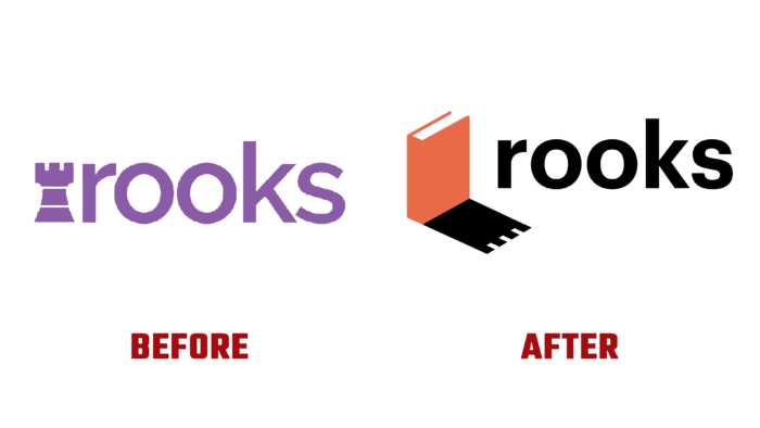
The Canadian company Rooks Bookkeeping was created to ensure convenient and transparent accounting accountability for everything that necessarily accompanies a business – from accounting to pricing. It provides a wide range of services covering virtually all business and financial reporting aspects. To implement its services, the brand uses modern software that facilitates the use of cloud accounting, through which users receive accurate and timely financial information. With Rooks Bookkeeping offerings, users have maximum freedom to make the right financial decisions. Given that any acquaintance with enterprises, organizations, and software applications begins with the study of their external display, the company decided to make changes to its visual identity based on its compliance with its current goals and objectives and the requirements of modern display technologies.
Initially, when creating the brand name, a symbolic connection was used with a chess piece – a rook, characterized by reliability and speed. In the new interpretation, the brand symbol is represented by a book whose shadow follows the contours of a chess piece. Such an image of him provides a more integral and complete reflection of the true meaning, goals, and objectives that the company has set for itself. The book is a symbol of the accumulated and existing knowledge in various fields that ensure users’ successful conduct of business. The whole visualization aims to demonstrate that every business person deserves professional support, with the help of which long-term financial success can be planned. The identity is built on the reflection of the created simplified accounting system. Positioning itself as a fundamental support for business, the brand uses the rook symbol, which is the cornerstone on the chessboard, playing a key role in this complex and exciting intellectual game. Its vital qualities become the property of the created brand, which applies them to help the business achieve success.
In typography, minor changes were made, which resulted in an increase in the thickness of the letters and a simplification of the graphic execution of the letters “k” and “s.” This made the text more readable and easily recognizable among the many logos. The contrasting black color of the text has become the second corporate color after the rich orange execution of the book symbol, whose reflection in the form of a shadow of a chess piece is also executed in black. All graphics of the sign and logo were executed using modern digital technologies, which ensured its clear and contrasting performance. The composition, made in a minimalist style, has become easily recognizable and memorable.


