


![]() Rosenborg Logo PNG
Rosenborg Logo PNG
Since its foundation, the club has been actively developing and winning a place in the sun. The Rosenborg logo conveys a desire to win and demonstrate mastery. The team has its way in the world of sports. The emblem claims that it will be successful.
On 19 May 1917, twelve youths from Trondheim’s Rosenborg district founded a club named Sportsklubben Odd, in reference to Odd from Skien. Weekly dues were 25 øre, enough to fund a kit within a year. In July 1918, the team beat Falk 2:1 in its first match.
League entry was delayed for years. In 1923, the squad nearly collapsed and played one game. In 1927, it was renamed to Rosenborg Ballklub due to a naming conflict. By 1928, the club entered sanctioned Class B competitions and began a gradual promotion.
In 1931, Rosenborg won the regional championship unbeaten and moved up. The Norwegian Cup debut followed in 1932. Postwar seasons brought instability until 1957, when the club moved to Lerkendal Stadion and secured a permanent home.
The breakthrough came in 1960 with a Cup final against Odd. After a 3:3 draw, Rosenborg won the replay 3:2 in extra time. Another Cup followed in 1964. In 1967, the club entered the top division and won it immediately. Odd Iversen scored 17 goals in 18 matches, then 30 the next season.
After a long gap, the 1985 title win over Lillestrøm sparked growth again. Professional status followed in 1988. Under Nils Arne Eggen, Rosenborg won 13 consecutive league titles from 1992 to 2004.
In Europe, the club reached the UEFA Champions League group stage in 1995 and qualified for it every year until 2002. In 1996–97, it beat Milan 2:1 at San Siro and reached the quarterfinals, where it lost to Juventus. In 2000, John Carew was sold to Valencia for a record fee. After 2004, dominance faded, but four titles followed between 2015 and 2018.
Meaning and History
![]()
The club had not changed its usual design since the 1970s, when it used a black-and-white diamond logo with short captions. That being said, the black-and-white combination has been considered the team’s official color scheme since it was called Odd, when the team members first appeared on the field in black shorts and white shirts.
What is Rosenborg?
Rosenborg is a shortened and commonly used name for Rosenborg Ballklub. This is a professional Norwegian soccer team based in Trondheim. The team competes in Eliteserien, having won 26 league titles. The club was founded in 1917 as Odd and received its current name in 1928.
the 1970s
![]()
The emblem of that period looked like a parallelogram standing at one corner. The geometric shape was divided into two black triangles by a white vertical stripe that ran down the center. In the left corner were “1” and “9”. They were followed by the abbreviation “RBK,” with the letter “B” on a white background and the letters “R” and “K” on black backgrounds. The right corner was occupied by the number “17”, which, together with “1” and “9,” formed the year Rosenborg was founded: 1917. The frame around the diamond and the inscriptions were dark gold.
the 1970s – 1980s
![]()
The logo appears smaller because the designers have narrowed the white stripe and enlarged the letters and numbers. The year the club was founded is now yellow, and the abbreviation that was gold is now white. The border is white, with thin yellow lines on both sides.
1980s – 1990s
![]()
In the 1980s, “B” was black, and “R,” “K,” “19”, and “17” were white. The frame around the rectangle’s edges is also black and white because Rosenborg chose to reflect his club’s colors in the emblem.
the 1990s – 2007
![]()
The developers changed the scale of the elements, leaving everything in its place. To do this, they widened the rhombus border, narrowed the central white stripe, slightly increased the numbers, and reduced the letters. The two dots separate the abbreviations from the year the team was created, which are now bold.
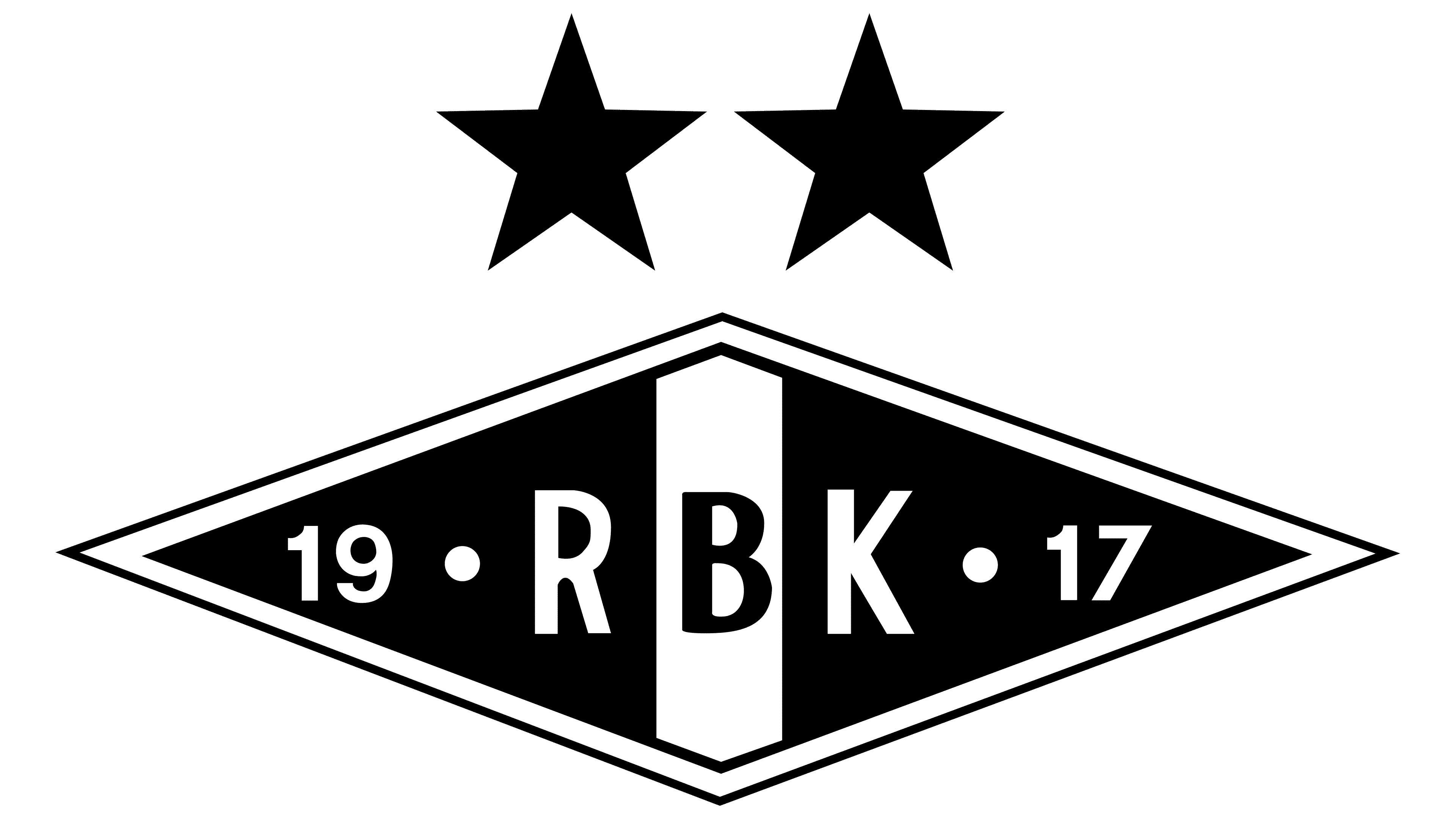
2007 – today
![]()
Rosenborg won its twentieth title in 2006, so two gold stars were added to the logo a year later.
Font and Colors
The elements of the club’s visual identity reflect its name and year of foundation. However, the designers had to split the number “1917” into two parts to avoid taking up too much space on the small diamond-shaped figure. For the same purpose, the phrase “Rosenborg Ballklub” has been reduced to three letters: “RBK.”
The designers didn’t want to overload the logo with unnecessary details, so they chose a simple sans-serif font. The color scheme is also minimalist: the black-and-white combination distinguishes the Rosenborg graphic sign from other club crests. By the way, the same monochrome palette is used for the players’ home kits.