


![]()
The Royal Ballet and Opera symbolize the British stage, and they are known worldwide for their performances and virtuosic artists. The Royal Opera House stands at the heart of London’s Covent Garden, where productions beloved by audiences from many countries are created and performed. Over three thousand people, including artists, directors, technical and creative staff, are involved in its work, with performances broadcast globally through digital services, cinemas, and international tours.
The recent redesign of the theater’s logo changed its perception. The previous emblem featured a meticulously drawn coat of arms, full of intricate details and fine craftsmanship. The new approach by DesignStudio offered a different vision, a simplified and bold coat of arms. The images of the lion and unicorn became more substantial, and the lines contrasted. Although this style became more suitable for digital formats, it lost some of the elegance of the previous version, slightly emphasizing the animals’ rougher features.
![]()
However, the designers worked attentively and confidently with the typography. The new font appears elegant: letters are closely spaced, creating a compact composition. A striking detail is the ampersand and the letter “R,” which feature expressive curves. The red-black-white palette helps the new brand image appear classical without excessive seriousness.
The corporate identity is complemented by the idea of a “Living Timeline,” based on the connection between the Royal Opera’s traditions, contemporary productions, and plans. This concept formed the foundation for all brand elements, from color to visual forms. The palette revolves around the signature red, enhanced with shades drawn from the theater’s archives. This solution preserved the company’s heritage while adding flexibility and freshness to posters and promotional materials.
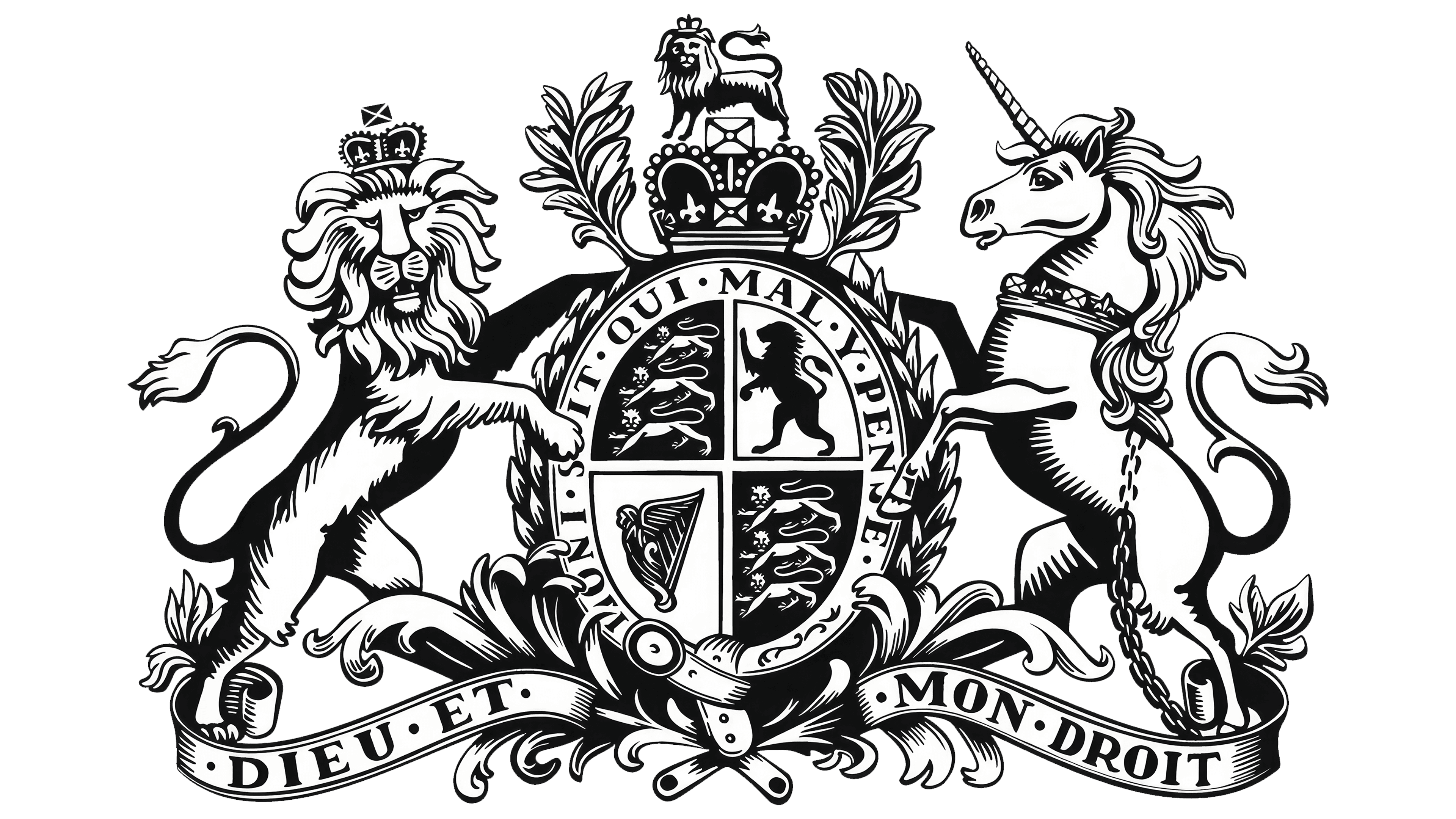
The new style transforms easily: the emblem looks equally good on its own or within a square frame, adapting to various formats and media. The inverted version of the coat of arms is particularly successful, where the white silhouettes of animals remain readable due to the correct use of shadows.
The new image of the Royal Ballet and Opera turned out expressive, contemporary, and worthy of the theater’s status. Now it remains to see its full implementation across all communication channels to confirm the success of this concept.
![]()