


![]()
The Canadian brand RW&CO has undergone a major update to its visual identity, strengthening its position in the fashion market. The new style, created by the studio Dalziel & Pow, reflects precision, taste, and the company’s modern outlook.
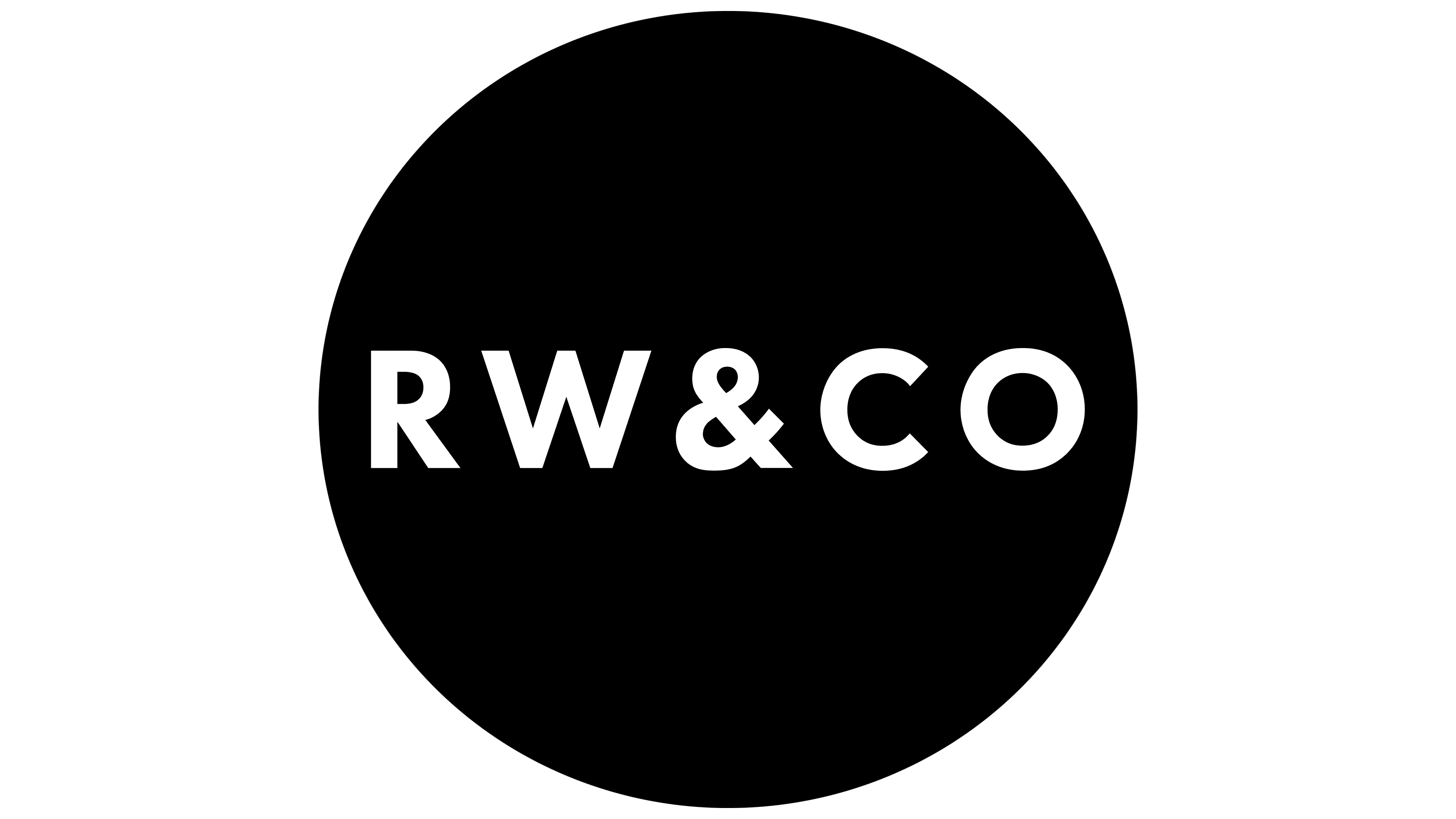
The main change concerns the new logo. The dot after “CO” has been removed, and the letter spacing has become wider and calmer, giving the wordmark a sense of lightness and balance. The focus is on harmony of proportions and a sense of confidence without unnecessary decoration.
![]()
The color system now includes an expanded palette. The foundation consists of refined, subdued tones that convey calmness and quality. A secondary group of bright colors is used selectively in packaging, shopping bags, and promotional elements. They create emotional highlights and add liveliness to perception.
The typography has become simpler and more expressive. Clean forms emphasize the brand’s sophistication and versatility. The tone of communication has also changed. It now sounds natural, inspiring, and closer to everyday speech. Advertising materials now feature more street scenes and real-life moments showing real people, their daily lives, emotions, and freedom of expression. Close-up shots of fabrics and details help convey quality and attention to form.
![]()
RW&CO aims to be a brand for everyone, regardless of gender, style, or age. The new identity reflects this direction and shapes a modern, open, and human image in which clothing becomes part of everyday life rather than just a fashion choice.