Sabio Group recently launched its new brand to reach more audiences and offer its customer experience and contact center technology services.
The unique, eye-catching, yet visually cool logo results from the company’s accelerated growth strategy, which has been working on its new professional image for the past 18 months.
The company’s website, typography, illustrations, and icons are part of a “transformation” package for a company that has gone through many socio-economic upheavals in recent years.
Since 2019, the company has become more recognizable and attractive to customers in countries like the United Kingdom, France, the Netherlands, Spain, Malaysia, Singapore, and Southeast Asia. There are now 1,000 employees working under the brand’s umbrella, and around 600 customers worldwide are turning to the company for help.
Therefore, visual changes were inevitable.
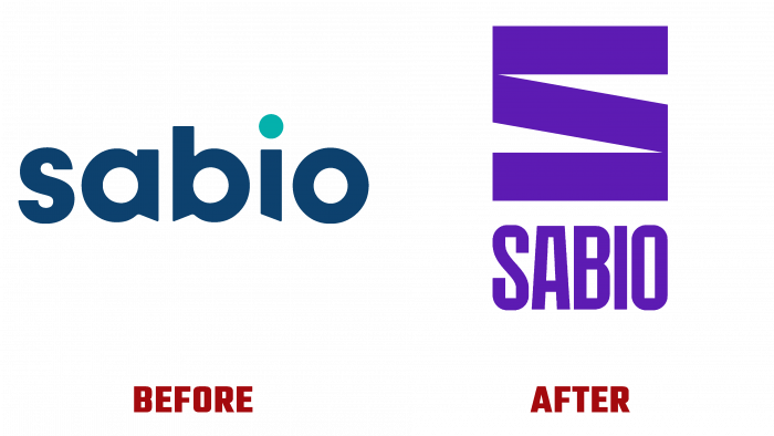
The logo used to look more playful. Its typeface was a dark blue color with distinctive accents in the letters A and B shapes, while the letters themselves were lowercase. Above the letter, I was a color accent in the form of a green dot. It should be noted that the color was very different from the basic color of the font, so the contrast did not benefit the logo. This dot looked like an unnecessary bright spot.
The brand has enlarged and established itself, so its scale has grown. Now the font logo has either a subtle blue hue on a blue background or an alternative in the form of a purple (or lilac) hue. All letters are capitalized, and the font itself is elongated forward and resembles rectangles in shape.
The logo signs are created from blocks of rectangles, which roughly form the letter S.
One cannot say that the logo looks harmonious. Visually, it strains the eye, and we have to compromise – enjoy the color solutions or carefully observe the game of sharp and clumsy forms of letters.
In the near future, the initiators of rebranding will probably reconsider their point of view, and there will be a new logo, which will gain more success than such a clumsy version.


