The Sacramento Kings emblem reflects a commitment to origins and rich history. The mascot and emblem graphics symbolize the team’s play features, aspirations for leadership, confidence, and firmness in-game tactics.
Sacramento Kings: Brand overview
| Founded: | 1923 |
| Founder: | Vivek Ranadivé |
| Headquarters: | Sacramento, California, U.S. |
| Website: | nba.com |
For some people, moving to a new place is a wonderful event, but for others, it’s the opposite feeling. The Kings experienced the only successful period in its history in their former residence – in the town of Rochester in western New York.
The Sacramento Kings is one of the oldest basketball teams. It was founded as a semi-professional team in the early 1920s in Rochester, New York. In 1945, the “Rochester Royals” club was admitted to the NBL, and three years later, it switched to the BAA due to the merger of the BAA and NBL. The name “Royals” was chosen because it won the team naming contest conducted by the local newspaper. The name for the team was suggested by 15-year-old Richard Pitt. In 1949, the “Rochester Royals” joined the NBA. The colors were immediately changed to royal blue and white.
In Rochester, the club twice became the league champion (first NBL, then NBA), but by 1957, it outgrew its modest homeland and moved to a larger city – Cincinnati. The name was not changed (and was even inscribed twice on the emblem), and the colors initially remained blue and white until red was added. A version with a vertical inscription was also tested. But in the early ’70s, it was replaced by a more familiar copy.
Then, the team had to move again. The fact is that things in Cincinnati were not going very well, and the “Royals” decided to move to another place. However, the team couldn’t decide exactly where, so they headed to two cities at once. For three seasons, from 1972 to 1975, the team played home matches in two Great Plains cities – Kansas City and Omaha. The name had to be changed simultaneously because there was already a baseball club, “Royals,” in Kansas City, even though it was a quarter-century younger. But baseball was the real king in America, and basketball players silently turned into a synonym – Kansas City-Omaha Kings. The uniform remained the same (though this was until 1975 when the “Kings” settled in Kansas City, the name of which was still added to the shirts for some time).
Finally, in 1985, the club moved to California, to the city of Sacramento. That’s where it’s based now. The name, of course, was changed to Sacramento Kings. The team received the name Kings when moving to Kansas City. Since there was already a baseball club based there, Kansas City Royals, a similar name – Kings – was chosen. The only change in the club’s image was the blue color changed to sky blue (although blue remained in the home uniform). Also, a crown appeared over the letter i instead of a dot. In the early ’90s, there was another throwback to the basics, but with significant changes – black and purple colors were added to the emblem.
The first attempt was predictably terrible, and the alternative version did not fix the situation (it’s assumed that the designers were inspired by the attire of royal jesters). In the early 2000s, the purple color took over, and the crown’s dot returned to the home shirt. The alternative gold uniform, introduced in 2005, was so vehemently rejected by fans that it immediately disappeared.
The “Sacramento Kings” mascot is Slamson, the lion.
Meaning and History
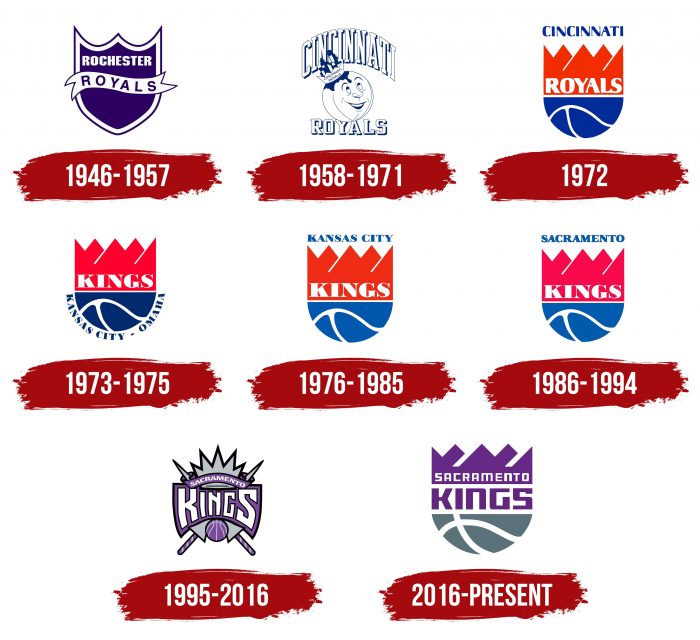
The Sacramento Kings team has changed logos several times due to numerous relocations. Meanwhile, it never turned to its mascot for inspiration: in most emblems, artists played with the club’s name, linking together the crown and basketball. The latest version appeared in 1985. Stylistically, it is no different from the previous one, but the designers significantly worked on the details, giving the drawing modernity.
What is Sacramento Kings?
Sacramento Kings is a basketball team from the capital of California. Since its foundation in 1923, it has changed its name several times. It was known as Rochester Seagrams, Rochester Eber Seagrams, Rochester Pros, Rochester Royals, Cincinnati Royals, Kansas City-Omaha Kings, and Kansas City Kings. The last renaming to “Sacramento Kings” occurred in 1985.
1946 – 1957
When the team was in Rochester and called the “Royals,” it used a logo of a triangular shield with two inverted arches at the top. The main space inside the heraldic element was blue, and the wide frame was white and light blue. In the center was a white ribbon with the inscription ROYALS. Directly above it was the word “ROCHESTER.”
1958 – 1971
Having moved to Cincinnati, the club abandoned the old emblem and adopted a new one: a basketball with a face, a crown, and the inscription “CINCINNATI ROYALS.” The words are depicted in large, voluminous letters. The first is curved like an arch and is located at the top, while the second is written in a straight line at the bottom. The team’s name is also duplicated on the crown.
The drawing style is cartoonish but very simple: the artists used blue for outlining elements, leaving the interior white.
1972
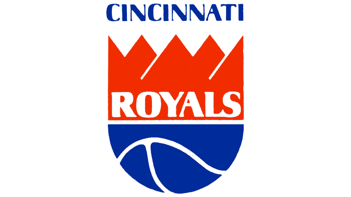
In 1972, a logo appeared that would become iconic in the future. The red-orange crown (at the top) and half of a blue basketball (at the bottom) form a whole figure resembling a heraldic shield with a round base. Above them is the word “CINCINNATI,” and inside the royal attribute is “ROYALS.”
1973 – 1975
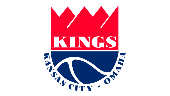
After moving to Kansas City and changing the name to “Kansas City-Omaha Kings,” the club changed the emblem, removing the old inscriptions. The word “KINGS” appeared at the bottom of the crown, and the phrase “KANSAS CITY-OMAHA” was curved under the ball.
1976 – 1985
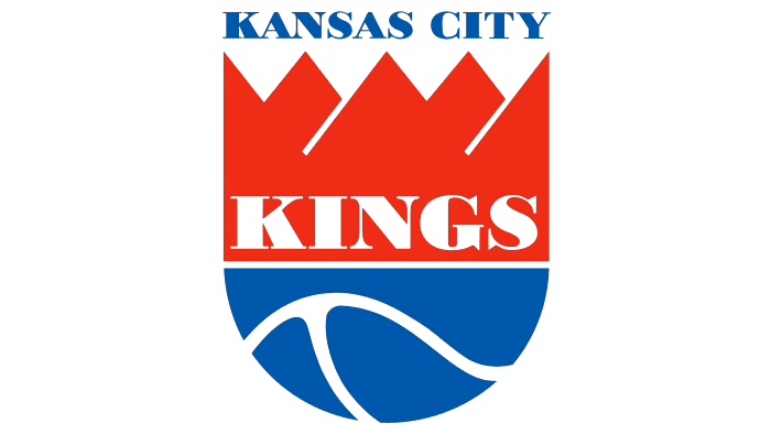
The next redesign is associated with the team simplifying its name to “Kansas City Kings.” The designers removed the word “OMAHA” and moved the city name up, positioning it above the graphic composition.
1986 – 1994
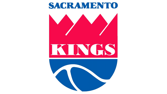
The team’s subsequent move to another city led to the word “KANSAS CITY” disappearing from the logo, and in its place appeared the word “SACRAMENTO.” At the same time, the designers changed the palette, giving the red crown a dark pink hue.
1995 – 2016
On the eve of 1995, the “Sacramento Kings” adopted a new emblem with a radical redesign. Nothing remained of the classic style: the developers combined the crown, two crossed spears, a basketball, a ribbon with the inscription “SACRAMENTO,” and a large sign with the word “KINGS.” The palette includes white, black, silver, and purple colors.
2016 – present
In the 2016-2017 season, the club returned to the classic style. The logo was created by specialists from the branding agency Hattiesburg, Miss., designer Rodney Richardson from RARE Design, and representatives of the Sacramento Kings. Initially, they wanted to create something entirely new, so they sketched thousands of drafts with crowns, shields, swords, lions, and the abbreviation “SK.” But everything kept coming back to the already used “crowned” basketball. So, the attempt to develop a design from scratch led to the modernization of the old symbol.
Sacramento Kings: Interesting Facts
The Sacramento Kings are an old basketball team in the United States that’s been around for a long time. They started a long time ago as the Rochester Royals.
- How They Started: In 1923, they began as the Rochester Seagrams, a semi-pro team. They changed their name to the Rochester Royals and joined a big basketball league in 1945. They became part of the NBA in 1948 when two basketball leagues joined.
- They Won a Big Game: In 1951, they were the best in the NBA, beating the New York Knicks. That was the only time they’ve won the big championship.
- They Moved a Lot: The team didn’t stay in one place. They moved from Rochester to Cincinnati in 1957, then to Kansas City in 1972, and finally to Sacramento, California, in 1985.
- New Names: Every time they moved, they got a new name to fit their new city but kept “Royals” or “Kings” to show they were still the same team.
- A Long Time Without Winning: They had a tough time for 16 years, from 2006 to 2022, when they didn’t get to play in the important end-of-season games.
- Fans Love Them: Even when they didn’t win much, they had fans who supported them. Their loud arena was known as “The Loudest House in the NBA.”
- Welcoming Players from Everywhere: The Kings were one of the first teams to have players from different countries, which helped make basketball popular worldwide.
- Cool Owner: Their owner, Vivek Ranadivé, is the first person from India to own an NBA team. He likes using new technology to improve the team.
- They Care About the Planet: Their arena is good for the environment. It’s the first to get a special green building award and runs completely on solar power.
- Famous Players and Coaches: Some people who played or coached for the Kings are in the Basketball Hall of Fame, like Oscar Robertson and Jerry Lucas.
The Kings have a special story in basketball with their long history, moves, love for new ideas, and efforts to do good things for the world.
Font and Colors
The updated logo reflects the franchise’s historical past and revitalizes its legacy. The simple sign encrypts the phrase “Kings of basketball,” which corresponds to the team’s ideology. Rodney Richardson, who led the rebranding process, retained classic elements: the crown, the semi-cut ball, and the inscription “SACRAMENTO KINGS.” He only changed the colors and shapes, leaving the combination of silver and purple and widening the white lines.
The developers used a transformed font: the original block font with many angles. According to the authors’ concept, it symbolizes the strength and courage of the basketball players.
The palette also changed: the designers made the upper part of the emblem purple and the lower part dark gray. The purple-violet shade is the identifier of the Sacramento Kings and the color of most royal families. The slate-gray color is inspired by the granite found in the mountains near Sacramento.
Sacramento Kings color codes
| Purple | Hex color: | #5a2b81 |
|---|---|---|
| RGB: | 91 43 130 | |
| CMYK: | 81 100 12 2 | |
| Pantone: | PMS 268 C |
| Black | Hex color: | #000000 |
|---|---|---|
| RGB: | 6 25 34 | |
| CMYK: | 30 0 0 100 | |
| Pantone: | PMS Black C |
| Slate Gray | Hex color: | #63727a |
|---|---|---|
| RGB: | 99 113 122 | |
| CMYK: | 15 0 0 65 | |
| Pantone: | PMS 431 C |
FAQ
Why is there a lion on the “Kings” logo?
There is no lion on the main Sacramento Kings logo – it is represented as an additional badge. This animal embodies royal power, high status, strength, and leadership. It is also the team’s mascot.
Why did the “Sacramento Kings” change their logo?
The basketball team changed its logo design to reflect its heritage. Initially, the designers wanted to depict something entirely new but then changed their minds.
What symbols are depicted on the “Sacramento Kings” court?
A basketball, a crown, and a lion are the primary visual symbols of the Sacramento Kings Court. They can be used separately (lion, crown) and in various combinations.
Where did the Sacramento Kings team come from?
The franchise’s main location is the Californian city of Sacramento. Previously, it was based in Kansas City, Omaha, Cincinnati, and Rochester.
