Today, insurance and travel are inextricably linked to creating the best possible experience for service users. But like everywhere else, there are challenges, especially related to the age range of travelers. Many entities in the insurance, finance, leisure, and travel industries have some challenges serving customers over the age of 50. Saga prides itself on creating the most comfortable experience for all ages. To improve the quality of services, the brand surveyed its users of this age group and those who might be potential customers. The result was that the majority in this age group prefers to evaluate themselves not according to their years but according to the visual assessment that can be made of external factors, existing experience, and psychological attitude.
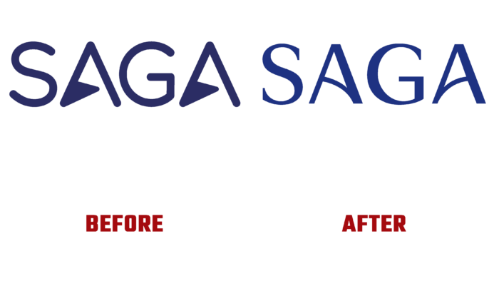
The new form and visualization required a change in visual and verbal identity. Being oriented to the accumulated experience of generations, Saga emphasized exactly this point, shaping its own identity. Particular attention was paid to the fact that the group over 50 is no less diverse than the younger generation. One of their unifying profiles is a shared interest in quality service and the presence of care. It was important to reflect on the new identity, weaving them harmoniously into the overall pattern of the new image. The basis of the logo was a new wordmark created using modern technology. It was inspired by a visit to the company’s first hotel. The original pattern in the execution of the railing suggested that arcs and shapes made of metal could be reflected in the wordmark, its curvature, and the execution of the rungs of the letter A. An important element was the original and concise sign, which ensured the economical use of space in all applications.
Lucy McGrath, a designer and marble specialist, prepared new eye-catching logo prints. Her ideas provided a luxurious setting that accentuated the connection of the offerings to the core and abiding human values, quality, and a high level of service. The marble effect was the result of high technology. The patterns have been “combed,” as it were, with various hues that dissolve on the water surface, where algae can be seen. Their presence creates a floating effect for the ink.


