


![]() Salvation Army Logo PNG
Salvation Army Logo PNG
The Salvation Army has chosen a logo that matches its status and concept. A shield conveys the military direction in the form of a chevron, and the Christian one is in red, symbolizing the divine fire and the blood of Jesus. The massive emblem features a harmonious balance of sharp angles and rounded lines.
The Salvation Army’s history began with William Booth, born on April 10, 1829, in Sneinton near Nottingham. After his father’s death, he left school at fourteen and became apprenticed to a pawnbroker. Seeing poverty at close range shaped his early preaching. On July 2, 1865, Booth held a meeting in a tent on a Quaker burial ground in Whitechapel, London. That meeting became the basis of the Christian Mission.
Catherine Booth, whom William married in 1855, became a full partner in the work. While he preached among the poor, she addressed wealthier audiences and raised funds. She also argued that women should have the same public role as men within the Mission. By 1867, the group had ten staff members, and by 1874, it had one thousand volunteers and forty-two evangelists.
In 1878, while editing an annual report, Booth changed the phrase “volunteer army” to “Salvation Army.” The new structure turned converts into “soldiers,” evangelists into “captains,” assistants into “lieutenants,” and Booth into the “General.” Uniforms appeared, along with the War Cry newspaper. Between 1881 and 1885, the military model helped the movement reach 250,000 converts across several continents.
The organization expanded abroad in 1879 and 1880, with Amos Shirley in Philadelphia, George Scott Railton and seven women in New York, and John Gore and Edward Saunders in Adelaide. In 1883, the first prison-gate home opened in Melbourne. In 1890, Booth published In Darkest England and the Way Out, proposing labor exchanges, farm colonies, missing-person services, and legal aid. Catherine died in October 1890, William died on August 20, 1912, and Bramwell Booth succeeded him. The Army worked alongside groups such as the Red Cross and YMCA.
Meaning and History
![]()
The Salvation Army logo reflects its highest priority: protecting those who find themselves in difficult situations and need help from outsiders. This badge conveys a desire to help the poor, support representatives from developing countries, and assist those affected by natural disasters. Therefore, it is used everywhere where only the TSA works, and these are 132 states. The organization’s symbolism is present in shelters, charity shops, and humanitarian aid centers. There are two emblems in its arsenal.
What is Salvation Army?
The Salvation Army is a Christian charity that operates in 132 countries. It focuses on protecting people who find themselves in difficult life situations or are affected by disasters. William Booth and Catherine Booth founded it. Time of origin: 1865. The head office is located in London.
1865 – 1901
![]()
The first years of the Salvation Army used a logo in the classic coat-of-arms style. It was a standard roundel consisting of a white circle, a wide ring, and a geometric-style frame. The center was a red “S,” which, together with the Christian cross, formed a vertical monogram. These elements had two meanings: the first was the term “salvation,” and the second was Jesus the Savior. Below were crossed swords, symbolizing the battle for salvation.
A wide blue band surrounded the middle with sacred words and symbols. The seven dots are the seven truths of the gospel. The “Blood and Fire” inscription reflects the desire to protect the disadvantaged and suffering. The massive crown at the top is the Lord God’s crown of glory. It consisted of five segments, each decorated with a four-pointed star. The final chord was the flag, a ribbon under the medallion, symbolizing the war against social evil and sin. It indicated that The Salvation Army would help anyone in a difficult situation.
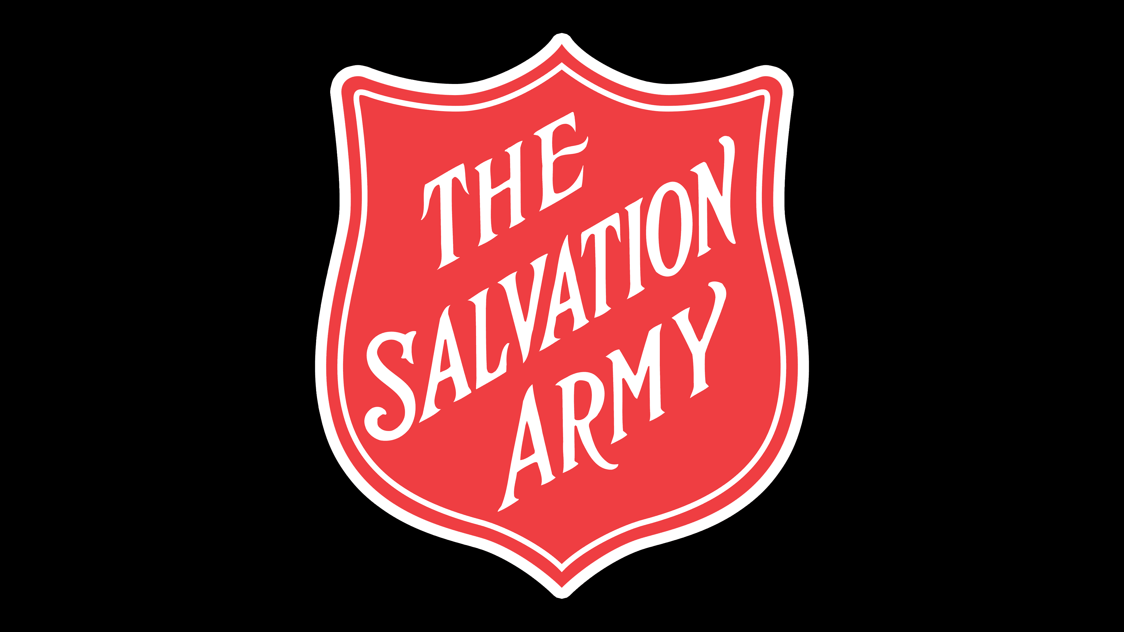
1901 – today
![]()
The round badge in a triangular frame gave way to a figured shield, so the logo lost its royal gloss and began to look like a military chevron, practical and minimalist. It reflects the essence of the charitable organization: protecting people in difficult situations. The attachment to Christian values can be traced in the red background, in the colors of active struggle, cleansing fire, and the blood of Jesus. The shield is hexagonal but has only four angular protrusions: three at the top and one at the bottom. The other two are rounded, so they look like wide sides. A double frame runs along the edges of the emblem. The central place is occupied by the diagonal inscription “The Salvation Army.”
Font and Colors
The logo of this organization has evolved from a complex form to a simpler one to make it easier to place on advertising media and signs. Therefore, next to the entrance to a thrift store, humanitarian aid center, or shelter opened by this service, there is a red board with the name hanging on it. It is concise and understandable.
The designers used Trajan Pro Regular, a sleek sans-serif typeface in standard configuration, for the Salvation Army emblem. According to the Commissioners Conference, which voted for it in 1958, it best forms the proper image, one that is clear and intelligible. The red in the logo represents the bloodshed of Christ for the salvation of people, the blue represents the purity of God the Father, and the yellow represents the flame of the Holy Spirit. There is also white, which serves as a background or for coloring inscriptions.