Provoking opponents is the primary goal of successful basketball players, and the San Antonio Spurs logo speaks to this better than anything else. The key element is a cowboy spur with a spiky star, creating an atmosphere of fierce competition and quick response to everything happening in the sports arena.
San Antonio Spurs: Brand overview
| Founded: | 1967 |
| Founder: | Spurs Sports & Entertainment |
| Headquarters: | San Antonio, Texas, U.S. |
| Website: | nba.com |
For some, relocating is a wonderful event, but for others, it’s the opposite. The Kings experienced the only successful period in its history in their former residence – in the town of Rochester in western New York.
The San Antonio Spurs are a basketball team based in San Antonio, Texas. The team competes in the Western Conference Southwest Division of the NBA. Founded in 1947 as the “Dallas Chaparrals” from the American Basketball Association (ABA), the club fell victim to the first attempt to foster a love for basketball in Dallas, a city insanely fond of football. Unfortunately, the “Dallas Chaparrals” (chaparral is a broad-leaved evergreen shrub predominantly found in northern Mexico and Texas) bred general disinterest in the city. In 1971, the team changed its name to Texas Chaparrals to attract a fanbase from all over the state, not just Dallas. A year later, the franchise reverted to its old name – “Dallas Chaparrals.”
In 1973, it was decided to sell the club. The deal between the owners and a group of investors from San Antonio included a 3-year option to purchase the franchise, after which it would return to Dallas. In San Antonio, the “Chaps” initially received the cowboy name “Gunslinger,” reminiscent of an arrow. However, even before they played a single game, the name was changed to “Spurs” to gain regional status and thus attract more fans. In fact, “Spurs” is a tribute to the history of Texas and the entire Wild West. The cowboy theme is incredibly popular in the western part of the US.
After moving to San Antonio, the “Spurs” radically changed their playing style, promoting so-called schoolyard basketball, which brought them both victory and popularity. As a result, the “Spurs” became one of the most profitable teams in their league and joined the NBA in 1976.
In 1990, the “San Antonio Spurs” logo radically changed. The color palette included dazzling pink, orange, and teal colors, nicknamed the “Fiesta.” In 2003, when a modest, conservative style was again in vogue, the “San Antonio Spurs” introduced a new minimalist black and silver logo.
Meaning and History
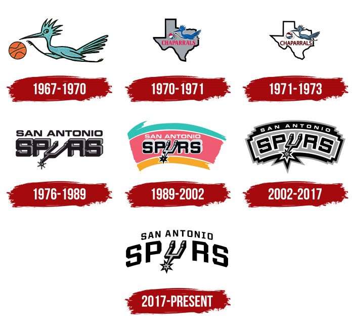
The “San Antonio Spurs” team’s logo is a graphic representation of its name. It originally plays with a spur, used instead of the letter “U.” This spelling was adopted in 1976 along with the new nickname. Before that, the club was known as Chaparrals and had a corresponding emblem with a chaparral bird.
What is San Antonio Spurs?
The “San Antonio Spurs” is a former American Basketball Association team that joined the National Basketball Association as a result of the merger of the two leagues in 1976. It’s the only former ABA team to have won an NBA championship five times as of 2021.
1967 – 1970
Until 1970, the franchise was called the “Dallas Chaparrals.” Its logo featured a blue chaparral bird chasing a brown basketball. This is a fast-moving cuckoo with a long crest and tail, which the artists paid special attention to.
1970 – 1971
Having gained the status of “Texas Chaparrals,” the team introduced a new emblem. Designers added a light pink inscription, ‘CHAPARRALS,’ and a grey geometric figure with a wide black outline in the shape of Texas. The first element was placed directly under the bird, and the second was placed in the background. The ball became tricolor: red, white, and blue harmoniously combined in it.
1971 – 1973
The club reverted to the name Dallas Chaparrals, but this is hardly reflected in the logo. Developers made the state’s silhouette white, keeping the black frame. They also recolored the nickname in burgundy and the bird in gray.
1976 – 1989
This period was one of radical changes in the franchise’s history. When the franchise was moved to San Antonio, the owners changed the name to reflect the heritage of West Texas. Spurs became the winner of the contest, inspiring designers to create a new club sign. As a result, the “San Antonio Spurs” entered the NBA with a concise emblem. The nickname was executed in voluminous letters, with a riding spur instead of the letter “U.”
1989 – 2002
In 1990, the famous logo with a three-color background appeared, which included the so-called “Fiesta colors”: turquoise, orange, and pink. The text was preserved, but the city name was recolored in white and the club nickname in black with white outlines. The shape of the spur was also changed: it became more pointed.
2002 – 2017
The Fiesta emblem went into the past. It was replaced by a strict symbol, combining four colors: silver, black, gray, and white. The general shape of the background figure was preserved, but designers sharpened it, added straight angles, and defined the boundaries. The inscriptions acquired an arched silhouette.
2017 – present
In 2017, the basketball club registered a new trademark, devoid of the intricate graphic background elements. It contains only the black inscription “SAN ANTONIO” and the word “SPURS” with a spur instead of “U.”
San Antonio Spurs: Interesting Facts
The San Antonio Spurs are a great basketball team with many wins and a big impact on their city and the sport.
- Starting Out: The team began in 1967 in Dallas with a different name and then moved to San Antonio in 1973. After a big change in basketball leagues, they joined the NBA in 1976.
- Making the Playoffs: From 1998 to 2019, the Spurs were in the playoffs every year for 22 seasons straight, a record. This shows that they’re always good and tough competitors.
- Winning Championships: They won the NBA championships five times (1999, 2003, 2005, 2007, and 2014) because they play well together, especially in defense.
- The Big Three: Players Tim Duncan, Tony Parker, and Manu Ginóbili were super important to the team. They worked well together and won many games.
- Coach Popovich: Gregg Popovich, or “Pop,” has coached the Spurs since 1996. He’s won five championships and many awards because he’s a smart coach and knows how to make his team play well together.
- Players from Everywhere: The Spurs have players from all over the world, like Tony Parker from France and Manu Ginóbili from Argentina. They were among the first teams to bring in players from outside the U.S. a lot.
- Honoring Players: The Spurs have retired the jersey numbers of some of their best players, like Tim Duncan and David Robinson, to show respect for what they’ve done for the team.
- Great Defense: They’re known for playing good defense, which has helped them win many games and awards.
- Helping the Community: The team does a lot for people in San Antonio, like sports and education programs for kids. They care about their city.
- More Than a Team: The Spurs are a big deal in San Antonio, bringing people together and making the city proud. They’re not just good at basketball; they also help make their community a better place.
The Spurs are not just a basketball team; they’re a group that works hard, helps out, and brings people together, making them important in San Antonio and basketball.
Font and Colors
The logo evolved from a cartoonish blue bird to a double arch formed by the inscription “SAN ANTONIO SPURS.” Additionally, the team’s main symbol since its appearance in the NBA has always been the spur, with a pointed wheel always depicted at its end.
The classic element has undergone several redesigns, affecting the text, color scheme, and small design details. Ultimately, its purpose is to present the club as part of the culture of West Texas, linking the region’s historical heritage and the modern era of basketball.
The Eurostile inscription has been an essential element of the club’s identity since it moved to San Antonio. It’s a sans-serif font developed in 1962 by Italian typographer Aldo Novarese. It replaced Microgramma and was often used in science fiction in the past. The square letters with rounded corners remind us of mid-20th-century television screens.
The current emblem’s palette includes black, white, and light gray colors. But fans remember another version – with a multicolored tricolor flag in the background. According to one version, the “Fiesta colors” (turquoise, orange, pink) symbolized the city’s Mexican population.
San Antonio Spurs color codes
| Black | Hex color: | #000000 |
|---|---|---|
| RGB: | 6 25 34 | |
| CMYK: | 30 0 0 100 | |
| Pantone: | PMS Black C |
| Silver | Hex color: | #c4ced4 |
|---|---|---|
| RGB: | 196 206 212 | |
| CMYK: | 5 0 0 20 | |
| Pantone: | PMS 877 C |
FAQ
What does the “San Antonio Spurs” logo mean?
The name of the basketball team is reflected in its logo: at the top is the phrase SAN ANTONIO, and at the bottom is the word SPURS with a spur instead of the letter U.
What should the San Antonio Spurs logo look like?
The San Antonio Spurs logo should look like an arched inscription divided into two lines. The top is the city’s name; the bottom is the franchise’s nickname. Additionally, a spur with a wheel should be in place of the letter “U.” The font should be a bold geometric sans serif with cut corners.
Why did the “Spurs” change their name?
The San Antonio Spurs team, which was called the Texas Chaparrals until 1971, was renamed due to relocation. Initially, the leaders wanted to call the team San Antonio Gunslingers, but before the start of the season, they changed their mind and chose the current option.
What colors are in the old “Spurs” logo?
The most colorful Spurs logo was depicted against the background of three wide stripes: orange, pink, and turquoise. They served as a base for the white inscription “SAN ANTONIO” and the black and gray word “SPURS.” This version began to be used in 1990.

